The network for creativity
Join 1.25M professional creatives like you
Connect with clients, get discovered, and run your business 100% commission-free
Creatives on Contra have earned over $150M and we are just getting started
Back to feedPost

NOMA is a brand identity project for an architecture and construction studio, shaped around the connection between creative vision and the discipline of building. The identity combines a bold wordmark, precise typography and a restrained color palette to communicate clarity and confidence. Architectural imagery, concrete textures and directional light bring a sense of scale and materiality to the visual system.
The motion piece extends that identity through dynamic framing and purposeful transitions. Changes in scale reveal the strength of the wordmark while echoing the rhythm of architectural forms. Together, the static and moving elements present NOMA as a studio that carries ideas from the first concept through to construction.
The network for creativity
Join 1.25M professional creatives like you
Connect with clients, get discovered, and run your business 100% commission-free
Creatives on Contra have earned over $150M and we are just getting started



Related posts


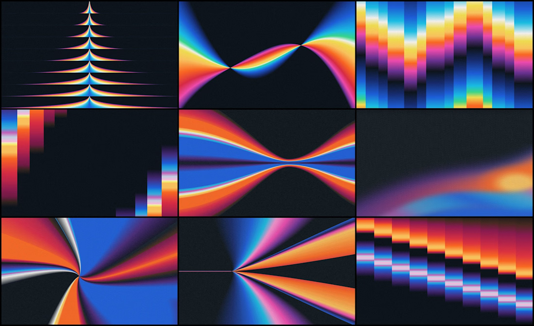
We designed the visual identity for an early-stage studio that helps AI companies adapt one product story for different audiences and channels.
Its positioning was already defined. Our job was to make it visible.
The organizing idea was refraction: one source opening into multiple expressions.
Rays expand from a shared point. Color fields stretch, compress and change direction, which gives a still image a sense of movement.
If your brand needs a lot of variety, decide first what every variation stays connected to.

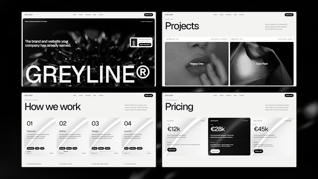
Made for design studios



You really did a great job!

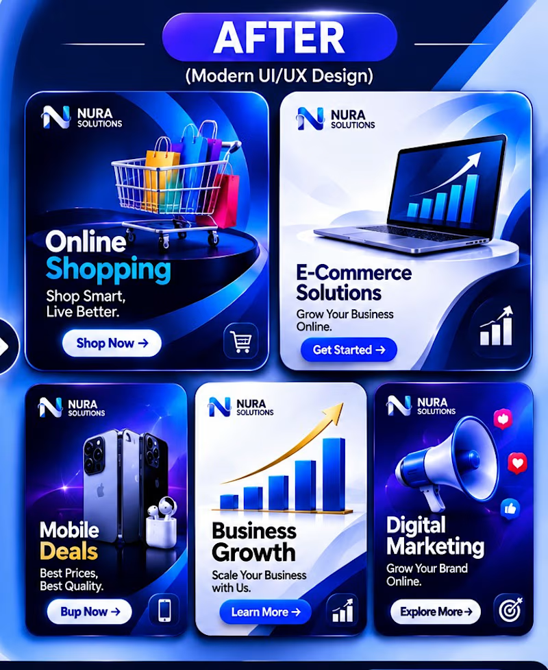
✨ FROM BASIC TO PREMIUM — A Creative Design Transformation.
Great design is more than just visuals; it's about creating clarity, impact, and a memorable experience.
This project showcases the transformation of five business-focused social media graphics into modern, premium designs using professional visual hierarchy, refined typography, balanced colors, and modern UI/UX principles.
My goal was to turn ordinary promotional graphics into visually engaging designs that communicate value and capture attention.
Design is not just what you see. It's how effectively it communicates.
BEFORE → AFTER
What's your favorite transformation?
#GraphicDesign #SocialMediaDesign #UIUXDesign #VisualDesign #BrandDesign #CreativeDesign
2 voted
100%
0 voted
0%

2 votes
Closed