The network for creativity
Join 1.25M professional creatives like you
Connect with clients, get discovered, and run your business 100% commission-free
Creatives on Contra have earned over $150M and we are just getting started
Back to feedPost
Just launched AquaFix — a modern plumbing website template built in Framer 🔧💧
Designed with service pages, pricing, testimonials, service areas, blog, contact forms, and smooth responsive interactions.
Would love your feedback on the design and overall experience.
#Framer #WebDesign #UIUX #FramerTemplate #NoCode #PlumbingWebsite


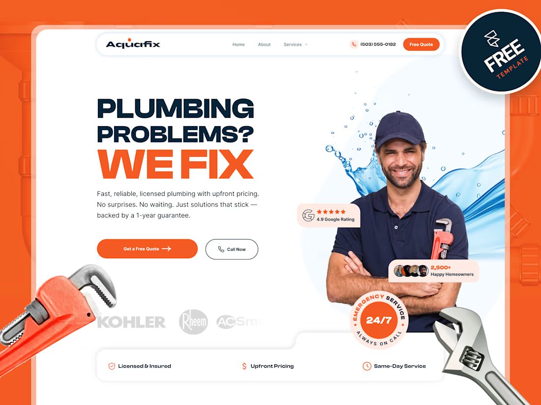

Live preview: https://aquafix.framer.website/

Congratulations on your launch, Priyabrata!
thanks

Nice work. I really like how the template feels, it's been centered around the customers journey.
thanks
The network for creativity
Join 1.25M professional creatives like you
Connect with clients, get discovered, and run your business 100% commission-free
Creatives on Contra have earned over $150M and we are just getting started





Related posts

My 3rd Framer template, SKI8, is live on @Framer
I kept landing on ski school websites with jaw-dropping mountains up top, then buried prices, tiny buttons, and no way to book.
Your site is your first lesson. If it feels clunky, people assume the instruction will be too.
So lead with one bold hero, show your courses clearly, and make booking a single tap.
That's exactly what SKI8 does: bold, snow-inspired, fully responsive, no code needed. Built for ski schools, clubs, camps, and instructors.
Grab it free on Framer 👇

Congrats buddy

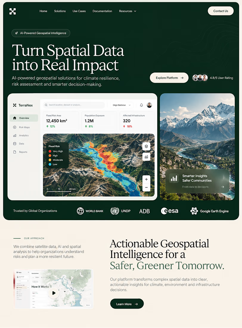
A few things we’ve been working on this month.
Different industries, different problems, but the same goal: making complex products feel simple, clear, and trustworthy.
Fintech → Investment Banking → Geospatial AI
More projects are still in progress.
Full case studies coming soon.




This is the kind of work I enjoy seeing — simple, focused, and actually thought through.

