The network for creativity
Join 1.25M professional creatives like you
Connect with clients, get discovered, and run your business 100% commission-free
Creatives on Contra have earned over $150M and we are just getting started
Back to feedPost

I took a random product…
and rebuilt it into a conversion-focused brand experience.
→ Structured the page for 5-second clarity
→ Reframed features into buyer-driven benefits
→ Added urgency, trust, and friction reducers
→ Designed it like a real DTC brand (not a dropshipping store)
The goal?
- Turn a simple product into something people actually want to buy.
Built using Replo + custom structuring.
Curious what added👇


The network for creativity
Join 1.25M professional creatives like you
Connect with clients, get discovered, and run your business 100% commission-free
Creatives on Contra have earned over $150M and we are just getting started











Related posts

The X pricing pool launch video was only 10s so made it 30s with more understanding
Next launch can be yours, DM me


Clean motion, great job!

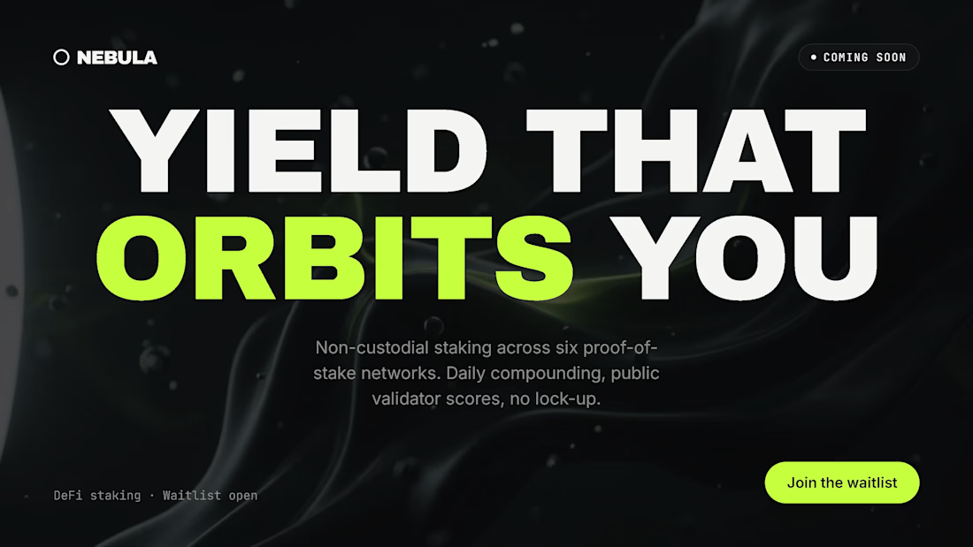
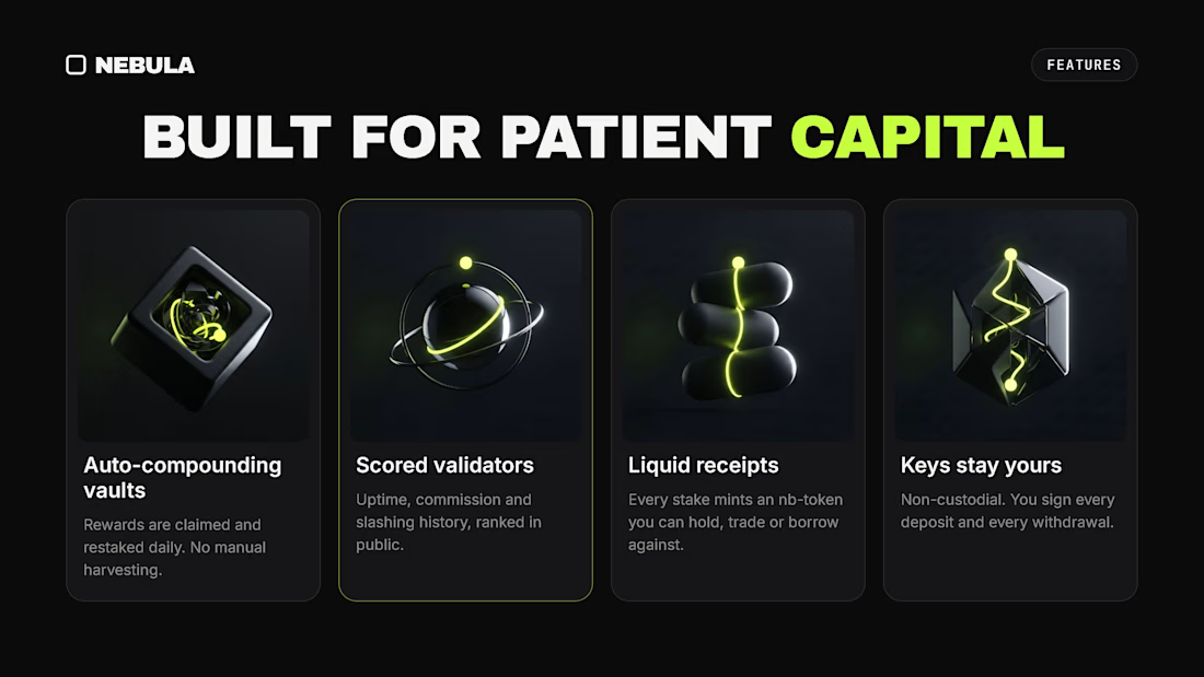
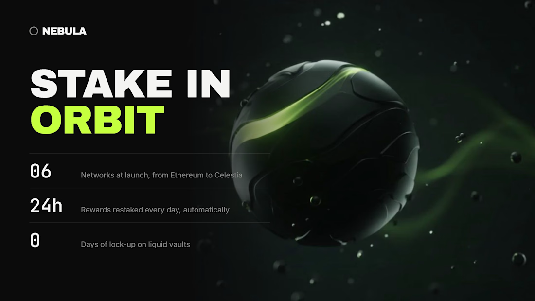
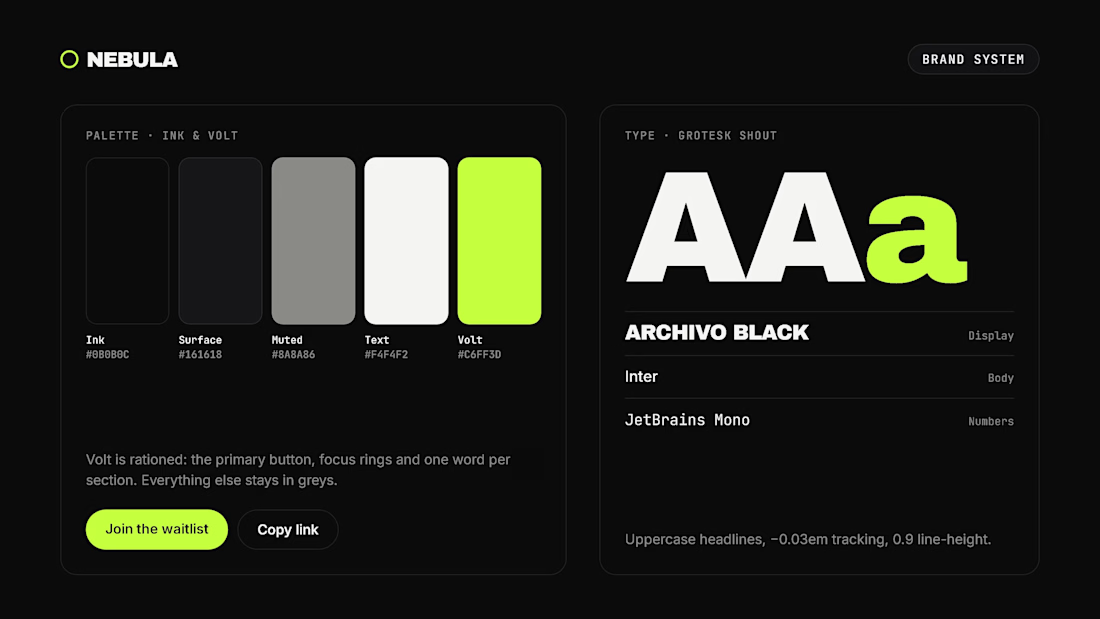
Spent Sunday wrapping up Nebula — a DeFi staking waitlist where I owned the brand system, UI, and frontend code.
Scroll-driven 3D orbit, cursor-tracking glow cards, magnetic buttons, and a strict brand rule: lime only touches CTAs, focus rings & 1 word per section.


efeosa nice work

WIP 🚧:
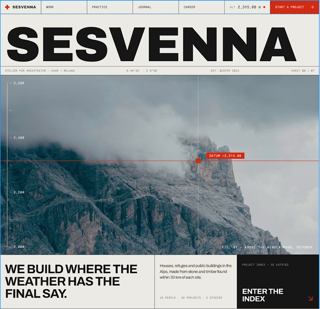
an architecture site for a studio that only builds where the weather decides.
The brief I set myself: make it feel like a set of drawing sheets. Every section is numbered, ruled and labelled like a title block, and every project carries real data: altitude, build window, snow load.
The hero is a small code component. A datum line follows the cursor and reads the altitude live off the scale.
Built in Framer. Still polishing motion and mobile.
#framer #webdesign #architecture


The drawing-sheets brief is such a charming concept for this site, Bright. That datum line reading altitude live off the scale in the hero is the perfect detail to anchor the whole thing.