The network for creativity
Join 1.25M professional creatives like you
Connect with clients, get discovered, and run your business 100% commission-free
Creatives on Contra have earned over $150M and we are just getting started
Back to feedPost
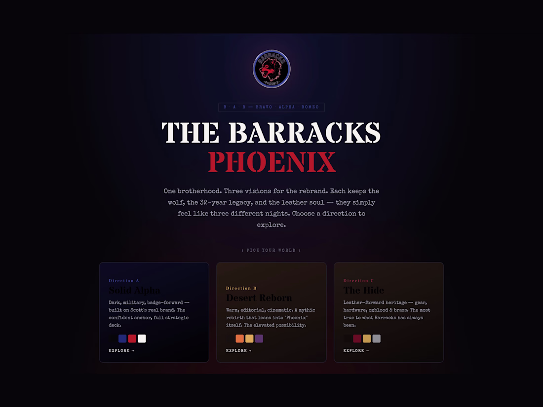
The Barracks is a 32-year-old leather-and-brotherhood institution. The owner is relocating from Palm Springs to a 4,600 sq ft space in Phoenix's Melrose District — and the move opens the door to a full rebrand.
I built a single interactive deck giving the client three full strategic directions to choose from, each rendered as its own self-contained brand world inside one URL:
⦿ Solid Alpha — dark, military, badge-forward. The confident anchor, built on the venue's existing brand colors.
⦿ Desert Reborn — warm, editorial, cinematic. A mythic rebirth that leans into "Phoenix" itself.
⦿ The Hide — leather-forward heritage. Gear, hardware, oxblood and brass. The most true to what The Barracks has always been.
Each direction keeps the wolf, the 32-year legacy, and the leather soul — they simply feel like three different nights.
Engineered as a gateway landing with a sticky switcher, each direction loaded as an isolated full pitch deck (iframe srcdoc) so their separate color systems never collide. One URL, three full brand visions, frictionless comparison.
Built end-to-end under Rare by Design. The full interactive deck is available on request.
The network for creativity
Join 1.25M professional creatives like you
Connect with clients, get discovered, and run your business 100% commission-free
Creatives on Contra have earned over $150M and we are just getting started
Related posts
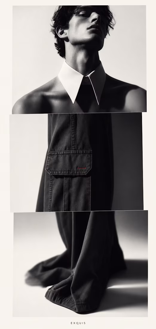
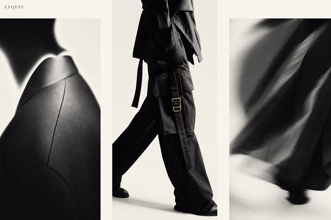
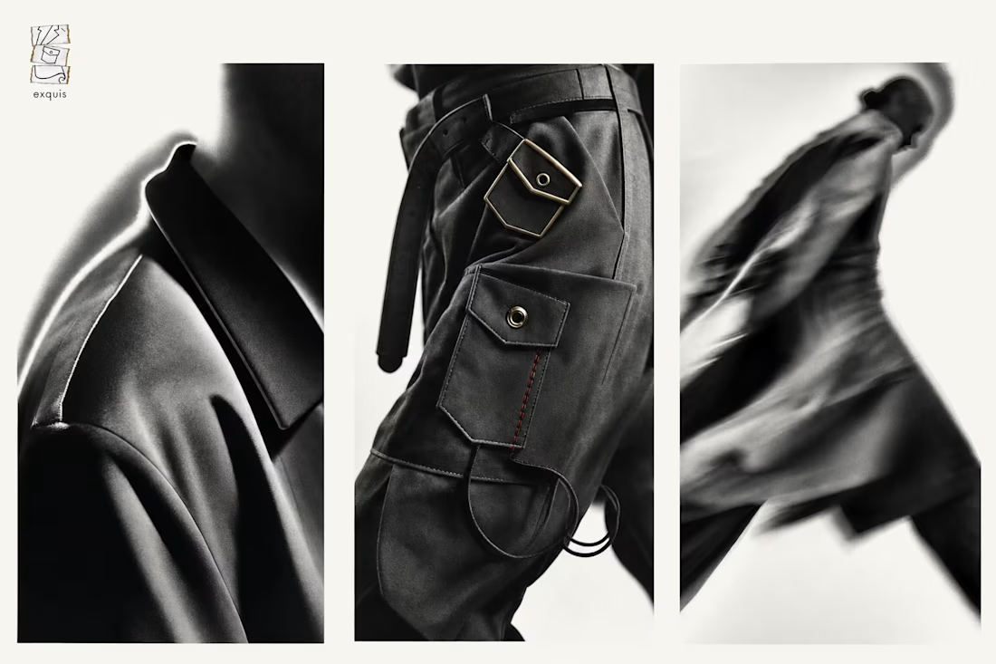
Three designers.
One garment.
None of them talk to each other.
That's not a flaw in EXQUIS. That's the entire brand.
Wow!
We all want @Contra HQ to have a mobile app, right? This is how I would approach it! 😉
Great work
Cool!
Challenges
View allTrending
Claude
Claude has entered the design space. How are you using Claude Design?
Contra University
Learn from expert creatives how to earn more using next-gen AI tools.
fifaworldcup2026
The World Cup is here and the whole world's watching. How are you designing for the world stage?
creativeaiflow
Creative AI workflows are evolving. What tools do you use, and what are their strengths and weaknesses?
freelancerlife
Freelancer life is wins, pivots, and everything in between. What’s yours right now?