The network for creativity
Join 1.25M professional creatives like you
Connect with clients, get discovered, and run your business 100% commission-free
Creatives on Contra have earned over $150M and we are just getting started
Back to feedPost

AI website vs. non-AI website. Same brand, completely different build process. 👇
Our original JZ Creates website was built in 2023 with Elementor.
It worked, but building it meant layouts, plugins, mobile fixes, copy edits, spacing adjustments, and a lot of troubleshooting. The full site took roughly 4–6 months.
The new site was different.
We started with creative direction—describing the experience, visuals, and interactions we wanted—and used AI to help build it.
What once took months came together in weeks.
The biggest difference is speed of iteration.
We can now create and test landing pages for different audiences, campaigns, and offers without the same time and cost barriers.
AI isn’t replacing creative direction.
It’s giving creators who know how to direct these tools a much bigger advantage.
AI Website: https://jzcreates.com/
Non-AI Website: https://jzcreates.com/creative-advertising-agency/
Which one do you prefer?
#AIWebDesign #CreativeTechnology #AICreators
The network for creativity
Join 1.25M professional creatives like you
Connect with clients, get discovered, and run your business 100% commission-free
Creatives on Contra have earned over $150M and we are just getting started



Related posts

Designed a site for an AI data company that doesn’t sell data, it sells what data becomes.🫶🏼


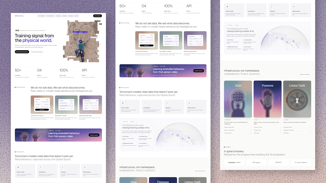
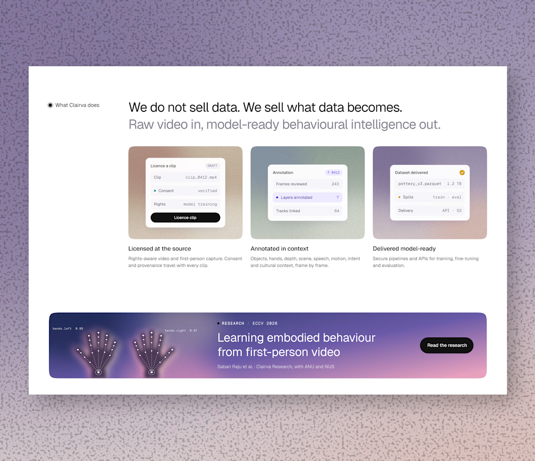
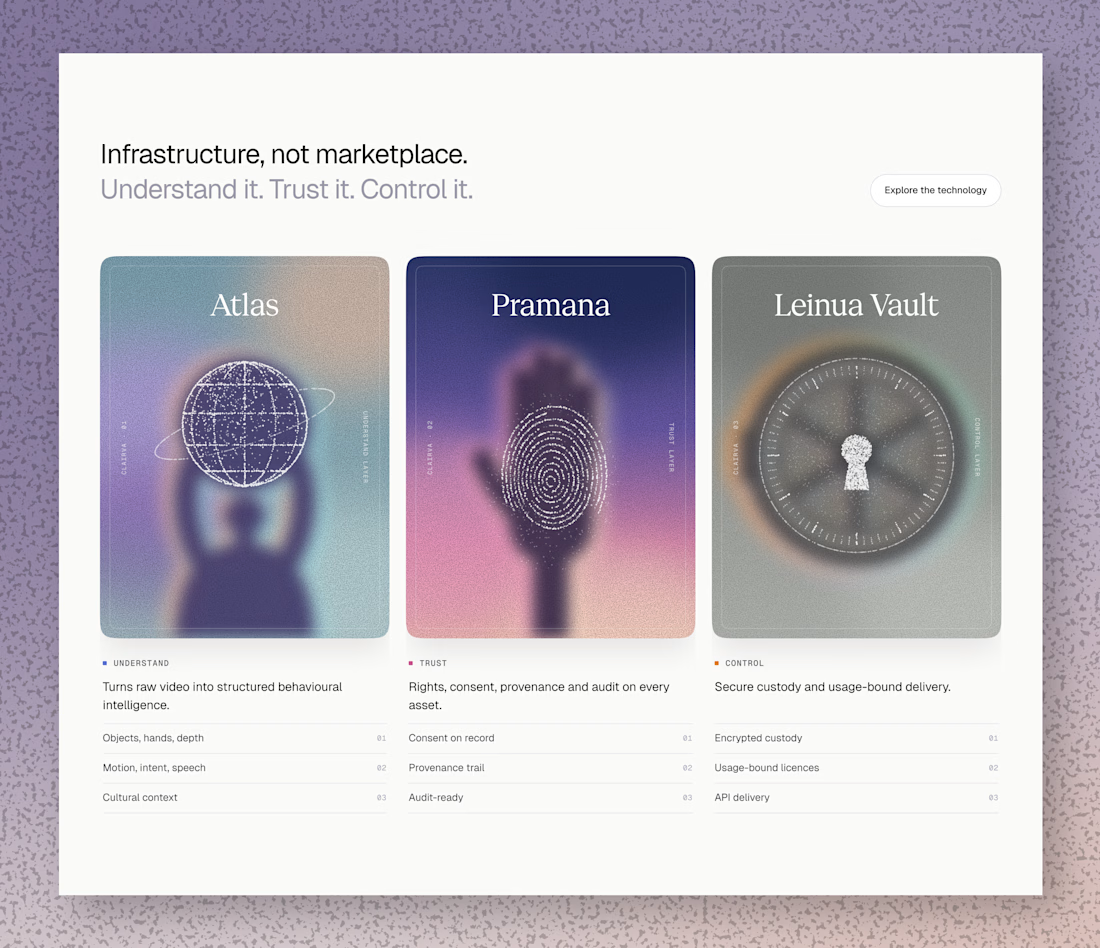

Those purple cards look like tarot cards for data, I'd pick Atlas 😄 Really nice soft colors

"SEO is dead, it's all AI now." The AI answers are still reading your pages.
• Crawlable HTML with clear headings.
• Key facts written in the text, not only in images.
• Allow the AI search crawlers you want in robots.txt.
• Structured data still helps machines read the page.
Have you checked whether AI search tools mention your business?
Follow for more videos: instagram.com/sellwrightstudio · youtube.com/@sellwrightstudio
Funny how the fix for AI search is the same old stuff, real text and clean headings. My WebGL sites are sweating a bit right now 😅

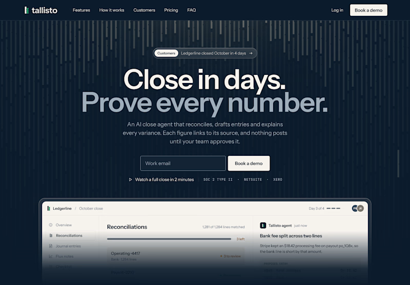
Quick one for SaaS founders and designers: which homepage hero would make you book a demo?
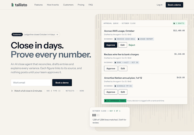
I’m designing the website for Tallisto, a concept AI accounting tool that helps finance teams close the month in days. Both versions use the same copy, so only the layout changes.
A is centred and dark. The headline does the talking, and the product sits right underneath it.
B is a light split layout. You read on the left and see the approval queue on the right, where every entry waits for a person to approve it.
Vote for the one you’d click, and tell me why in the comments. I’m building the winner in Webflow next.

3 voted
60%
2 voted
40%
5 votes
Closed

Split and light for me. The approval queue next to "Prove every number" shows the proof right away, which is what a finance team wants to see. The dark one looks moodier but the product sits low. Will you test the CTA copy too?