The network for creativity
Join 1.25M professional creatives like you
Connect with clients, get discovered, and run your business 100% commission-free
Creatives on Contra have earned over $150M and we are just getting started
Back to feedPost

More sections don’t automatically make a better website.
Every section should have a reason to be there.
Maybe it explains something users need to understand.
Maybe it answers an objection.
Maybe it builds trust.
Maybe it gives proof.
Maybe it helps someone decide what to do next.
But if a section exists only because “websites usually have one,” I’d question whether it needs to be there at all.
This matters even more for startups and complex products, where there is always a temptation to explain everything.
More information doesn’t always create more clarity.
Sometimes it just gives users more to process before they reach the point that actually matters.
I’d rather build a shorter experience where every section moves the story forward than a longer one that makes the user work to find the value.
Good structure isn’t about fitting everything onto the page.
It’s about knowing what deserves to stay.
The network for creativity
Join 1.25M professional creatives like you
Connect with clients, get discovered, and run your business 100% commission-free
Creatives on Contra have earned over $150M and we are just getting started











Related posts

Redesigning legacy local business websites: Is it better to burn it down and build totally modern from scratch, or preserve the nostalgic elements that regular customers recognize?
When taking on an established local shop (auto service, clinic, local store), how much of their old design language do you retain during a redesign?

I lean toward preserving the core identity and rebuilding the rest. Regulars trust the familiar bits, and a fresh foundation earns the trust of new customers.

Just shipped a new GoHighLevel website for M&B Painting & Construction 🏠
A painting & construction contractor serving Indianapolis, Carmel & Greater Central Indiana, and the brief was simple: turn visitors into booked estimates.
What I built
→ Conversion-first hero with a "10% OFF your next project" offer card + Get Free Estimate CTA
→ Click-to-call phone buttons across the page
→ Service cards: Interior & Exterior Painting, Drywall Repair, Flooring (LVP & Hardwood) and more
→ Local SEO service-area hub covering Central Indiana communities
→ Social proof section with homeowner reviews
→ Fully responsive and built natively in GoHighLevel, so the lead capture plugs straight into the CRM and follow-up automations
If you're a contractor or local service business and your website isn't bringing in leads, let's fix that. DM me or check out my services 👇

the "10% off your next project" card right next to the free estimate button is a smart touch for a painter. did m&b find you, or did you reach out to them?

A pricing section should make the next step easier.
What’s included? Which option fits? How do I get started?
I designed this pricing section for a web design and development agency with those questions in mind.
For founders comparing services, clear scope matters just as much as the price.
Building a website for your business or need a design and development partner for your agency? Let’s talk.

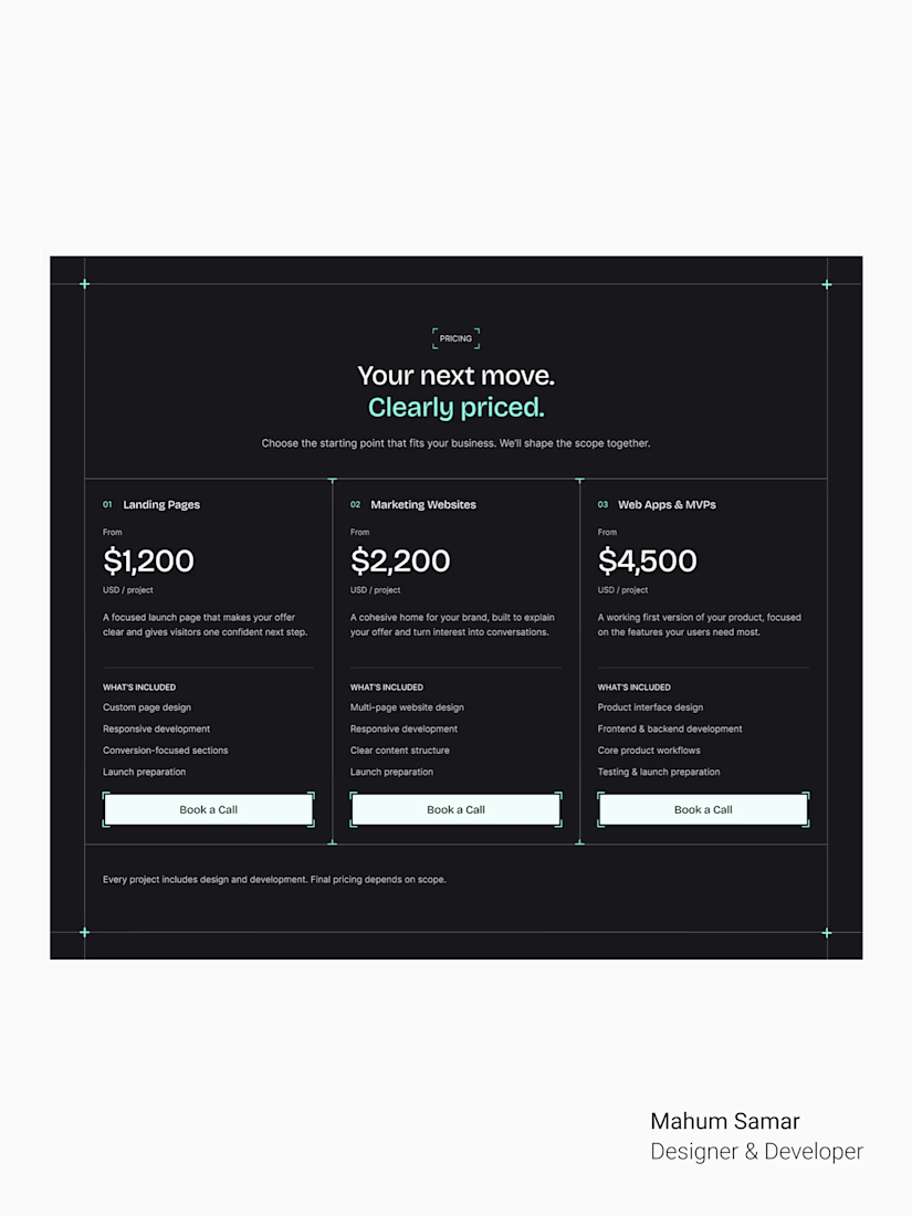
Framing the tiers around the questions founders actually ask is such a smart structure. The dark layout with clear starting prices makes the scope easy to scan, exactly what a pricing page should do.