The network for creativity
Join 1.25M professional creatives like you
Connect with clients, get discovered, and run your business 100% commission-free
Creatives on Contra have earned over $150M and we are just getting started
Back to feedPost

Overview
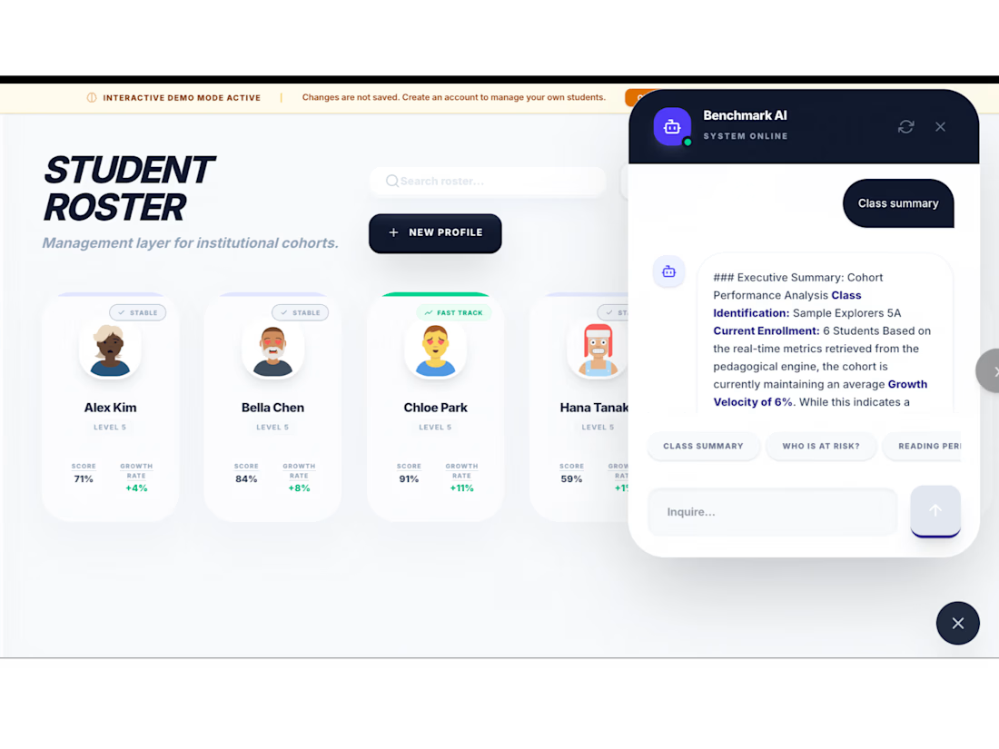
Standardized testing and unit assessments often leave teachers with a mountain of raw test scores but very little actionable insight. "Benchmark Explorer" is a professional-grade student growth tracking and benchmarking system designed to eliminate the guesswork. It transforms raw academic data into clear, visual, and highly actionable dashboards that allow educators to identify learning gaps instantly and personalize instruction.
How It Works
The system acts as a centralized data repository where student diagnostic data, proficiency test scores, and daily assessment metrics are aggregated. The backend automatically processes these disparate data points, cross-references them against targeted learning benchmarks, and outputs clear visual trends that map out exactly where an individual student—or an entire cohort—is falling behind.
Technical Deep Dive & Guardrails
Relational Data Architecture: Built on a highly structured, relational Airtable backend optimized to handle multi-variable academic data without processing lag.
Automated Reporting Pipelines: Powered by complex Make.com logic pipelines that dynamically calculate student progress percentages, growth milestones, and historical target metrics upon new score ingestion.
Actionable Skill Mapping: Designed with conditional visualization layers that automatically flag specific sub-skills (e.g., phonics vs. reading comprehension) requiring immediate teacher intervention or curriculum adjustments.


The network for creativity
Join 1.25M professional creatives like you
Connect with clients, get discovered, and run your business 100% commission-free
Creatives on Contra have earned over $150M and we are just getting started




Related posts

Real Estate SaaS Dashboard
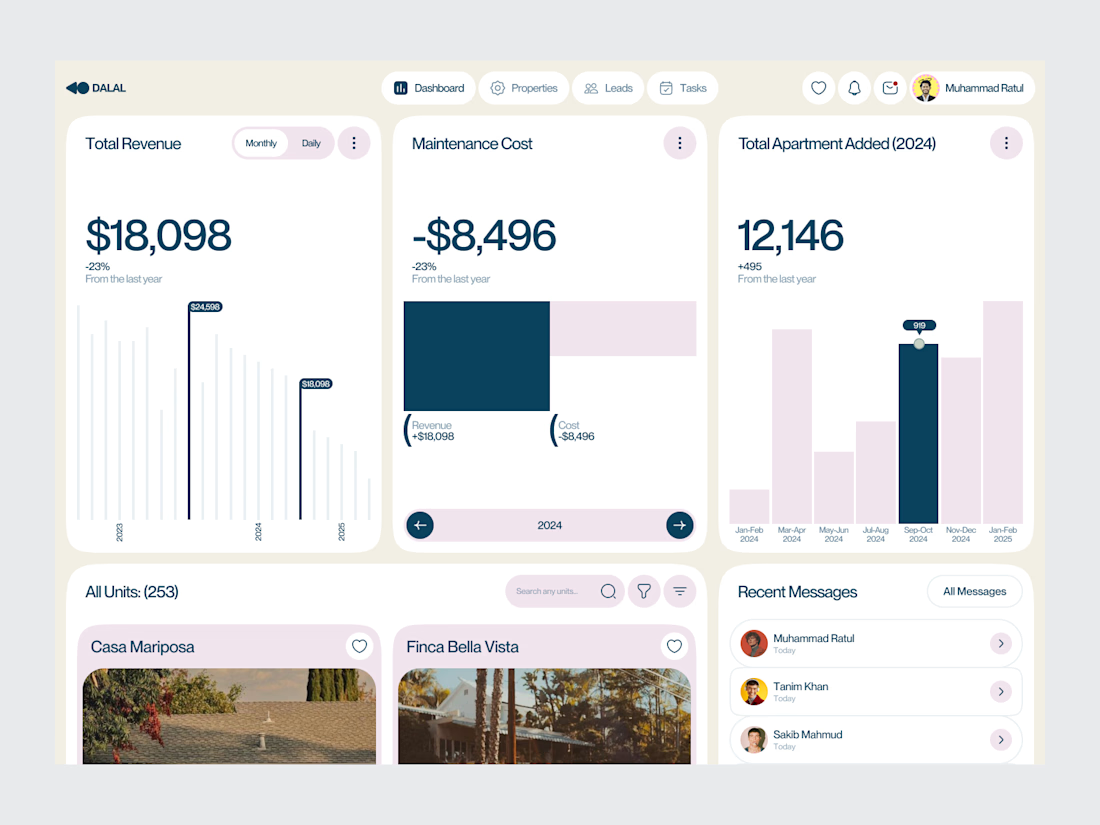
Real estate software often sits on top of a large amount of operational data.
Properties, leads, deals, revenue, tasks and performance all need to be visible without turning the product into an information wall.
For this dashboard concept, the design process started with hierarchy.
The most important metrics get immediate visibility. Supporting information is organized into focused sections, while actions remain close to the data they relate to.
The result is a SaaS interface designed around clarity, decision-making and everyday workflow.
Focus: Real Estate SaaS · PropTech UI/UX · Dashboard Design · Data Visualization · Property Management Software
The goal wasn't to make the product look complex.
It was to make a complex business easier to operate.
Designed by WaxyWeb.
Working on a SaaS or PropTech product?
hello.waxyweb@gmail.com
www.waxyweb.com


great one

ARTHADṚṢṬI — Amazon Sales Intelligence & Business Performance System
What started as an analytics project became an opportunity to build something closer to a real-world business reporting system.
I worked with Amazon sales data and took it through an end-to-end analytics workflow:
Raw Data → Data Cleaning → Transformation → Data Modeling → DAX → Power BI → Business Insights
What I worked on
• Data profiling and quality checks
• Cleaning & transformation using Power Query
• Handling missing and inconsistent data
• Business KPI development
• Data modeling
• DAX measures
• Interactive dashboard design
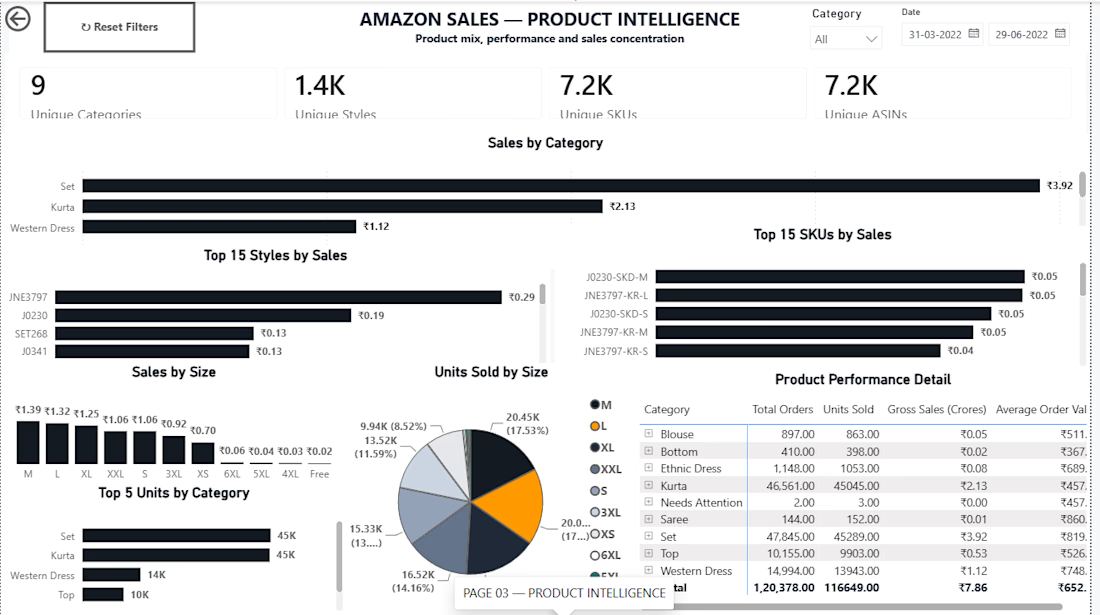
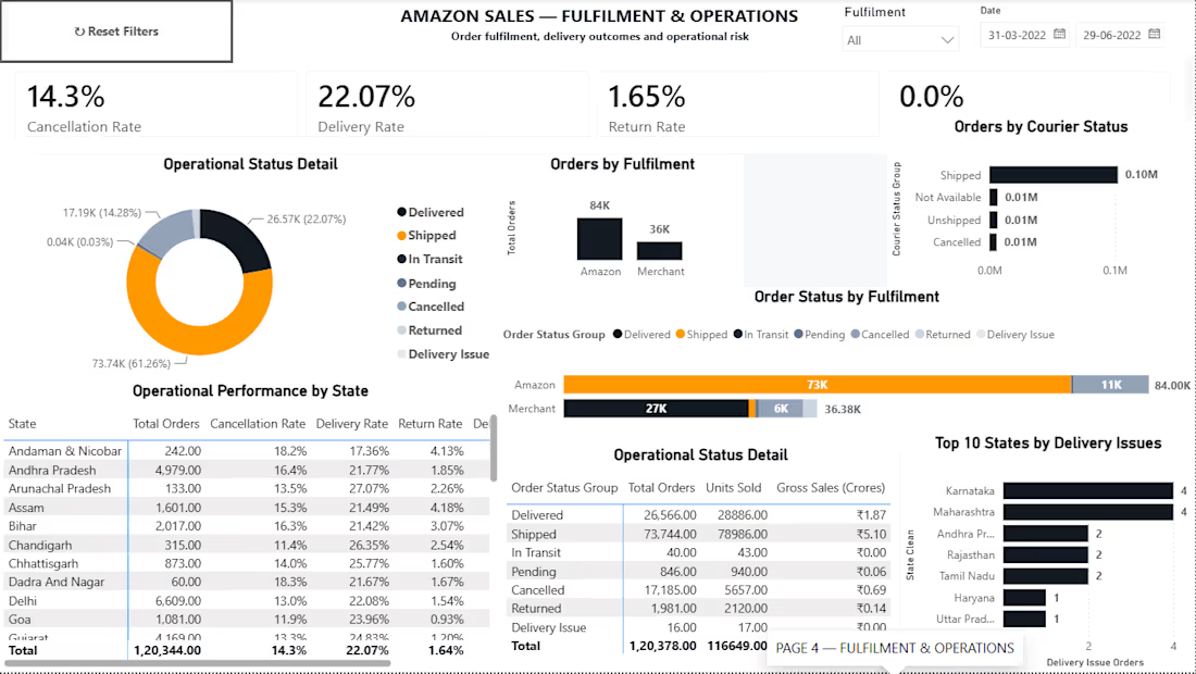
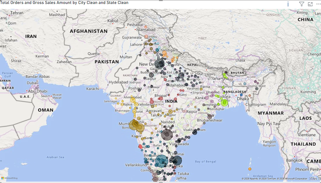
• Sales, product, fulfilment & geographic analysis
The final system provides visibility into:
→ Sales & revenue performance
→ Orders and units
→ Category & SKU performance
→ Fulfilment operations
→ Monthly trends
→ Geographic distribution
→ Interactive filtering & drill-down analysis
But the biggest lesson from this project was simple:
A dashboard shouldn't just look good. It should make the underlying data easier to understand and act upon.
I’m also available for dashboard projects.
If you have Excel, CSV, or other business data that is difficult to analyze, I can help transform it into a clean, professional and interactive dashboard.
Services I can provide:
→ Power BI Dashboard Development
→ Excel Dashboard Development
→ Data Cleaning & Transformation
→ Power Query Automation
→ DAX & KPI Development
→ Business / Sales Analytics
→ Interactive Reporting Systems
Check the github Repo
https://github.com/lokeshyadavalli001-star/ARTHADRSTI
Whether you need a dashboard built from scratch, an existing report improved, or messy data transformed into something usable, I'm open to working on it.
Have a dataset or reporting problem?
Send me a message. Let's turn the data into something useful.
#PowerBI #DataAnalytics #BusinessIntelligence #PowerQuery #DAX #Excel #DashboardDesign #DataVisualization #DataCleaning #FreelanceDataAnalyst

Any Suggestions and improvements is Sincerely Appreciated
Git hub Repo
https://github.com/lokeshyadavalli001-star/ARTHADRSTI

github.com
GitHub - lokeshyadavalli001-star/ARTHADRSTI: Amazon Sales Intelligence & Business Performance System
Amazon Sales Intelligence & Business Performance System - lokeshyadavalli001-star/ARTHADRSTI

I’ve been playing around with AI motion graphics, and this version caught my eye and I thought it might be interesting to share and get your thoughts on it.
Let me know what you think!


I am terribly impressed with the 3D application of the brand, it was a brilliant move!! But I was struck by the weight of the W & B letters in the logotype. Why do they look thicker than the rest of the letters? I feel that the logo name can be easily read without the difference in weight, what do you think?