The network for creativity
Join 1.25M professional creatives like you
Connect with clients, get discovered, and run your business 100% commission-free
Creatives on Contra have earned over $150M and we are just getting started
Back to feedPost
Taste Test

Which hero would convert better: A or B?
This landing page is for a LinkedIn personal branding expert helping B2B founders, coaches, and consultants attract more opportunities.
Don’t judge only by aesthetics. Consider clarity, trust, visual hierarchy, brand fit, CTA prominence, and which design would make a high-value client more likely to book a strategy call.
Which one wins, and why?
3 voted
16%
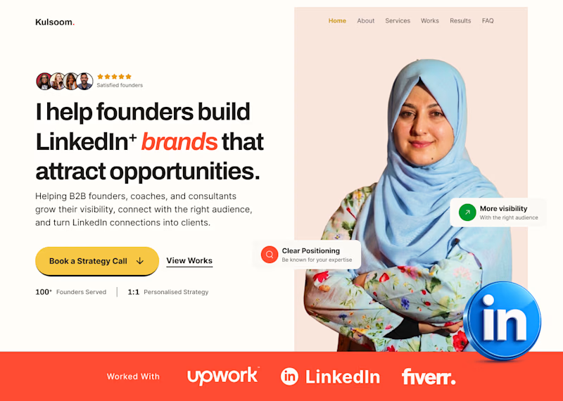
16 voted
84%
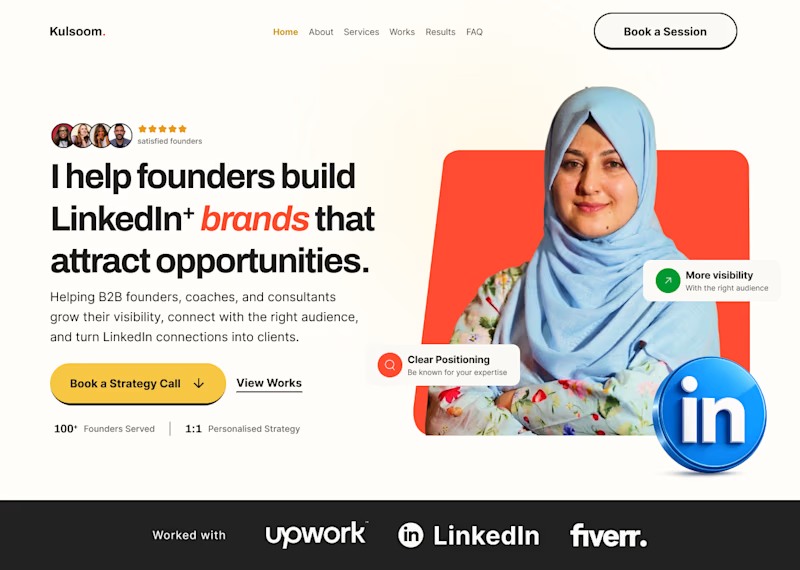
19 votes
Closed

B is better.
Thank you for responding, what do you think B is better?

My gut says A wins on trust, the darker background in B feels a bit more agency-generic even though the layout is nearly identical. What has this client's audience responded to before, warmer visuals or more corporate ones?
Thanks for the feedback Maty, The client's audience responds more to Corporate.

I prefer B.
Why do you prefer B


B is a better option
Thank you for the feedback, why do you think B is better
The colours, placements, and the platforms stand out better in B

Hero B. The dark social proof bar at the bottom gives it better structure and the overall contrast makes "Book a Strategy Call" much easier to spot instantly.
wow, thank you for the feedback! This is solid!


B wins for me. The darker proof bar adds contrast and makes the CTA jump out faster.
The network for creativity
Join 1.25M professional creatives like you
Connect with clients, get discovered, and run your business 100% commission-free
Creatives on Contra have earned over $150M and we are just getting started





Related posts

Which hero visual feels right for this brand?
While working on the homepage for Halfspace, a website design and SEO agency, I explored two different hero visuals for the same headline and layout. Same message, same structure, just a different visual metaphor and mood.
Option 1 - Rocket Launch. Bold, literal, and energetic, visually reinforcing the "launch your business" message with motion and fire.
Option 2 - Glass Cube. Abstract, sleek, and premium, giving a more refined, tech-forward feel without relying on a literal metaphor.
Would love your honest UX/UI take, which direction feels more impactful, memorable, and aligned with a web design/SEO brand, and why?
11 voted
41%
16 voted
59%
27 votes
Closed

Both design are great; it's hard to choose one





Option B feels nothing but premium

You leaned toward Atmospheric in my last taste test, so I took it beyond the hero.
Here’s the full homepage for the same fictional lighting studio, with two different scroll experiences: Fluid and Cinematic.
Which one makes you want to keep exploring?
Continuing from this post: https://contra.com/community/KacW2yxF-homepage-design-comparison-product-photography-vs
22 voted
46%
26 voted
54%
48 votes
Closed

I can't recognizable the difference but both of them are great 🎉🎉