The network for creativity
Join 1.25M professional creatives like you
Connect with clients, get discovered, and run your business 100% commission-free
Creatives on Contra have earned over $150M and we are just getting started
Back to feedPost

Think you can beat the puzzle solver from my new template? I couldn't 🙃


Great approach
🙌
The network for creativity
Join 1.25M professional creatives like you
Connect with clients, get discovered, and run your business 100% commission-free
Creatives on Contra have earned over $150M and we are just getting started



Related posts

Built this free SaaS portfolio template in Framer a few months ago, and it’s been amazing to see the momentum it’s gaining! 🚀
It’s now ranked #18 in Framer’s Marketing category, bringing in more visibility, views, and commissions.
I’ve shared the full case study here, covering the project and how it came together.
Take a look if you’re curious! 🙌


This is amazing Fawaz! 🚀 Ranked #18 in Framer's Marketing category is huge! Love how you turned a free SaaS template into visibility + commissions. That's smart product thinking. Can't wait to read the full case study, congrats on the momentum!

🚀 The Keel website is now live!
I designed Keel as a fintech website concept focused on presenting financial products through a clean layout, clear messaging, and a simple user experience.
I’ve also built the website in Framer. Check it out below!
🎨 Built with Framer: https://thekeel.site/
Always happy to hear your feedback!
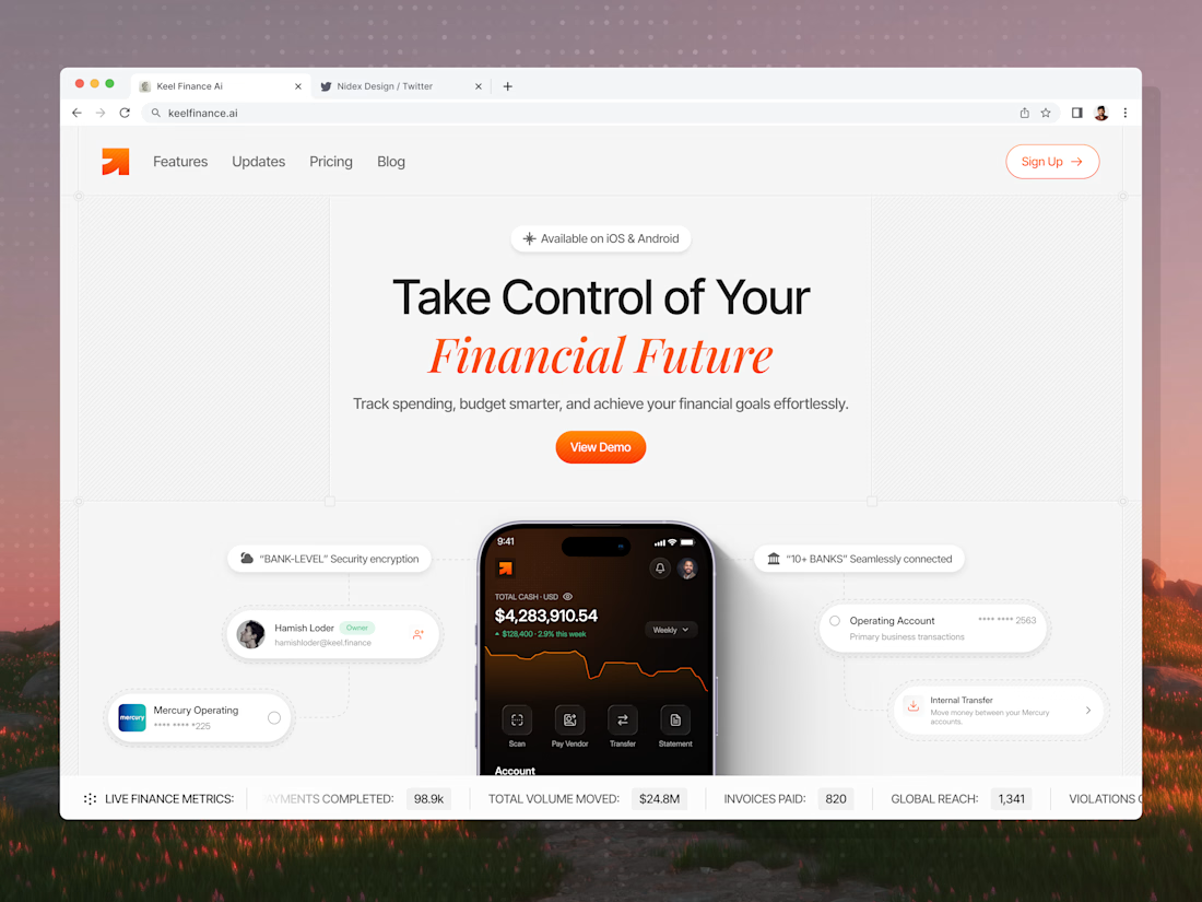
Congrats on the launch Nilkanth! Keel looks super clean — love how you kept the fintech messaging simple and focused. The "Take Control of Your Financial Future" hero with the app preview balances trust and clarity perfectly. Great job building it in Framer too!


We’re testing two filtering layouts for a template library.
Top Filters
The filters are placed above the content. This option feels lighter, leaves more space for the cards, and works well when there are only a few main categories.
Sidebar Filters
The categories remain visible in the sidebar. This makes the available options easier to scan and works better for more complex filtering, but takes up some of the content space.
Which layout would help you find the right template faster?

24 voted
39%
37 voted
61%
61 votes
Closed

Such a clean presentation. You can tell a lot of thought went into this.


