The network for creativity
Join 1.25M professional creatives like you
Connect with clients, get discovered, and run your business 100% commission-free
Creatives on Contra have earned over $150M and we are just getting started
Back to feedPost
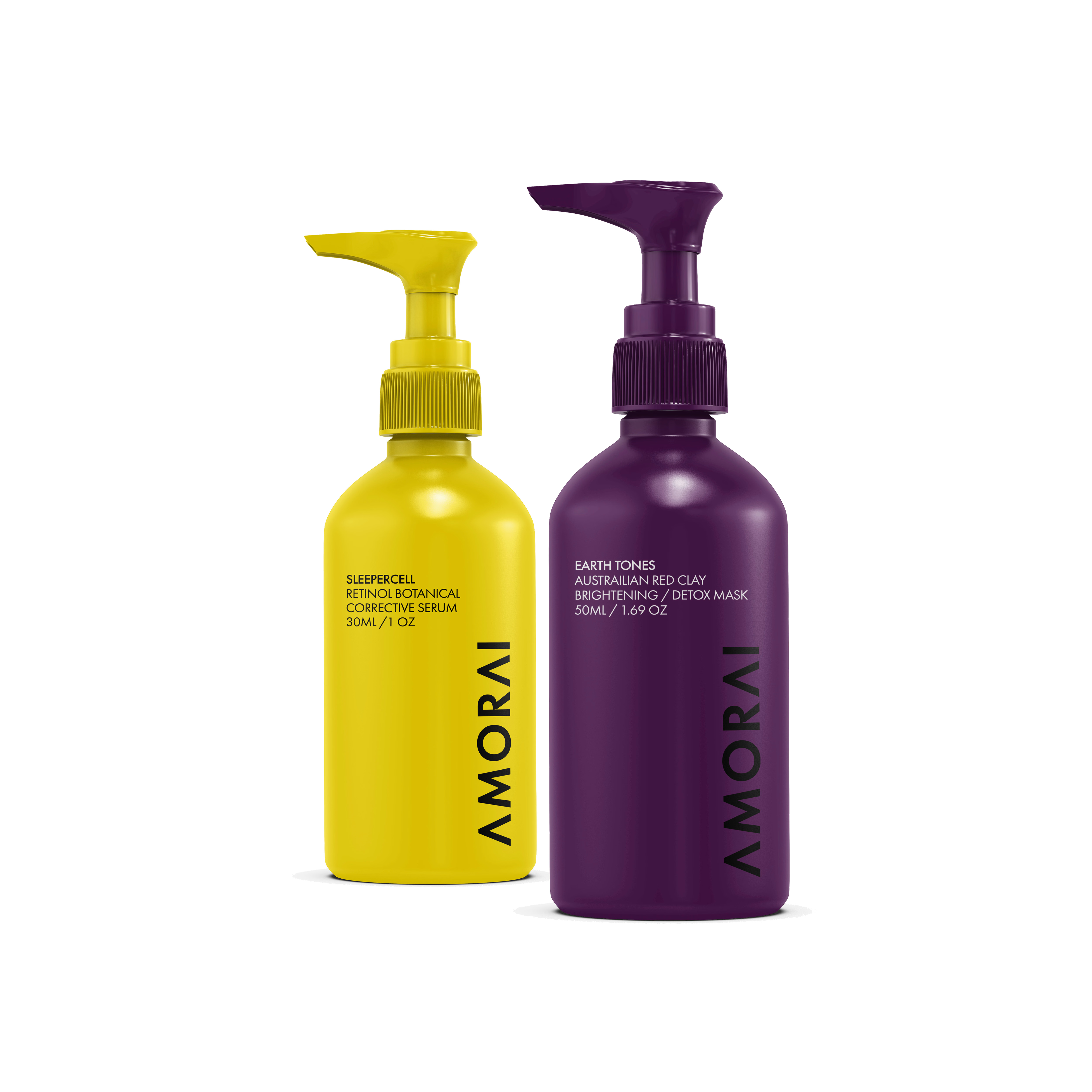
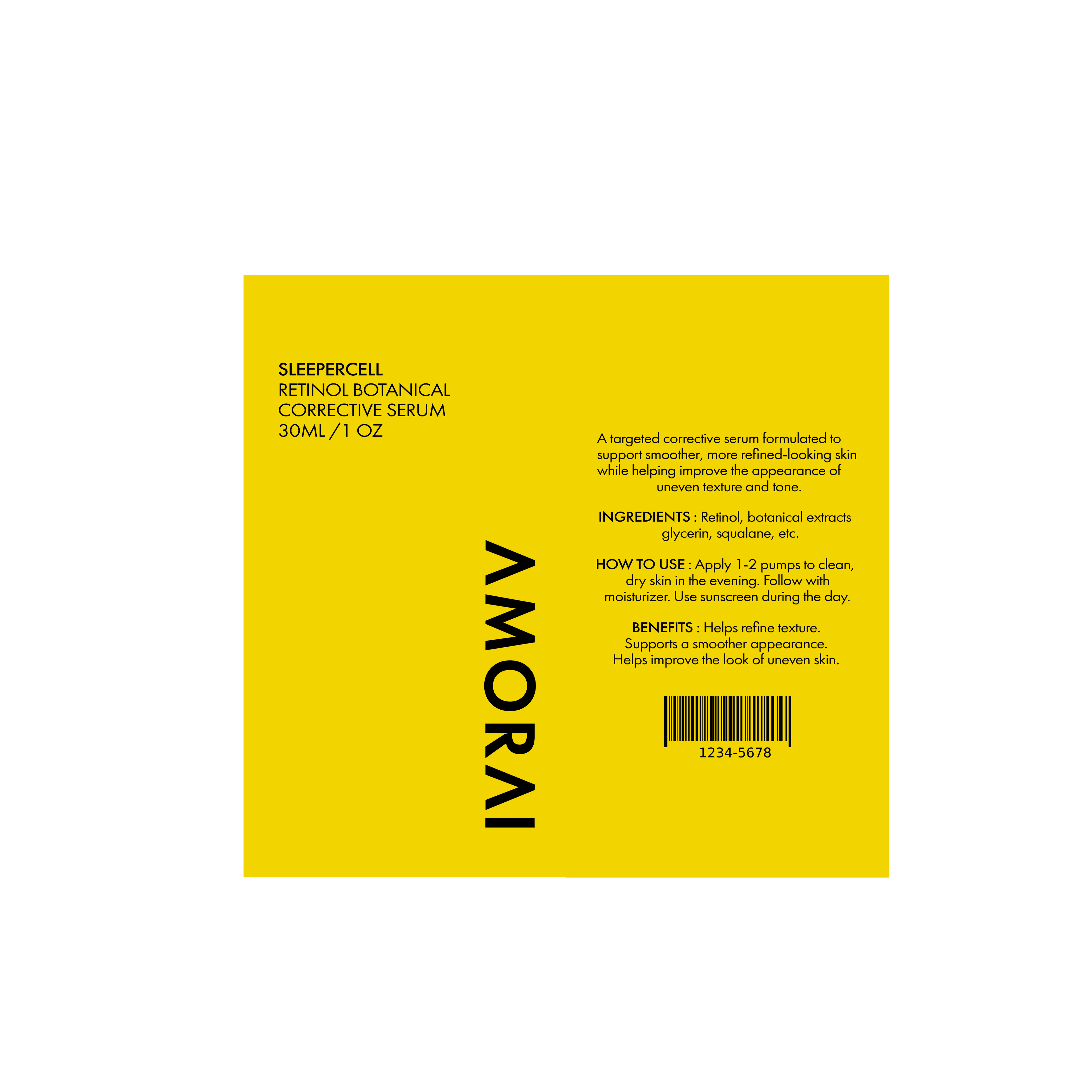
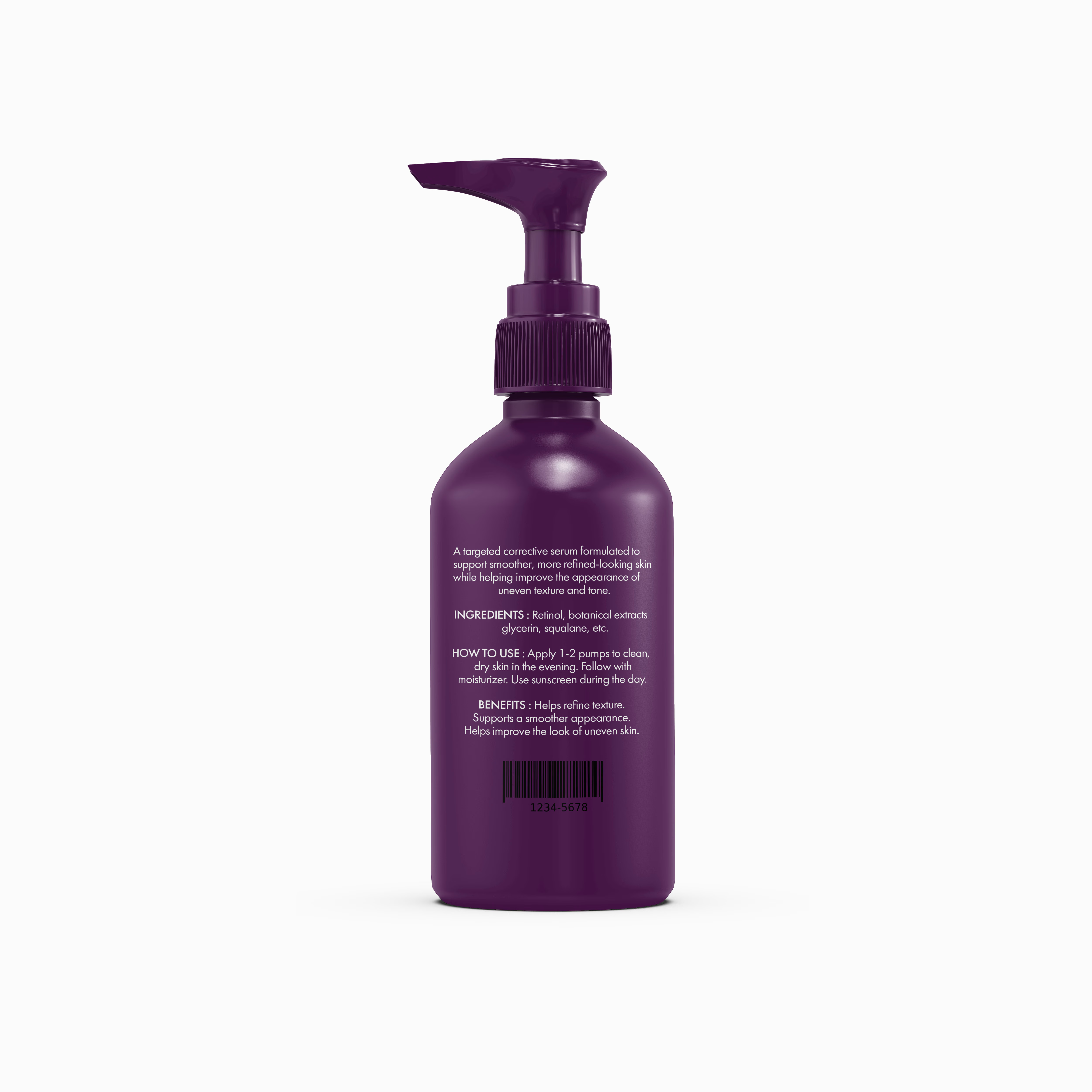
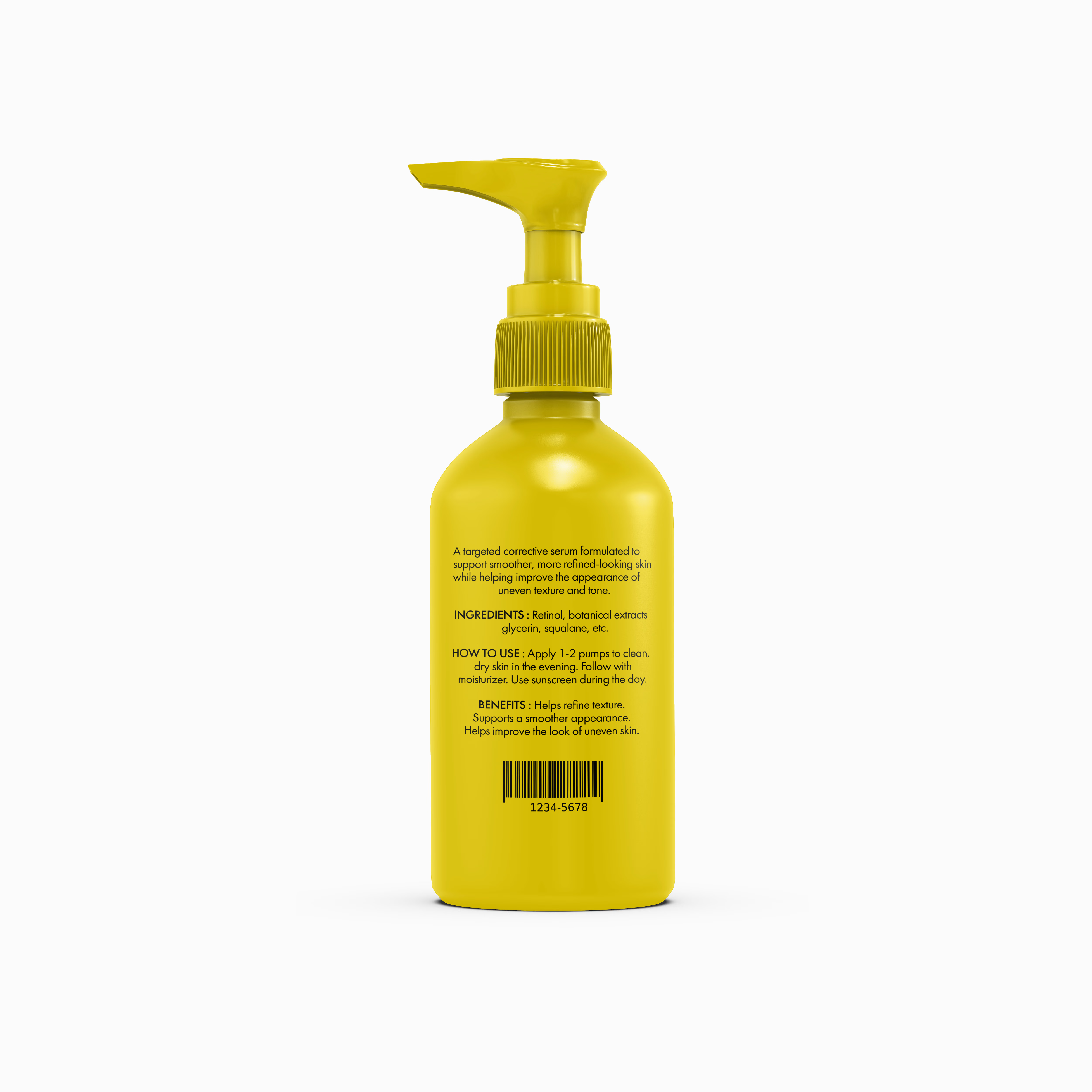
A minimal skincare packaging system designed around one idea: clarity.
I explored how color, typography, spacing, and hierarchy can make a product feel premium without overloading the packaging.
Two variants, front + back designs, and complete dielines, all built around the same visual system.
Designed to show that minimal doesn’t have to mean forgettable.
I’ve shared the complete project on Behance, including the full packaging presentation and design process.
The network for creativity
Join 1.25M professional creatives like you
Connect with clients, get discovered, and run your business 100% commission-free
Creatives on Contra have earned over $150M and we are just getting started




Related posts

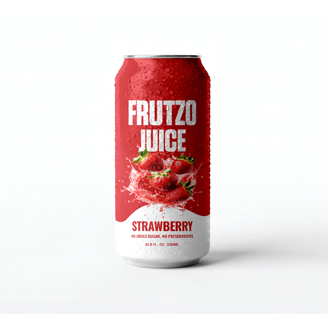
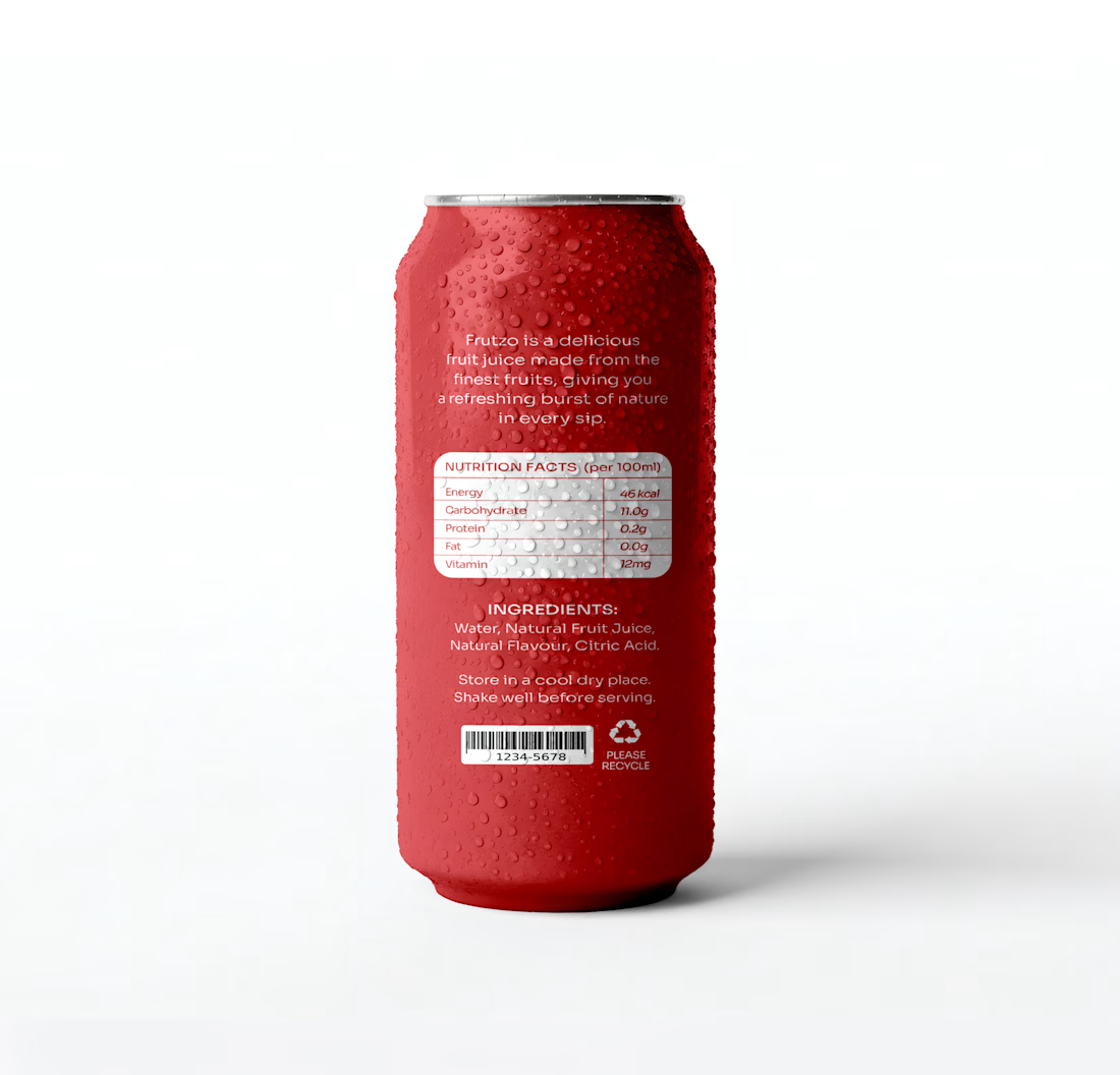
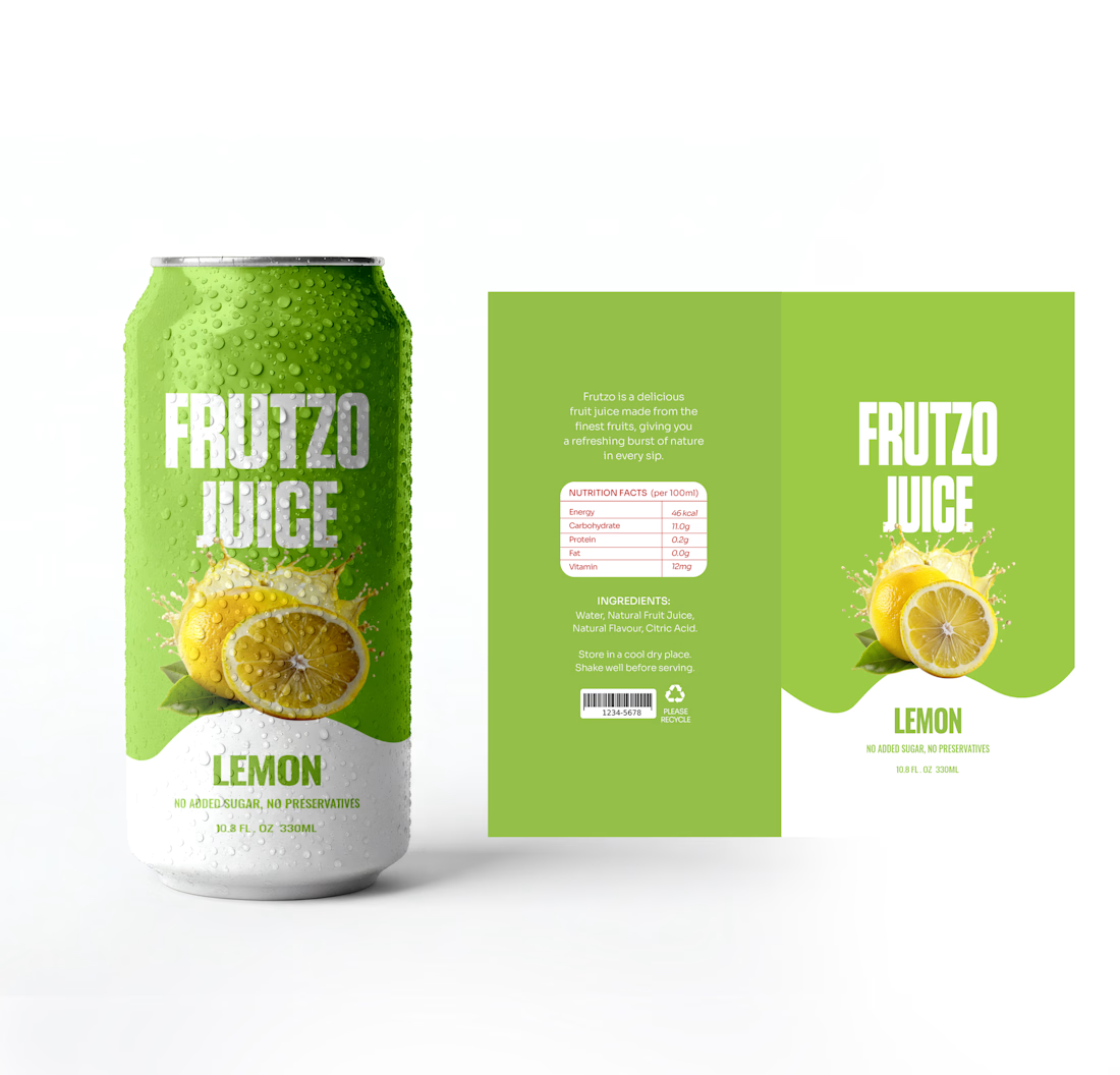
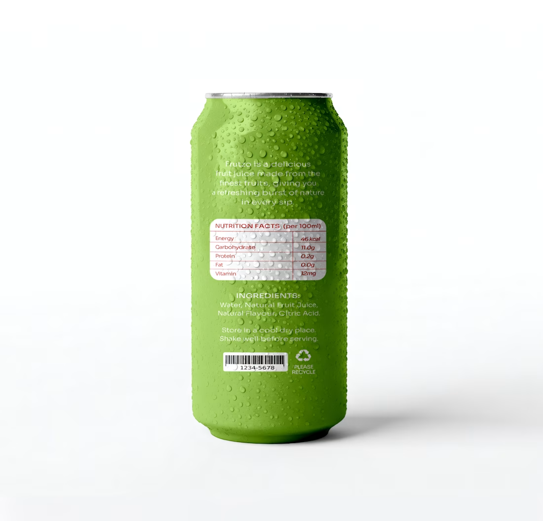
I designed FRUTZO as a complete packaging system, exploring two distinctive flavour variants: Strawberry and Lemon. From the visual direction and colour development to the front and back packaging layouts, every element was carefully designed to create a cohesive and recognisable brand experience.
The presentation also includes the packaging dielines, showcasing the actual artwork behind the final product visuals.
Two flavours. One distinctive identity. A packaging experience designed to make an impression.
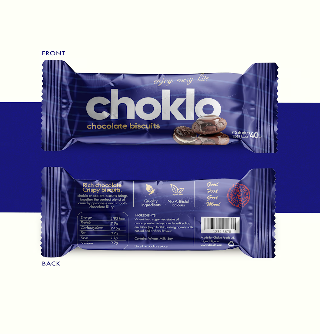
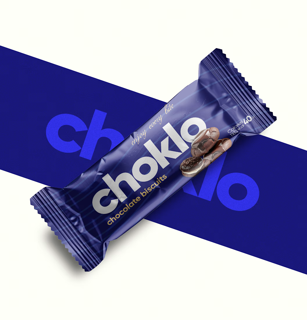
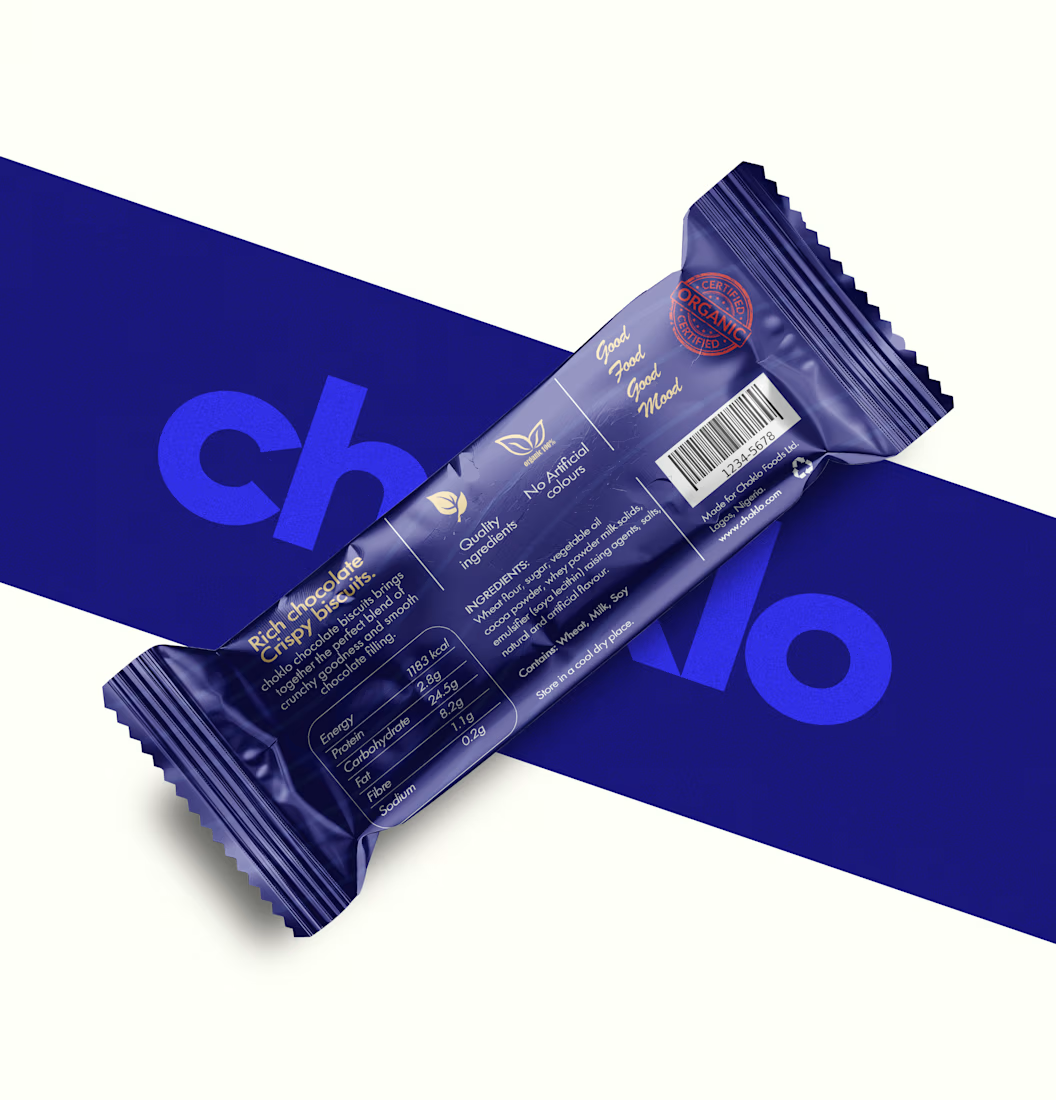
I designed choklo as a premium chocolate biscuit packaging concept built around bold geometric typography, a distinctive royal-blue palette, and a cohesive visual identity.
From the front-of-pack presentation to the back-of-pack information layout, every element is designed to work together as one considered system, balancing shelf appeal with functional clarity.
Because premium packaging isn’t just about making a product look expensive. It’s about building a brand that looks credible, feels intentional, and is ready to compete.
Looking to elevate your product with packaging that reflects the value of your brand? Let’s talk.
#PremiumPackaging #PackagingDesign #BrandIdentity #ProductBranding

Ever signed for a pack of pasta? Soon you will.
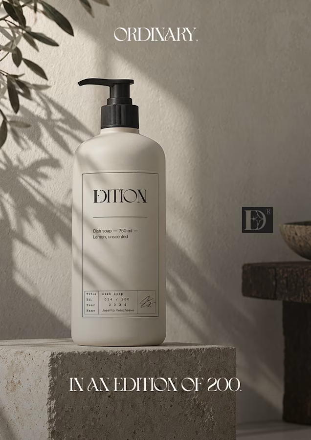
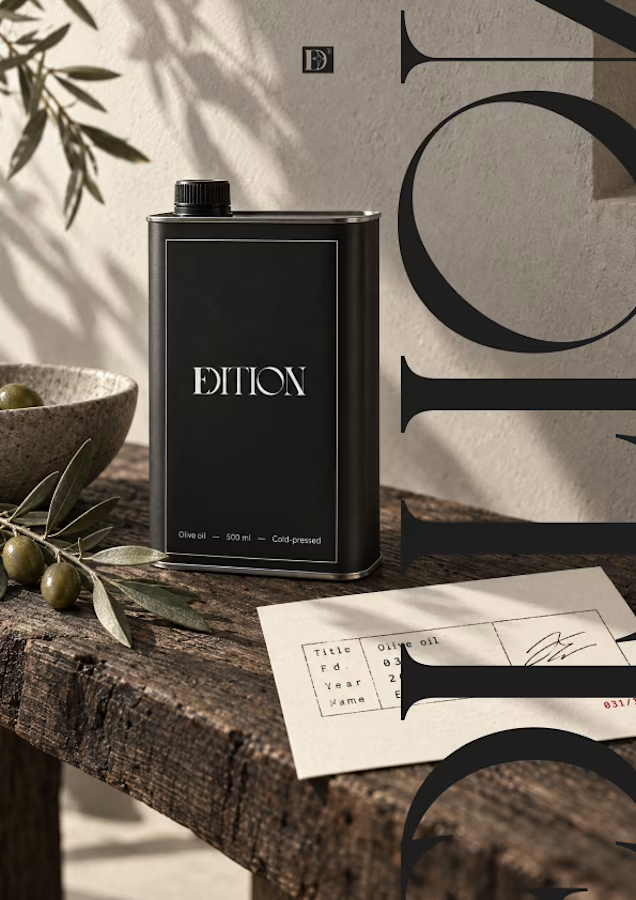
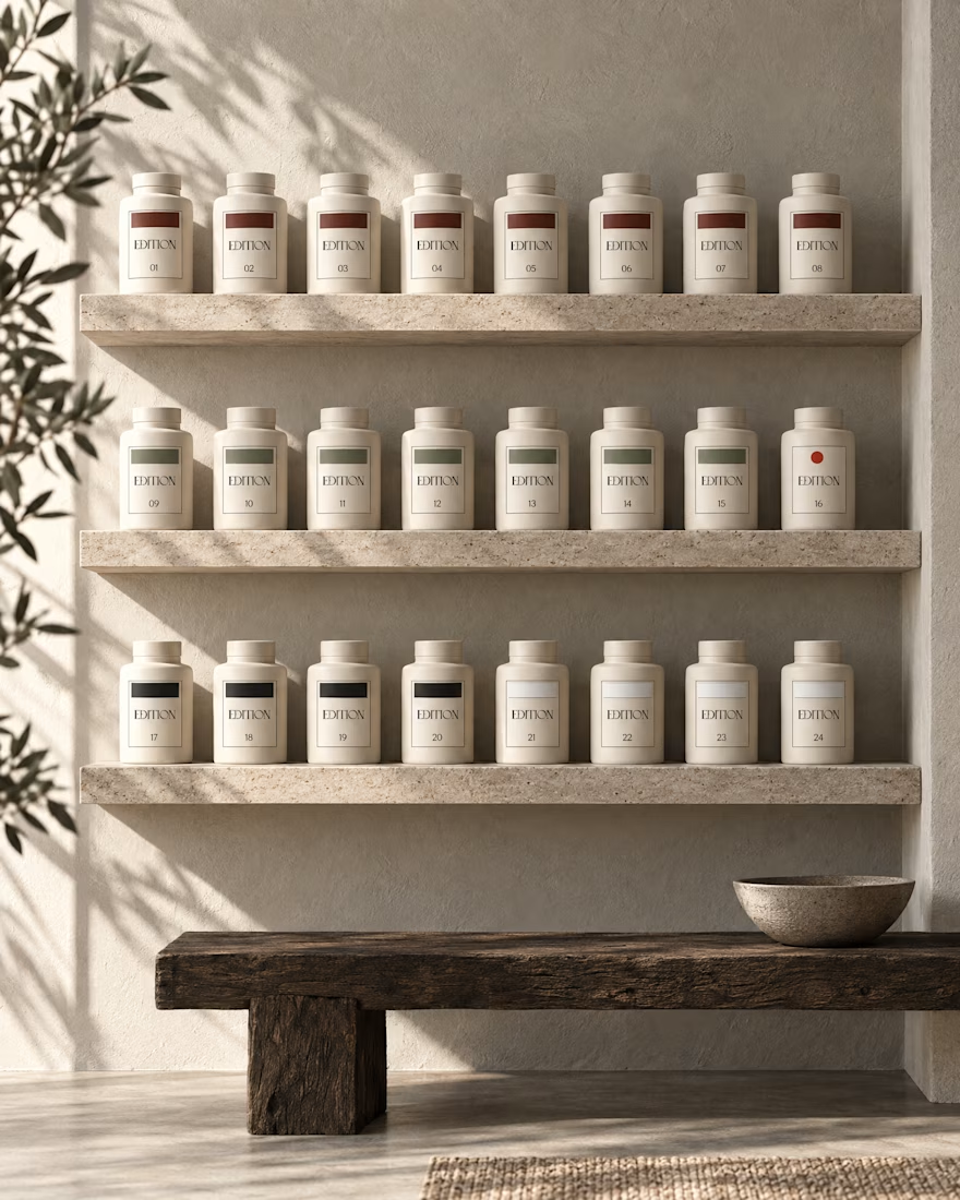
EDITION is a brand where nothing is decorative and everything is numbered.
Case study landing very soon.