The network for creativity
Join 1.25M professional creatives like you
Connect with clients, get discovered, and run your business 100% commission-free
Creatives on Contra have earned over $150M and we are just getting started
Back to feedPost

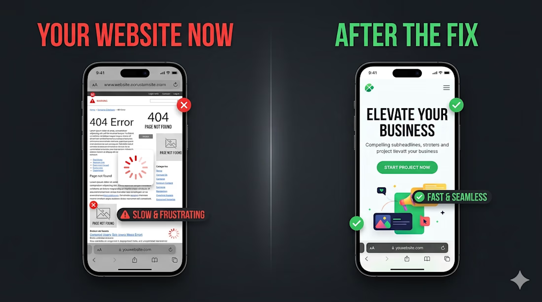
I asked an AI to review 10 small business websites.
The results were brutal.
Here's what came up on almost every single one:
#1 — No clear answer to "what do you do" in the first 3 seconds
Visitors don't read. They scan. If your homepage doesn't instantly say what you do and who it's for — they're gone.
#2 — The contact button is buried
I found contact forms at the bottom of pages, hidden in dropdown menus, or missing entirely. Every extra click costs you a customer.
#3 — Looks broken on mobile
Over 60% of web traffic is mobile. But most small business sites were clearly designed on a desktop and never tested on a phone.
#4 — Loads in 6+ seconds
Google starts penalizing sites after 3 seconds. Slow sites don't just frustrate users — they disappear from search results.
#5 — No trust signals
No reviews. No client logos. No "worked with" section. First-time visitors have no reason to believe you're legit.
The worst part? Most of these are 1–2 day fixes. Not a full redesign. Just targeted changes.
If you're a business owner reading this — go check your own site right now. How many of these do you have


The network for creativity
Join 1.25M professional creatives like you
Connect with clients, get discovered, and run your business 100% commission-free
Creatives on Contra have earned over $150M and we are just getting started





Related posts

I tested Opus 5.5 and had it build an arcade game in Unity using the CLI and Claude Code.
The game is called Heatwave and is a quick and fun little police chase game.
Of all the games I've made, this is actually the one I enjoy to test the most.
I'm terrible at it, but it's fun.

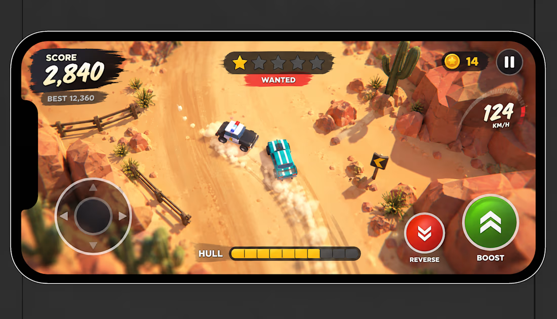
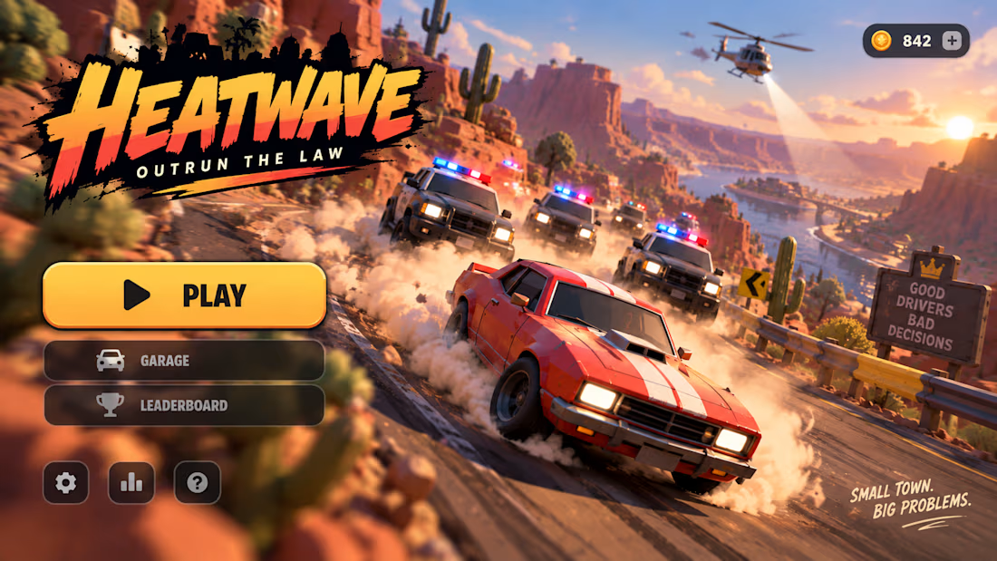

Wanting another run even when you are bad at it is a pretty good sign. What took more iteration in Heatwave, the driving feel or the police chase behavior?

New case study: the landing page for REVAI, a concept AI sales platform.
The brief I gave myself was structural, not decorative: design a page where every section earns the next one. Hero makes one claim and gets out of the way. The value proposition comes before any feature gets named — because a feature nobody understands yet is just noise. Proof (testimonial, logos) sits right before the final ask, not scattered earlier where it does nothing.
Art direction followed the same logic — high contrast where the page needs to make a claim, quieter and more editorial where it needs to build trust. The layout isn't there to look good in isolation. It's there to move someone from "what is this" to "I trust this" in one scroll.


Love the colors dude! Hell of a work🔥

Hi! I’m a college student and an aspiring AI/ML engineer who loves building things with technology and turning ideas into real projects.
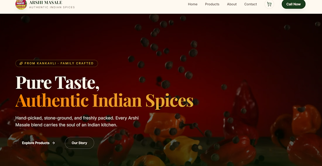
I built the Arshi Masale website for a local spice business from Sindhudurg, Maharashtra. This project was special to me because it showed me that even as a student, I can use what I’m learning to create something useful for a real business.
I focused on making it modern, simple, mobile-friendly, and ready for future e-commerce features. This is one of the projects that motivates me to keep learning, building, and eventually turn my passion for AI and technology into a career.

DO SUPPORT GUYS 😊