The network for creativity
Join 1.25M professional creatives like you
Connect with clients, get discovered, and run your business 100% commission-free
Creatives on Contra have earned over $150M and we are just getting started
Back to feedPost

Most authors don’t struggle because their books aren’t good.
They struggle because readers can’t find them.
Discoverability is the quiet difference between a book that sits and a book that sells. Covers matter. Keywords matter. Categories matter. Positioning matters.
I’m curious
What do you think is the hardest part of getting a book noticed today writing it or marketing it?
The network for creativity
Join 1.25M professional creatives like you
Connect with clients, get discovered, and run your business 100% commission-free
Creatives on Contra have earned over $150M and we are just getting started






Related posts

A hard lesson in creative work: your taste isn't always the point.
I think one of the hardest things about working with clients is learning to separate what you personally like from what your client actually needs.
And honestly, I don't think it's always easy.
As a writer, designer, or any kind of creative professional, you develop your own preferences. You have opinions about what sounds better, what looks better, what feels right. That's completely normal.
But when you're creating something for someone else, you have to remember one important thing: you're not creating it for yourself.
Your client might prefer a style you wouldn't choose, a tone you don't particularly enjoy, or an approach you wouldn't take if the project were entirely your own.
That doesn't automatically make their choice wrong.
Our job isn't to make every project reflect our personal taste. It's to understand the client's goals, their audience, and what the work needs to accomplish.
Of course, that doesn't mean blindly agreeing with everything. We're professionals for a reason. If something is unclear, ineffective, or likely to hurt the project's results, we should explain why and offer a better alternative.
But there's a difference between saying "This won't work because..." and "I don't like this."
Personal preference isn't the same as professional judgment.
And I think learning to recognize that difference is a big part of becoming better at what you do.
Sometimes, professionalism means standing by your expertise. Other times, it means setting your ego aside and delivering something that serves the client well, even if it isn't something you'd choose for yourself.

How a LinkedIn presence helps B2B businesses (AI product owners ,authors ,coaches , agencies)
B2B buyers don't buy from a logo. They buy from people they trust.
And before they book a call, most of them check you out on LinkedIn.
Here's what a clear presence does for you:
Builds trust before the first call. Buyers feel like they already know you.
Shortens the sales cycle.
Fewer...who are you? conversations, more ...let's talk pricing.
Brings people to you. Clear posts attract the right buyers, partners and hires without cold outreach.
Makes you easy to remember. When they're ready to buy, yours is the name they recall.
A silent or messy profile does the opposite. Buyers assume the business is small, slow, or unsure of what it does.
You don't need to post every day. You need a clear profile and a few real stories, shared consistently.
I can help with:
LinkedIn ghostwriting
Profile design and rewrite
Website writing
Message me to get started: [+923407950520]

Freelance copywriters: ask what to follow and what to avoid in a client's tone reference.
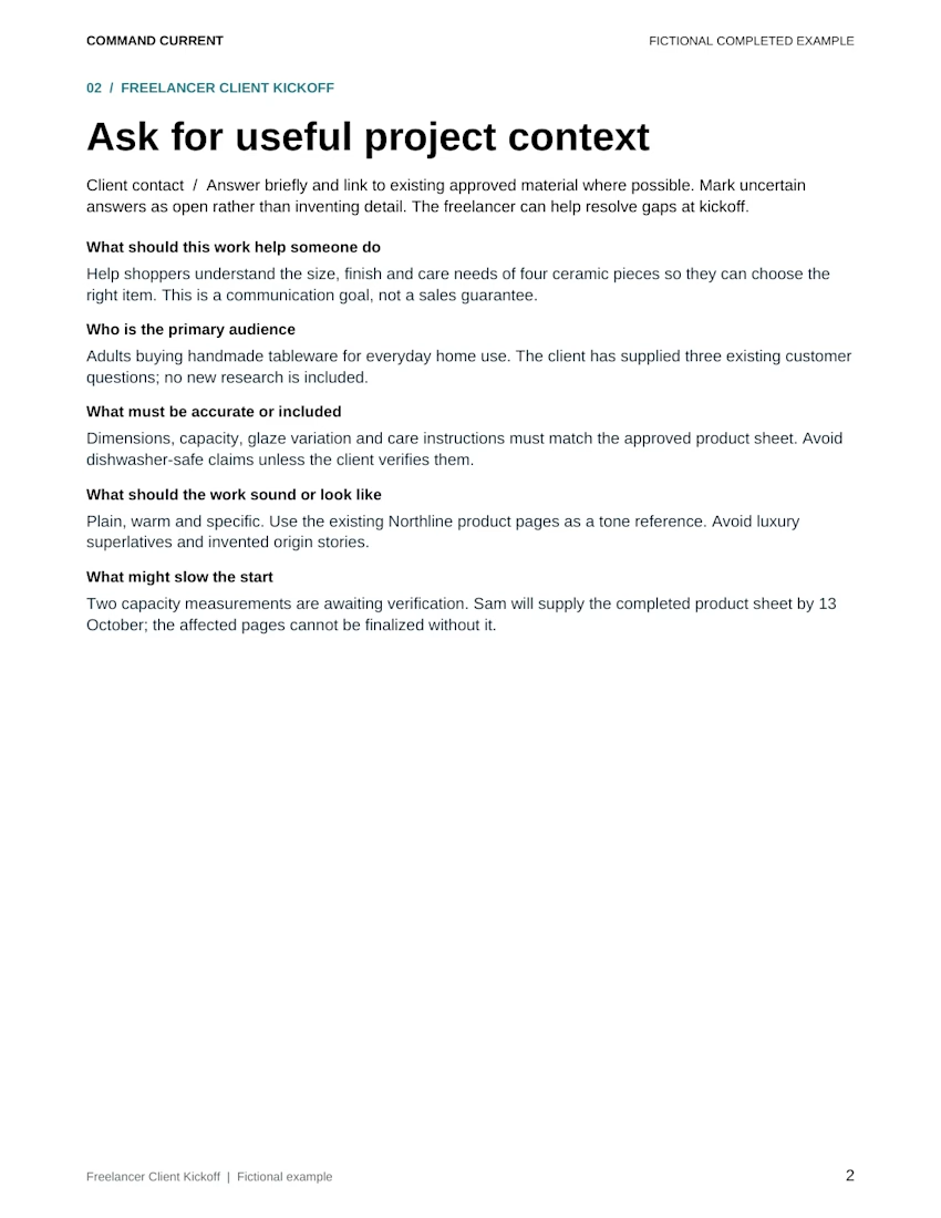
In the Freelancer Client Kickoff Template Bundle's fictional Northline project, the intake gives the writer three useful directions:
• Aim for plain, warm and specific copy
• Use the client's existing product pages as the tone reference
• Avoid luxury superlatives and invented origin stories
That last line makes the creative boundary visible before the first draft.
For your next kickoff, ask the client to point to an approved passage and finish two sentences: “Follow this because…” and “Avoid this because…” Save the answers beside the reference. Make the notes specific enough to use while revising, such as vocabulary, sentence length or the amount of product detail.
Keep the client's factual sources alongside those style notes. In this example, dimensions, capacity, glaze variation and care instructions must match the approved product sheet. A tone reference guides the wording; product claims still need their own check.
Shown: the complete Ask for useful project context page from the kit's fictional completed example. All names and project details are invented for illustration.
The five-file ZIP includes an eight-page editable Word packet, matching print PDF, Excel tracker for client inputs and approval decisions, eight-page fictional example and two-page Quick Start. Designed for desktop Word and Excel; PDFs are static. Use it after the project is agreed, alongside your existing contract and approval process.