The network for creativity
Join 1.25M professional creatives like you
Connect with clients, get discovered, and run your business 100% commission-free
Creatives on Contra have earned over $150M and we are just getting started
Back to feedPost
Taste Test

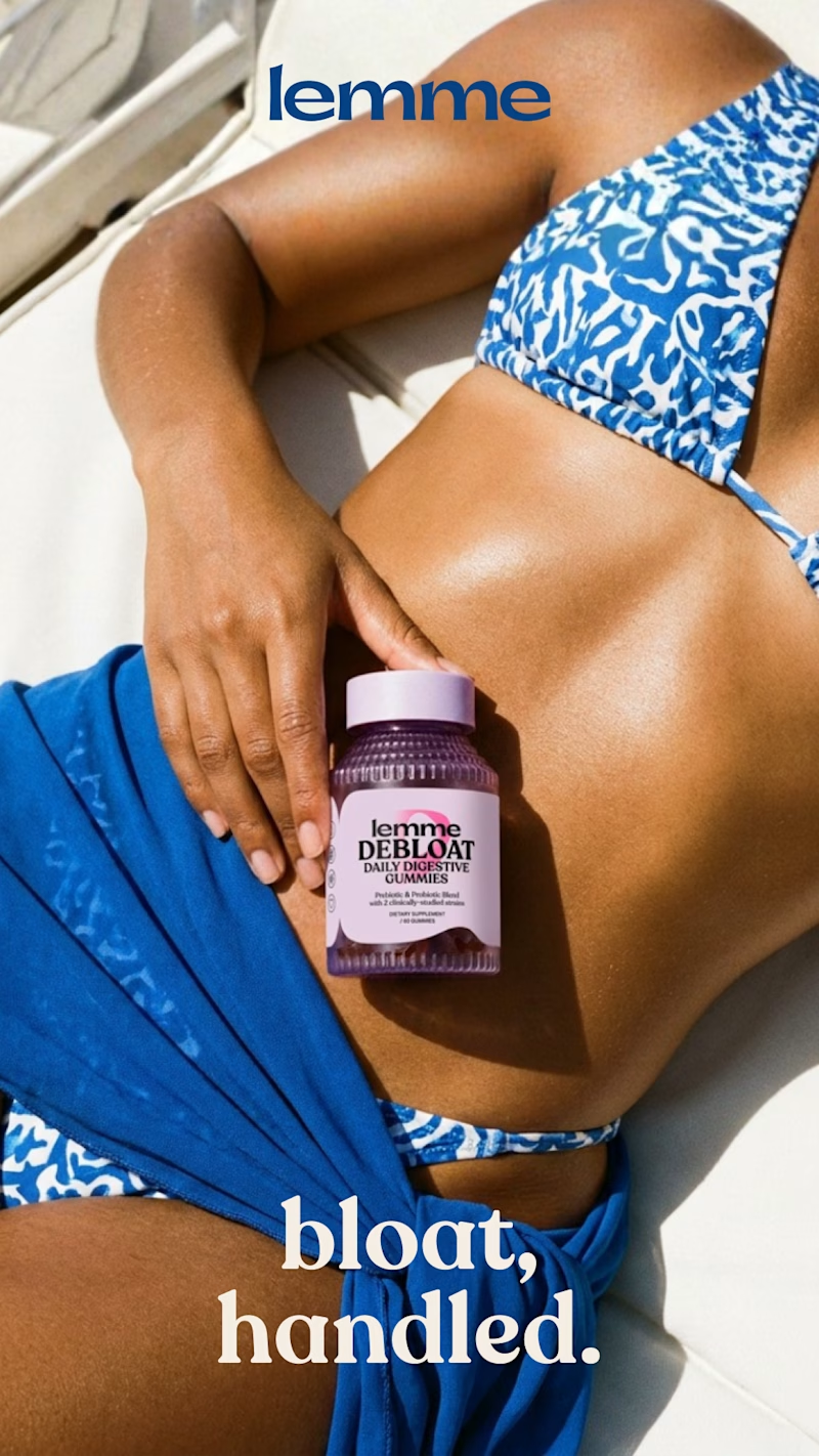
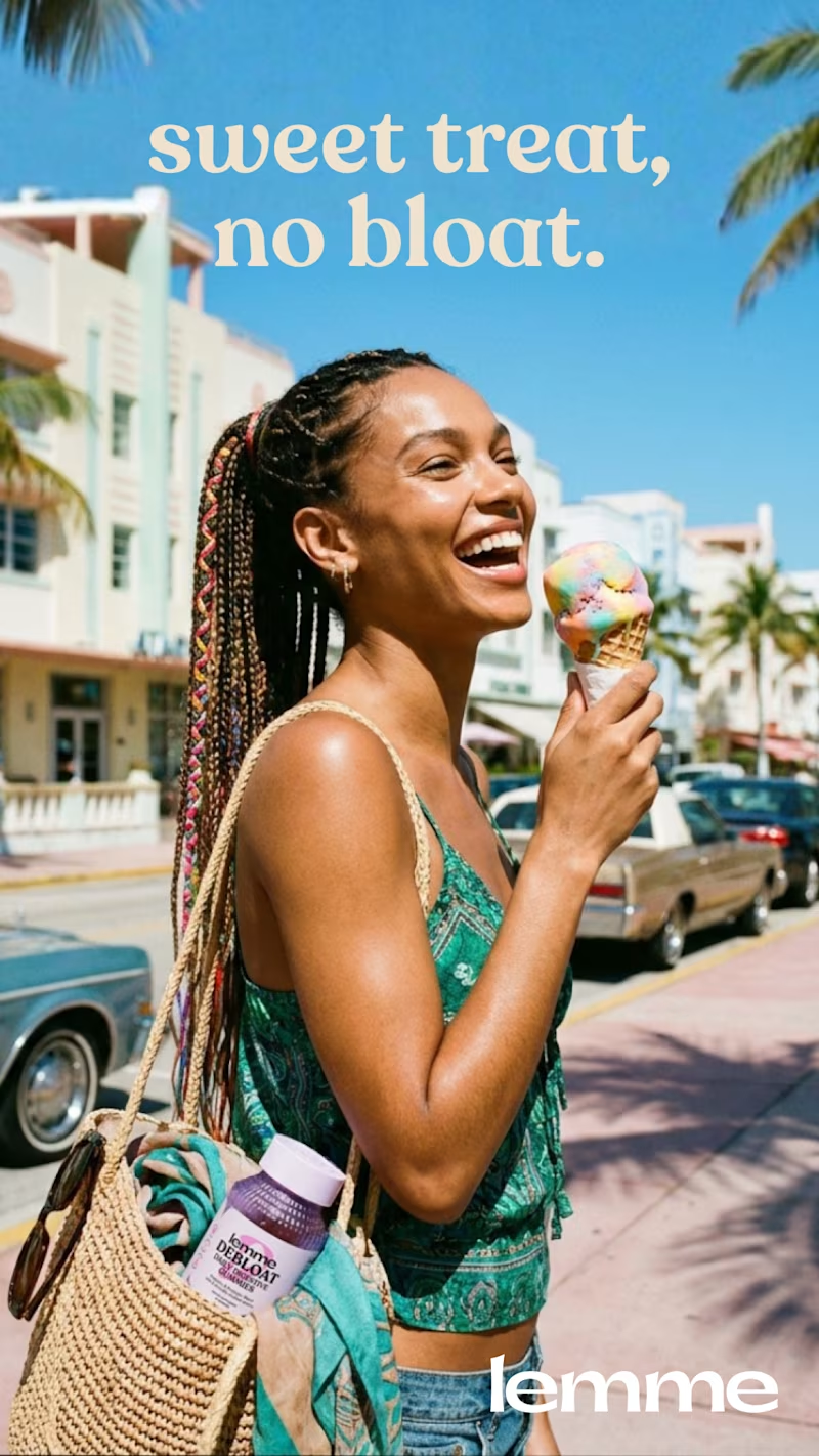
Ad creatives from my last case study. Which one's your favorite?
50 voted
62%
31 voted
38%
81 votes
Closed


B. In A the body shot is carrying the whole claim, so the copy has nothing left to do — it just labels the picture. B splits the work: the ice cream sets up the objection and "sweet treat, no bloat" answers it in four words, which is about all anyone reads at thumbnail size in...

Nice work as usual! Option B gives the copy so much room to land effectively next to the product framing.

B IS AMAZING!!

Option B!

Option B's beach energy sells the lifestyle instantly, but "bloat, handled" in A is such a blunt hook it almost dares you to look away. Did the vote split end up matching your gut pick when you were putting these together?

B delivered what it was asked!

Perfect way to advertise a product
You are welcome


B communicated the message perfectly

B

A is so straightforward and visually appealing!

Option A for me

Great work, Option B🔥


i will go with B


Bloated handled for me

Voted A

✌🏻✌🏻✌🏻

I think you nailed it with A


I'd go with B!
The network for creativity
Join 1.25M professional creatives like you
Connect with clients, get discovered, and run your business 100% commission-free
Creatives on Contra have earned over $150M and we are just getting started








Related posts


Which feels more established to you?
22 voted
30%

52 voted
70%

74 votes
Closed


Same brand. Same palette. Two completely different proposals for a real estate developer.
A: An isotype built from blocks. Geometric, precise, the language of construction. It says we build.
B: Custom lettering with movement. Warmer, more editorial. It says we build places you’d want to live in.
36 voted
51%

35 voted
49%

71 votes
Closed

My vote is B, Milagros. Custom lettering with movement has real editorial warmth, which suits a developer selling places people actually want to live in.

Brand identity exploration
Which one do you think it fits better?
36 voted
77%

11 voted
23%

47 votes
Closed

Cobalt is great Gold is unique 🎉🎉🔥🔥