The network for creativity
Join 1.25M professional creatives like you
Connect with clients, get discovered, and run your business 100% commission-free
Creatives on Contra have earned over $150M and we are just getting started
Back to feedPost

Many dessert brands compete on flavour.
But before customers taste your product, they experience your brand.
That was the challenge behind Lieto. The brand struggled to stand out in a crowded dessert market. We set out to create an identity that felt playful, memorable and flexible enough to grow across packaging, social media and future product lines.
The result wasn’t just a new logo, it was a visual system designed to help the brand gained trusts, eventually ,positioned to be something bigger.


The network for creativity
Join 1.25M professional creatives like you
Connect with clients, get discovered, and run your business 100% commission-free
Creatives on Contra have earned over $150M and we are just getting started



Related posts


Great!!

What makes a candy brand recognizable across every pack?
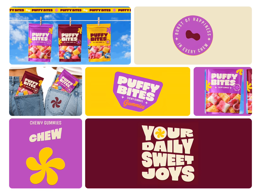
For Puffy Bites, I built the identity around rounded lettering, expressive symbols, and a palette of burgundy, purple, yellow, and cream.
The same visual language carries through pouch packaging, smaller wrappers, campaign imagery, and an animated brand showcase.
One design decision that ties it together: the packaging color changes, while the logo placement, product descriptor, and supporting graphics maintain a consistent structure.
I handled the full client project, from logo and visual identity to packaging and campaign applications.
Which colorway would catch your eye first—purple, burgundy, or yellow?
Explore the full Puffy Bites case study. If you’re developing a candy or snack brand, I’m available for branding and packaging projects.

Love it,
Great work

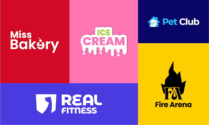
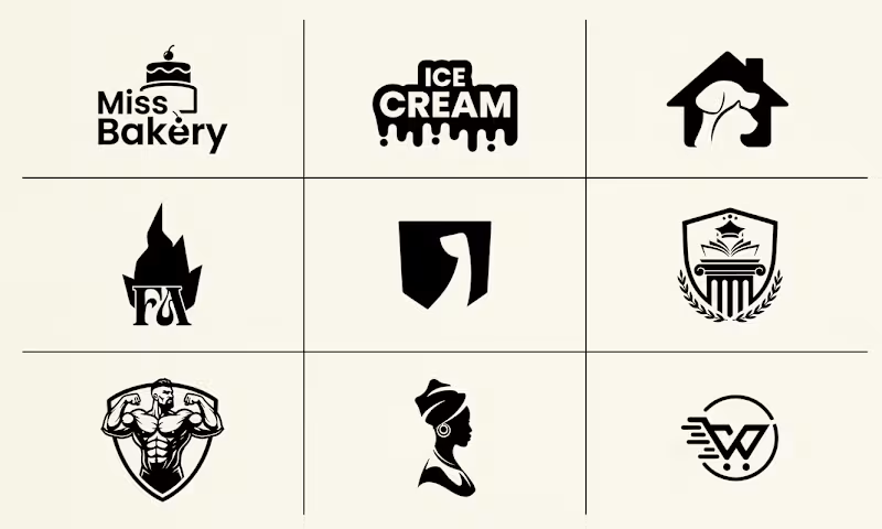
Which branding style is more effective: vibrant multi-colored identity presentations or clean minimalist monochrome grid sheets?
4 voted
80%
1 voted
20%
5 votes
Closed

Nothing better than Multi color