The network for creativity
Join 1.25M professional creatives like you
Connect with clients, get discovered, and run your business 100% commission-free
Creatives on Contra have earned over $150M and we are just getting started
Back to feedPost
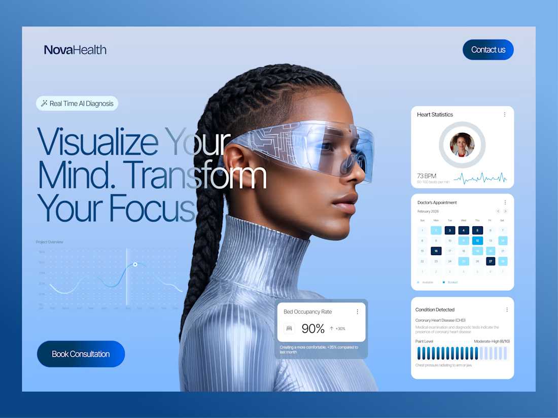
One of my favourite parts of this website redesign.
The Bento grid.
But the interesting part isn't the final design. It's what happened before it. Instead of jumping straight into UI, I opened Figma's pencil tool and sketched every block first.
Not to make it look good.
To figure out what each section should communicate. That's usually the hardest part.
Once the structure was clear, designing became much faster because every card already had a purpose. After that, I brought the layout to life with subtle animations, giving it a modern, tech-focused feel that made the entire section feel much more interactive.
The client loved the final result, and honestly, this is why I enjoy UI/UX design so much: solving the thinking before solving the visuals.
BTW How do you approach a new design?
Do you sketch first, wireframe, or jump straight into high-fidelity?


Great Presentation!

Thanks for liking
The network for creativity
Join 1.25M professional creatives like you
Connect with clients, get discovered, and run your business 100% commission-free
Creatives on Contra have earned over $150M and we are just getting started
Trending
retrofuturism
Share your favorite designs from the past exploring the distant future. Or your own take on the aesthetic 🚀
halftone
Dots. Texture. Grain. Let's see your designs using the halftone technique.

Midjourney
Creatives are showing off what they're making with Midjourney.
colorgrade
Video editors sound off: How do you enhance the mood of your video in color grading?





Related posts

Strategy, narrative, web design and Webflow development for Samu.ai, the copilot for B2B sales reps and managers in Latin America. 8 weeks, from positioning to launch 🚀


8 weeks for all that is quick

Hero section exploration. Designed & Built in @Framer
Image generated with @Higgsfield AI



Smooth

Finished this private aviation landing page.
The goal was not just to make jets look premium.
The page had to build trust through:
Positioning → Fleet → Destinations → Process → Experience →
Inquiry
For high-value services, visual quality gets attention.
The full journey is what builds confidence.


That sequence from positioning to inquiry is doing the real conversion work. In premium services, each section needs to remove a different kind of doubt, and this journey handles that thoughtfully.