The network for creativity
Join 1.25M professional creatives like you
Connect with clients, get discovered, and run your business 100% commission-free
Creatives on Contra have earned over $150M and we are just getting started
Back to feedPost

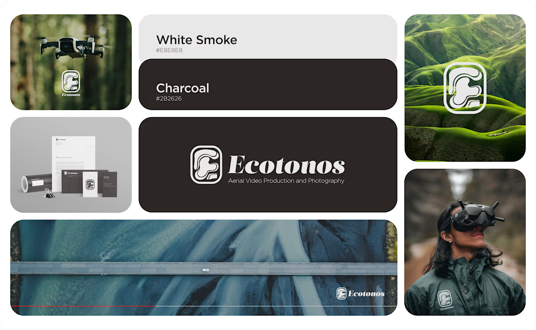
This was a branding project for Ecotonos. Ecotonos is a media production company that specializes in aerial video and photography. The brand's name is based on the term "ecotone", a transitional zone where two different ecosystems meet. I tried to recreate that converging of ecosystems with the logomark. I used segmented organic shapes configured to resemble the letter E. The band that surrounds the shapes unifies the mark and provides visual cohesion.
Since the brand is presented next to brightly colored nature shots, I used a neutral color palette so as not to conflict with the background. I wanted the imagery to really shine in the branding.
The typeface complements and conveys a cool yet structured look that a media company should resemble.
I’d love to hear everyone's thoughts!


Nice work!
The network for creativity
Join 1.25M professional creatives like you
Connect with clients, get discovered, and run your business 100% commission-free
Creatives on Contra have earned over $150M and we are just getting started


Trending
aivideo
AI video tools are moving at warp speed. Which ones are you experimenting with?
illustration
Handcrafted illustration is bubbling up across the web. What are you drawing lately?
aidesignflow
AI tools are redefining design work. What's your current workflow?
returntonature
Spring is a reset for creativity. What’s inspiring you outside the screen right now?
freelancerlife
Freelancer life is wins, pivots, and everything in between. What’s yours right now?