pro
Adrian Cole
Graphic designer with experience crafting impactful visuals
New to Contra
Adrian is ready for their next project!
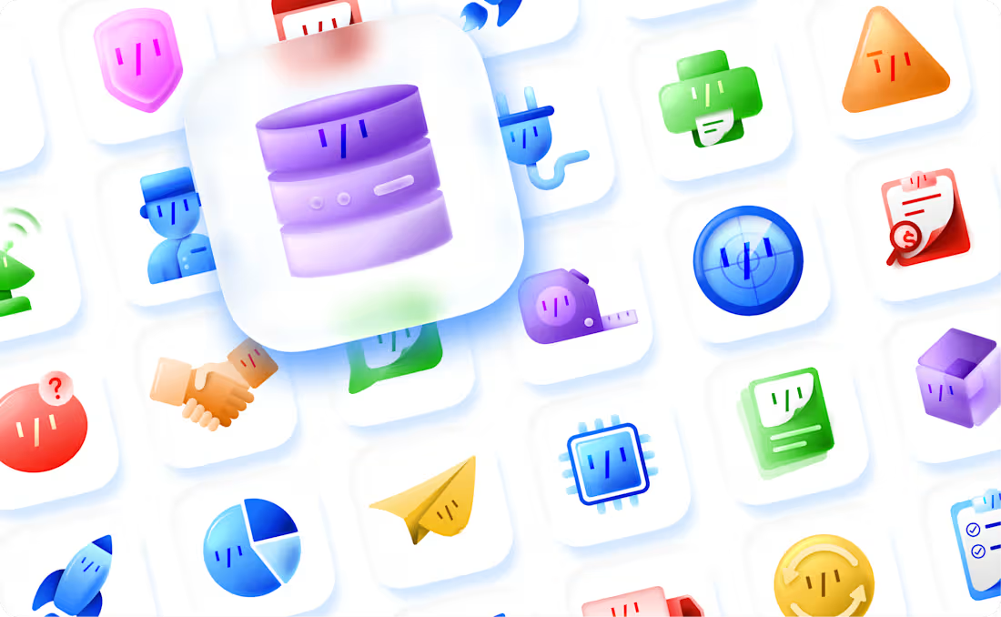
These are some Icons I recently created for an AI company. The soft, translucent look gives them a modern version of skeuomorphic design. Integrating the face of their AI agent mascot into each icon demonstrates the AI's versatility and integration. Overall, I'm very happy either way how they turned out!
2
23
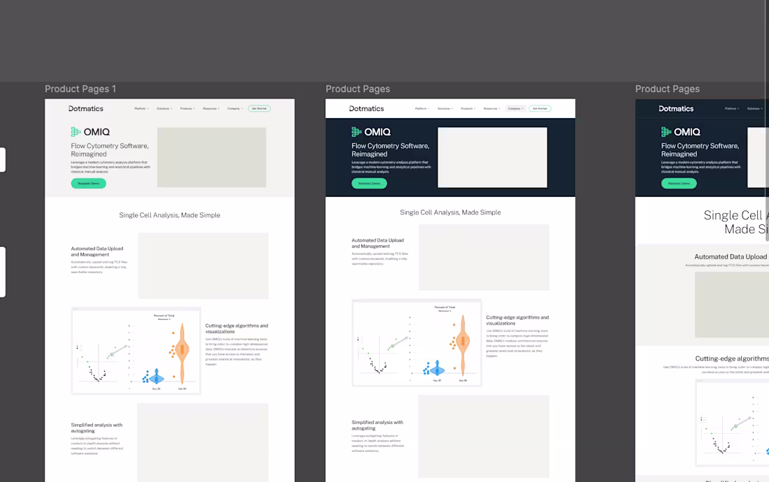
When Omiq was acquired by Dotmatics, I was responsible for leading the visual rebrand and redesign of the Omiq website. The objective was to align the product's identity with Dotmatics' established brand guidelines, ensuring consistency across their full product portfolio. Working in Figma, I developed high-fidelity designs, refined UI components, and prepared detailed, production-ready specifications for the development team, enabling a smooth and efficient build process.
1
32
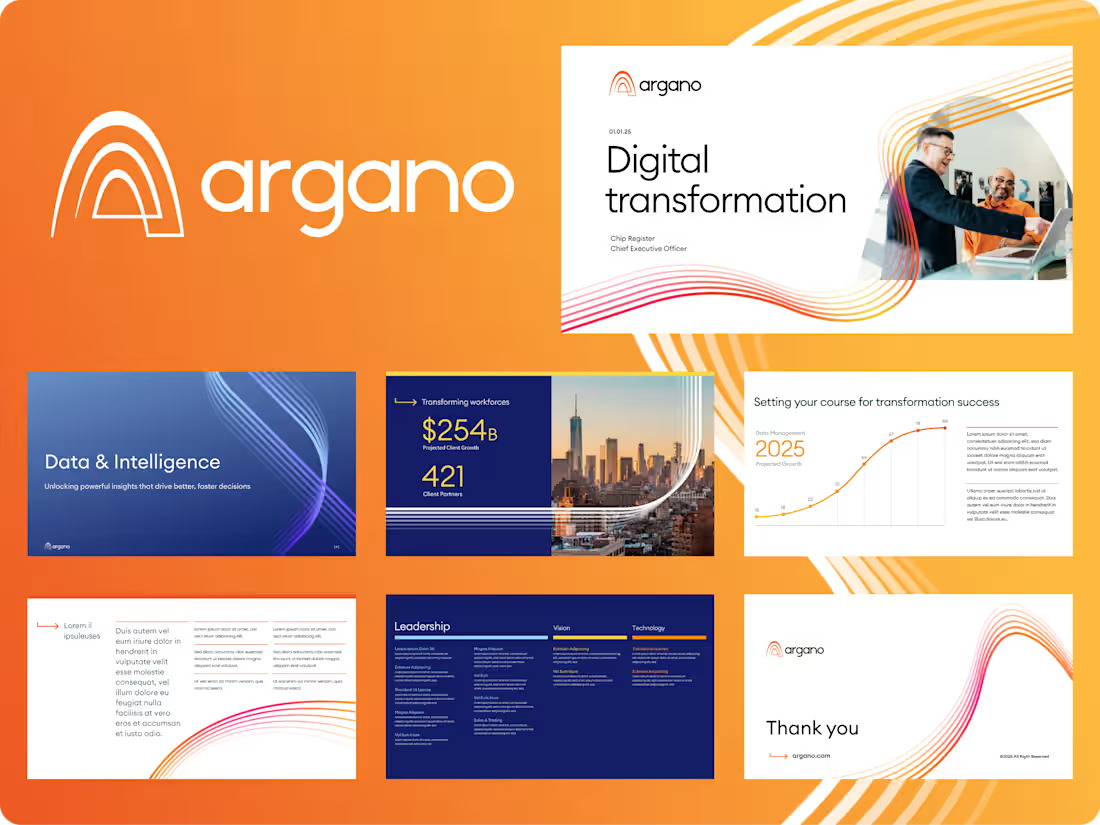
This task involved creating custom, branded master templates in PowerPoint that are visually engaging and easyfor the team to edit and use to create their own presentations
0
18
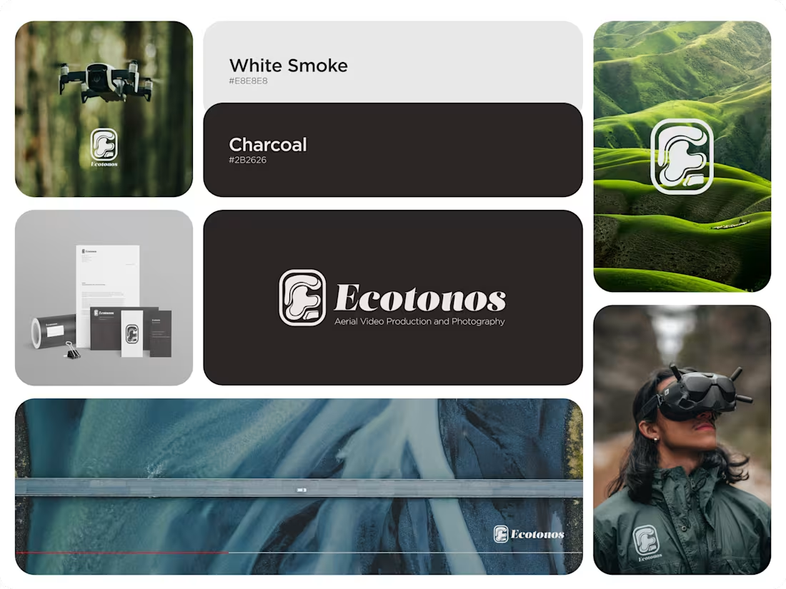
This was a branding project for Ecotonos. Ecotonos is a media production company that specializes in aerial video and photography. The brand's name is based on the term "ecotone", a transitional zone where two different ecosystems meet. I tried to recreate that converging of ecosystems with the logomark. I used segmented organic shapes configured to resemble the letter E. The band that surrounds the shapes unifies the mark and provides visual cohesion.
Since the brand is presented next to brightly colored nature shots, I used a neutral color palette so as not to conflict with the background. I wanted the imagery to really shine in the branding.
The typeface complements and conveys a cool yet structured look that a media company should resemble.
I’d love to hear everyone's thoughts!
1
27
197
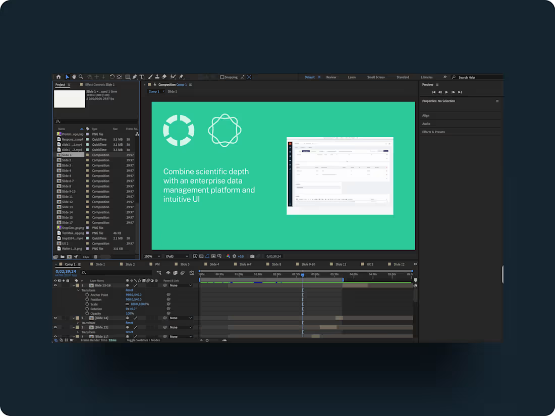
This is a shortened version of an animation I made for a tradeshow booth. It's snappy to grab people's attention but tells a story about the services and ultimately the success the company provides its customers.
1
46
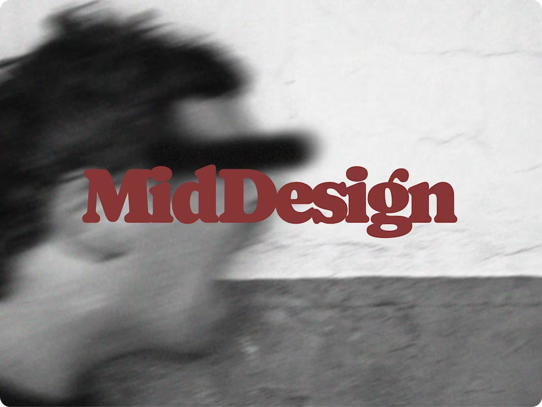
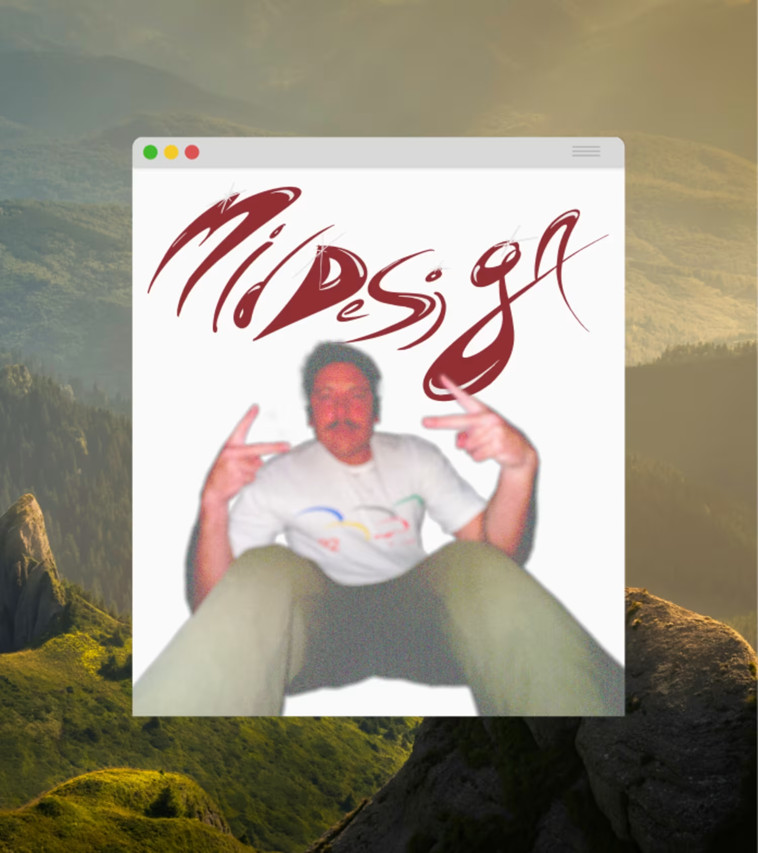
I'm very excited to publish my portfolio. It was a great experience getting to know Webflow and building something I'm proud of. Check it out! https://middesignstudio.com
1
2
51
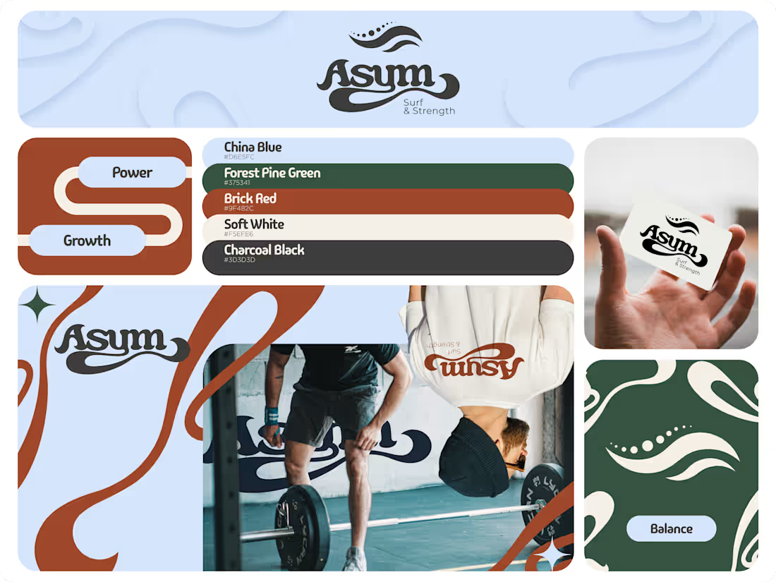
This is a recent branding project I worked on for a strength and conditioning business specializing in addressing the asymmetrical demands surfing places on the body. My design reflects the fluidity of the ocean, with the asymmetry of human anatomy, all while retaining that core surfing identity.
4
29
202
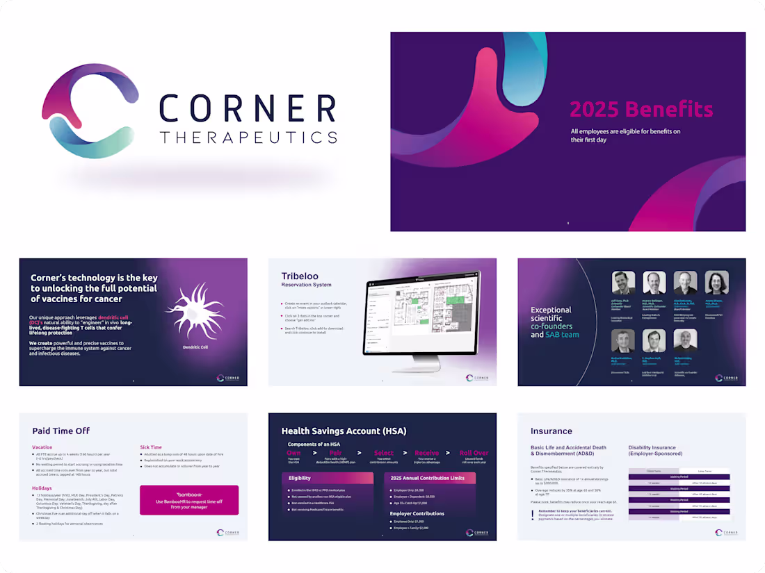
Here is a recent project to create PowerPoint templates for Corner Therapeutics. It's super fun taking rigid programs like PP and creating something cool out of it!
1
63