The network for creativity
Join 1.25M professional creatives like you
Connect with clients, get discovered, and run your business 100% commission-free
Creatives on Contra have earned over $150M and we are just getting started
Back to feedPost

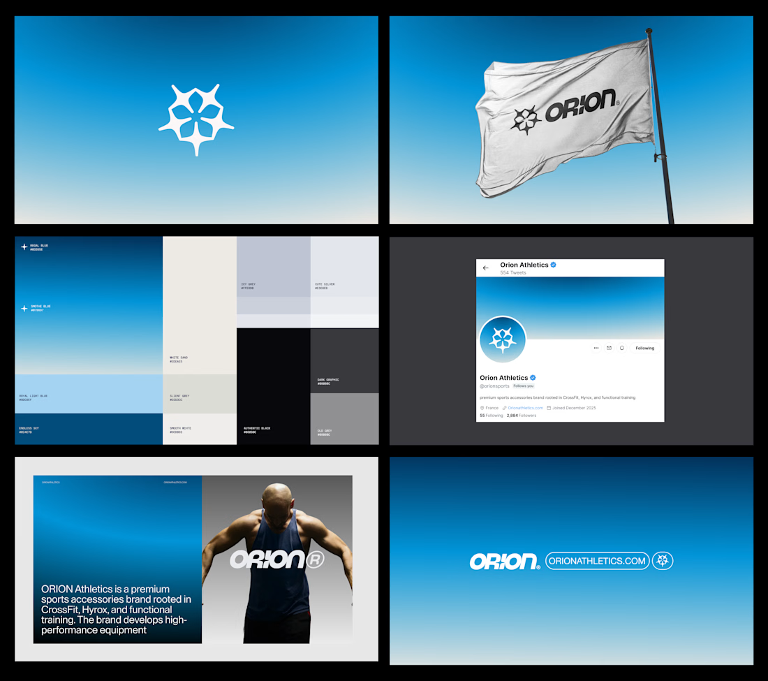

This system feels especially strong in application: the gradient, dark neutrals, and star-like symbol create a recognizable thread across social, apparel, and digital touchpoints. The hierarchy stays crisp throughout.
The network for creativity
Join 1.25M professional creatives like you
Connect with clients, get discovered, and run your business 100% commission-free
Creatives on Contra have earned over $150M and we are just getting started



Related posts

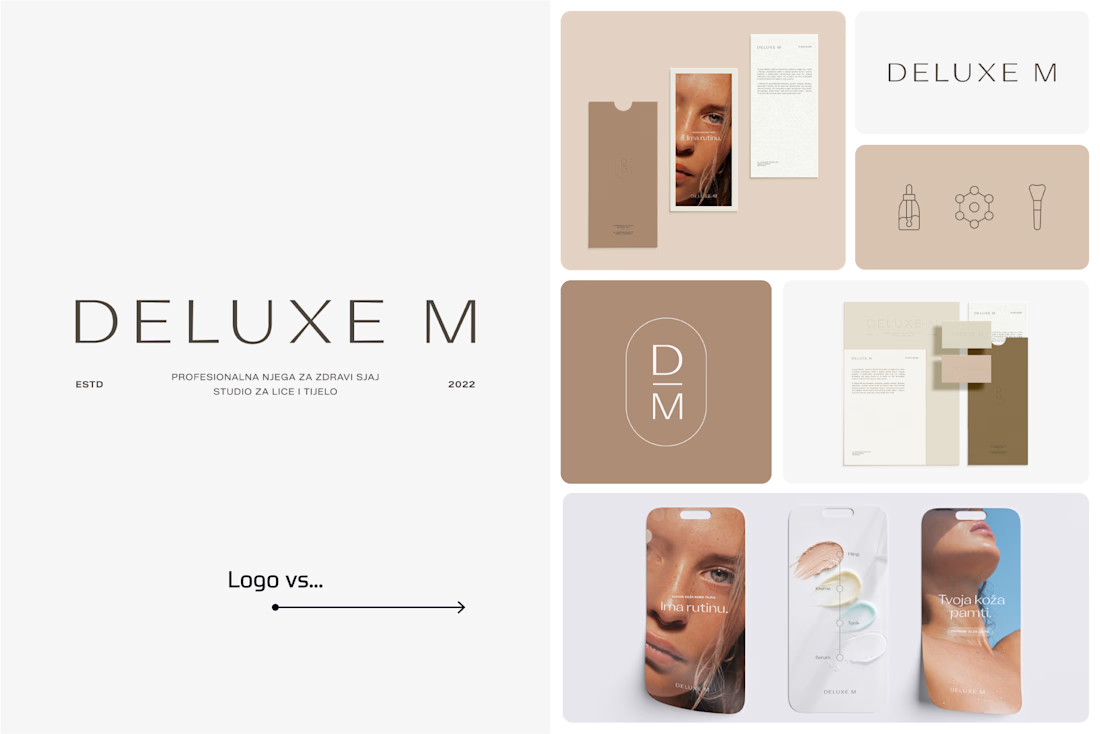
A logo is one thing. Giving it a whole personality is another. 👀
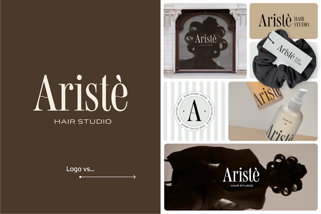
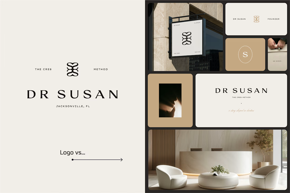
I picked a few of my branding projects to show what happens beyond the logo.
First, the logo on its own. Then, the full visual identity: colours, typography, graphic elements, patterns, packaging, and all the little details that make each brand feel like itself.
Because I don't want a logo to just look good sitting on a presentation slide. I want to see what it can become when it gets out into the real world.
Every project has a different story, personality, and visual direction. And that's probably my favourite part of brand design: figuring out how to turn one initial idea into a whole visual language.
Swipe through and meet the logos, then their bigger personalities. ;)
A logo is the starting point. The fun really begins after that.
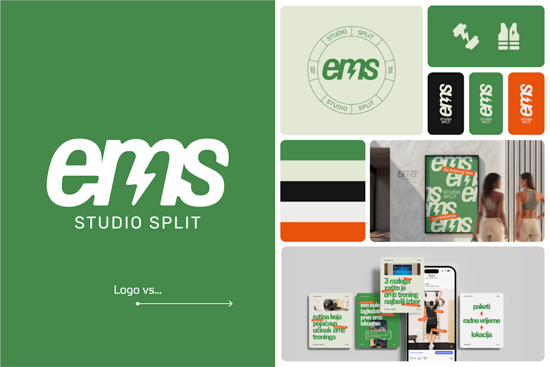

Clever use of the lightning bolt in the EMS logo!

Brand work for Boofi, DeFi platform
We are working on visual direction, motion and animations


So cute! Love it!


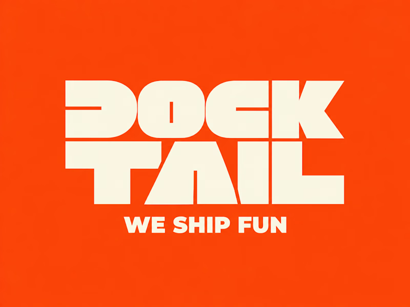
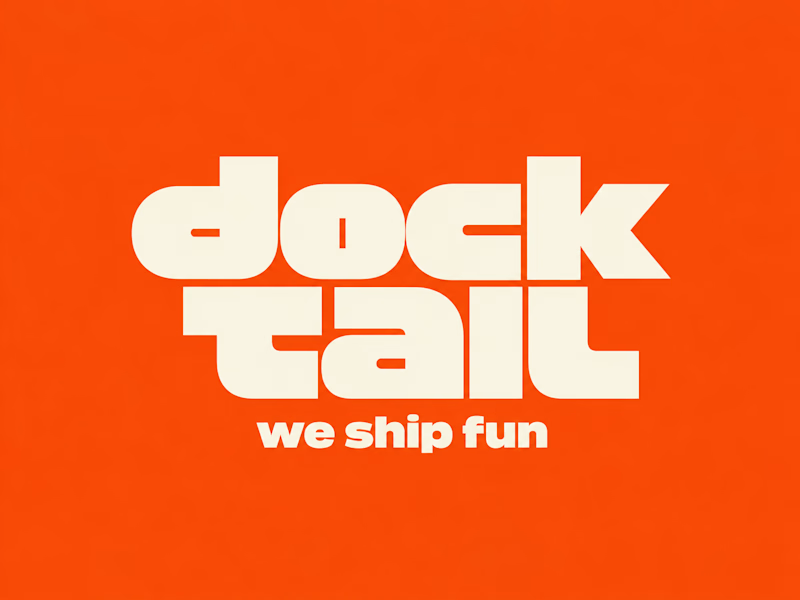
DockTail approached me with a fun idea: make us look nothing like what we do.
As strange as it sounds, I think this is one of the most exciting creative challenges. When branding a business, the primary objective is usually to communicate what it does. But what happens when you deliberately take that away?
After a few days of brainstorming, experimentation, and using Curative Intelligence, I arrived at these two concepts.
One is ALL CAPS, the other is all lowercase. Both carry the same personality, but express it through two entirely different approaches.
Now I'm curious: Which one do you like more?
22 voted
65%
12 voted
35%
34 votes
Closed