The network for creativity
Join 1.25M professional creatives like you
Connect with clients, get discovered, and run your business 100% commission-free
Creatives on Contra have earned over $150M and we are just getting started
Back to feedPost

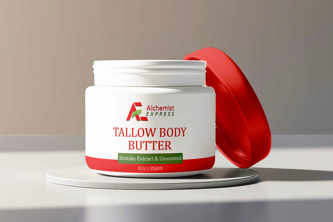
Great packaging doesn’t just look good, it has to work on the shelf, communicate clearly, and make the product feel worth picking up.
I specialize in packaging and label design, creating polished, production-ready designs for brands that want their products to look professional and competitive.
From bottles and jars to pouches and cartons, I handle the design process from concept through print-ready artwork and custom dielines.
My focus is on:
• Strong visual hierarchy
• Distinctive brand presentation
• Practical, production-ready layouts
• Custom dieline creation
• Professional print-ready files
• Packaging that works both visually and commercially
I’m now building my presence on Contra and looking forward to connecting with brands, founders, and creative teams looking for reliable packaging design support.
Need packaging that looks as good in production as it does on screen? Let’s talk.
TypographyAdobe IllustratorAdobe PhotoshoppackagingdesignlabeldesignproductpackagingPackaging Design


The network for creativity
Join 1.25M professional creatives like you
Connect with clients, get discovered, and run your business 100% commission-free
Creatives on Contra have earned over $150M and we are just getting started

Challenges
View all


Related posts


I'm looking for a typographer/logo designer for my upcoming fashion brand!

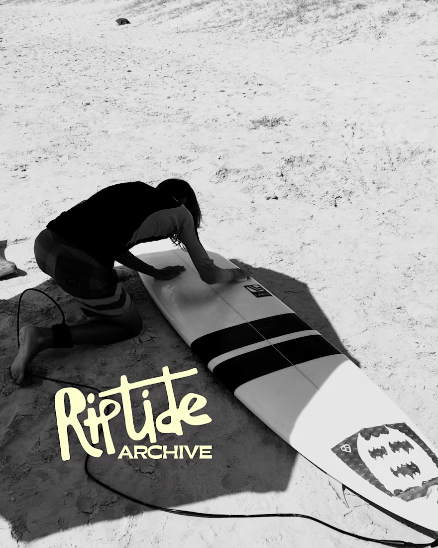
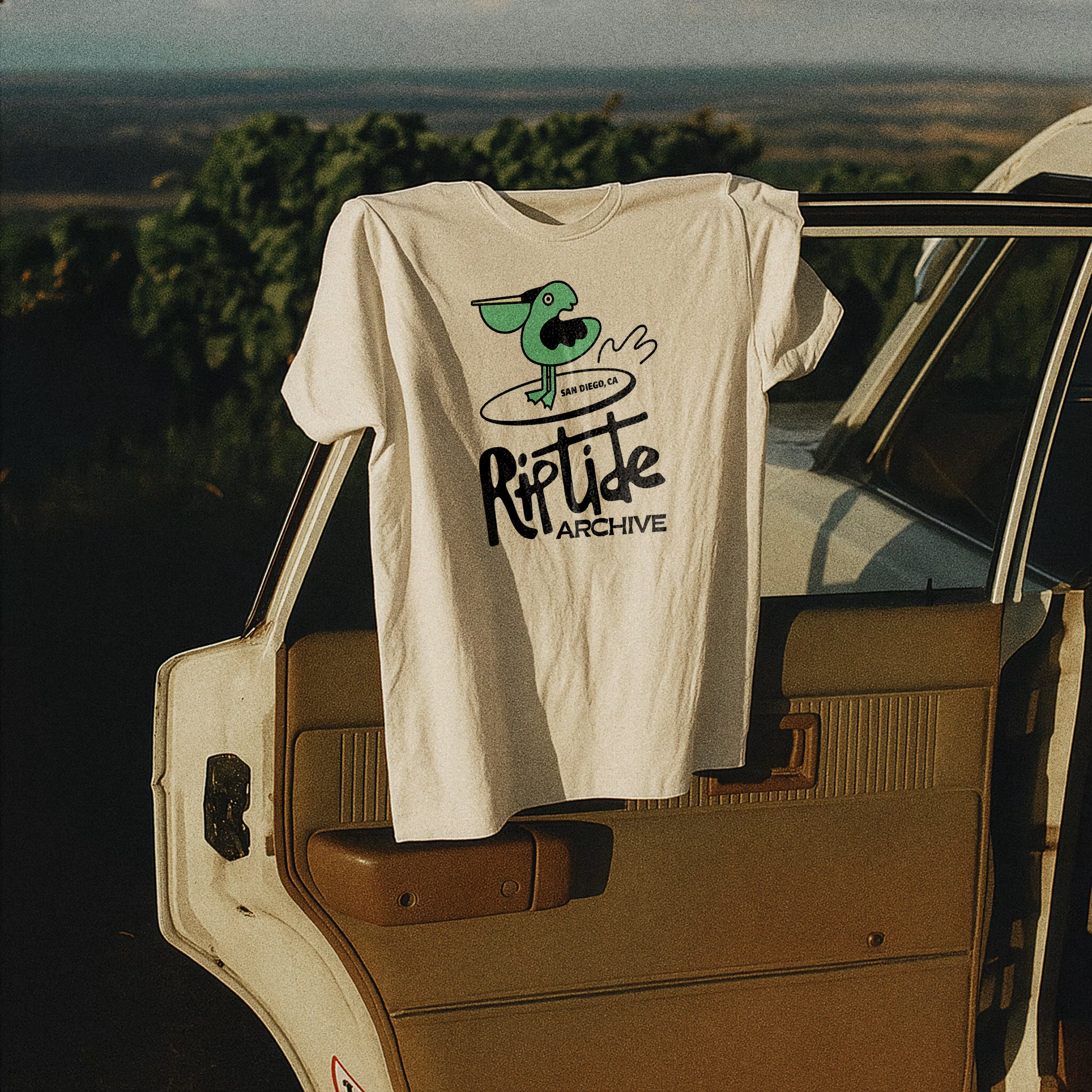
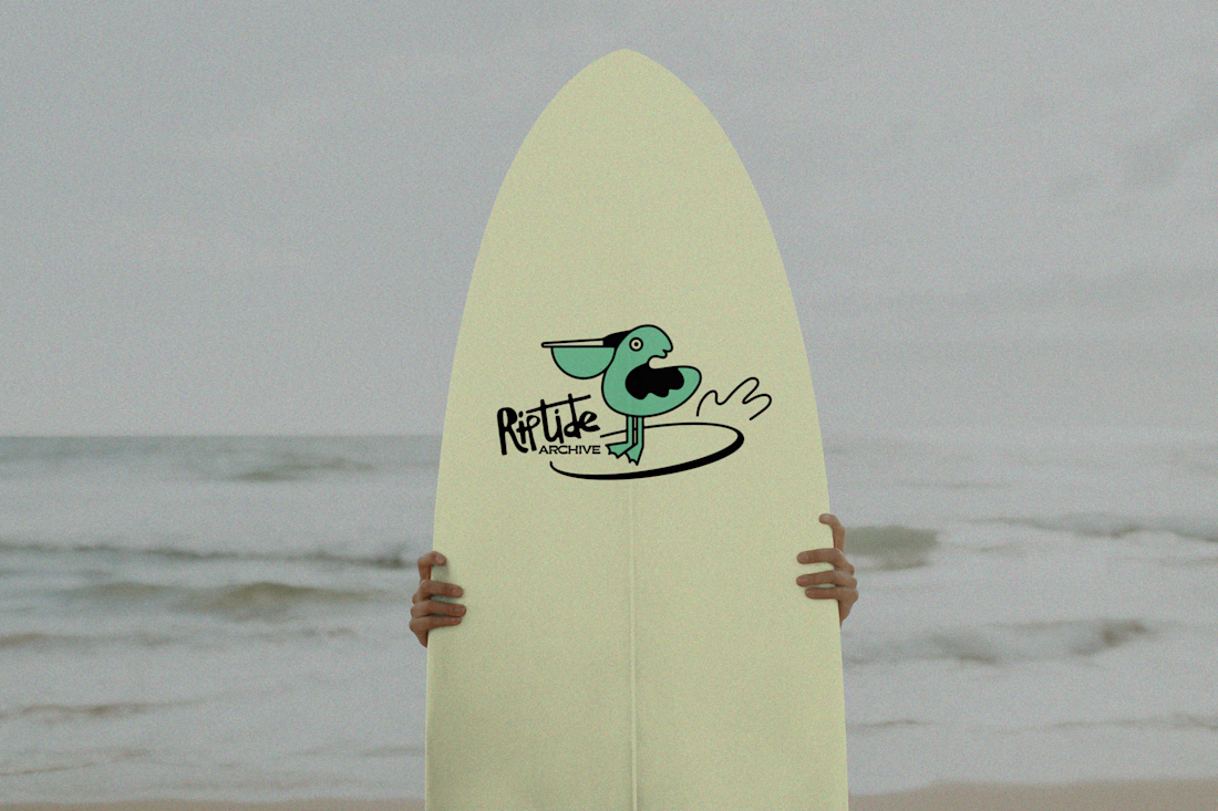
Logo for Riptide Archive. They document underground surf culture through limited run apparel, photo zines and short films.

Love this!

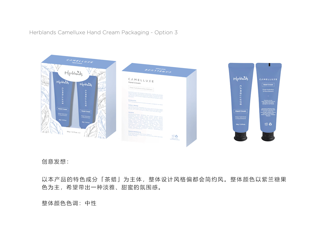
Design Concept — Packaging Proposals
Three Visual Directions
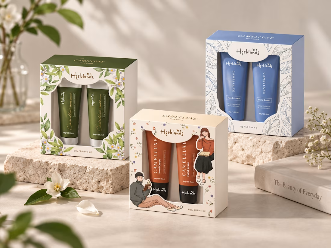
Three packaging concepts explore different styles and colour palettes for the Camelluxe hand cream range.
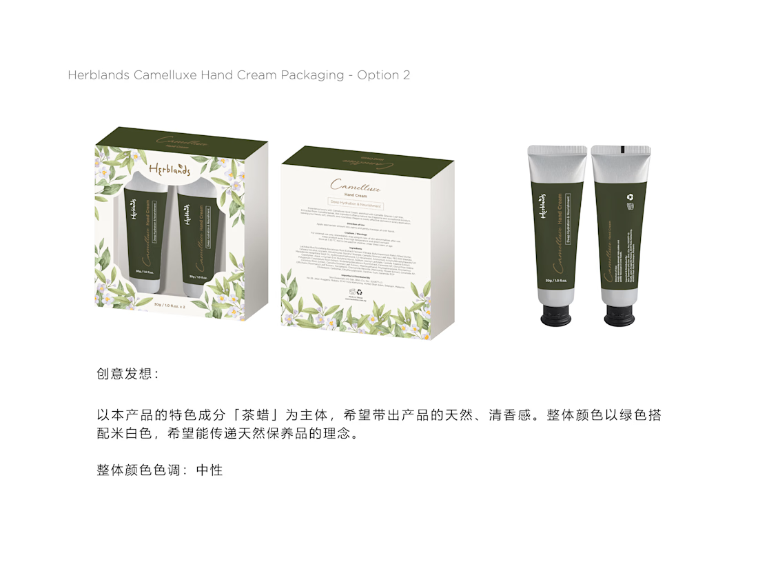
Proposal 01 — Botanical Elegance
Natural & Refined
Deep green tones with delicate floral illustrations create a natural, elegant, and premium botanical identity.
Proposal 02 — Clean & Modern
Fresh & Minimal
Soft blue tones with line-art botanical elements create a clean, calming, and contemporary skincare aesthetic.
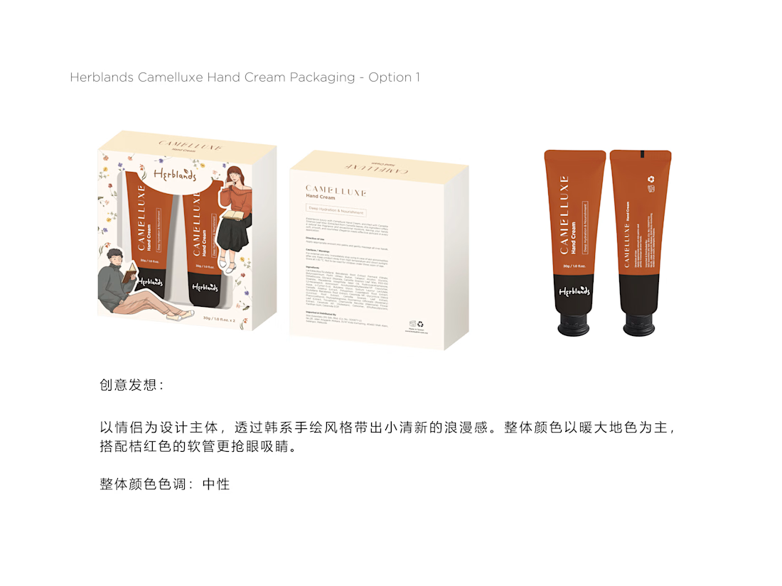
Proposal 03 — Warm & Youthful
Playful & Lifestyle-Led
Warm orange tones, character illustrations, and small floral details create a friendlier, more youthful lifestyle direction.
Credit: HWG

Very nice 👌
