The network for creativity
Join 1.25M professional creatives like you
Connect with clients, get discovered, and run your business 100% commission-free
Creatives on Contra have earned over $150M and we are just getting started
Back to feedPost

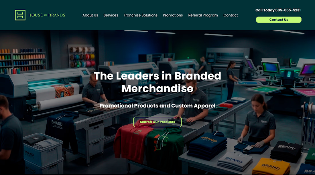
This project for House of Brands was developed as an industrial-modern B2B powerhouse, designed to showcase the scale, precision, and heritage of a large-scale printing and merchandise operation. The development strategy focused on "Operational Transparency," using real-world facility imagery to build immediate credibility with corporate clients.
Here is a breakdown of the design and development strategy for this site:
1. UX Strategy: The "Factory-to-Front-Door" Narrative
The site architecture was developed to take the user on a journey from the production floor to the final branded product:
The "Active" Hero: Instead of a generic stock photo, we used an authentic shot of the production line. This immediately establishes "The Leaders in Branded Merchandise" as a primary manufacturer rather than just a middleman.
Service Grid: We implemented a clean, 4-column card layout to categorize diverse offerings like "Franchise Solutions" and "Sales & Promotions." Each card acts as a quick-entry point into a deeper sales funnel.
The "American Ingenuity" Pillar: We integrated a prominent video section and a "Why Choose Us?" feature list. This pairing of high-quality video with digestible bullet points caters to both visual learners and analytical decision-makers.
2. Visual Identity & UI Design
Color Palette: The design utilizes a high-contrast industrial green and deep charcoal. The "electric lime" green is used sparingly as an action color (buttons/accents), providing a high-energy "go" signal against the professional, dark backgrounds.
Asymmetric Gradients: We developed custom gradient backgrounds in the mid-sections to create depth and visual interest, breaking up the long-scroll format and keeping the user engaged.
Typography: A heavy, bold sans-serif was selected for headlines to mirror the "strength" of industrial machinery, while the body text maintains a high-readability weight for technical service descriptions.
3. Trust & Authority Modules
Physical Presence: By including a high-resolution shot of the physical building signage, we anchored the digital brand in the physical world—a key trust factor for B2B clients looking for long-term partners.
Tabbed Information: We developed a custom "Ingenuity/Experience/Merch" vertical tab system. This allows the user to toggle through dense information without cluttering the screen, keeping the UI clean while providing deep context.
Social Validation: A minimalist "Real Customer Reviews" carousel was integrated at the bottom, using verified star ratings to provide the final push toward the contact form.
4. Technical Goals
The development focused on "High-Resolution Performance." Since the brand’s value is tied to the quality of their prints, we optimized the site to handle large, detailed photos of the facility and products while maintaining fast load times for B2B procurement officers browsing on desktop.


The network for creativity
Join 1.25M professional creatives like you
Connect with clients, get discovered, and run your business 100% commission-free
Creatives on Contra have earned over $150M and we are just getting started
Related posts

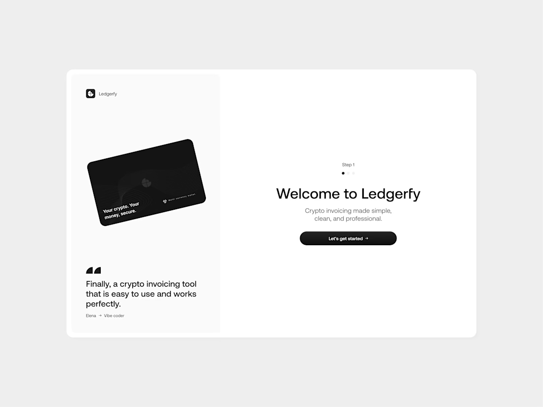

Yes, they're good job bro


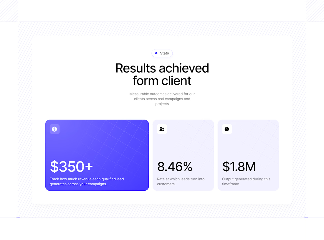
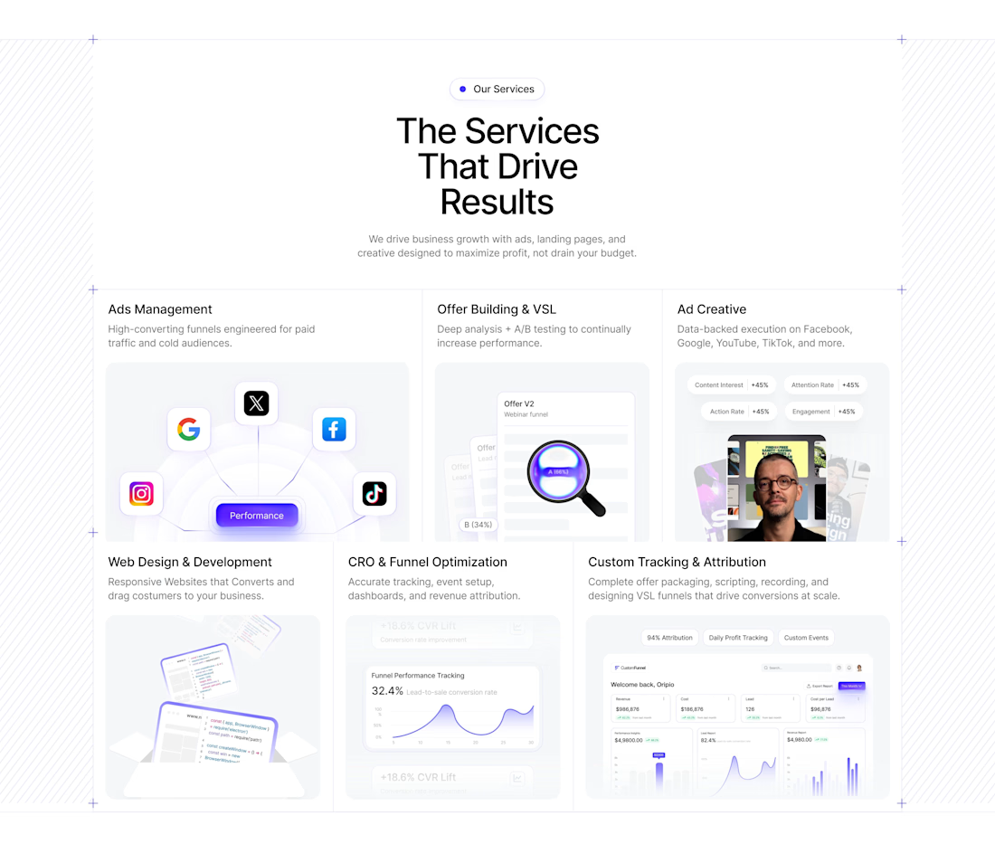

The simplicity here actually makes the whole experience feel more premium.

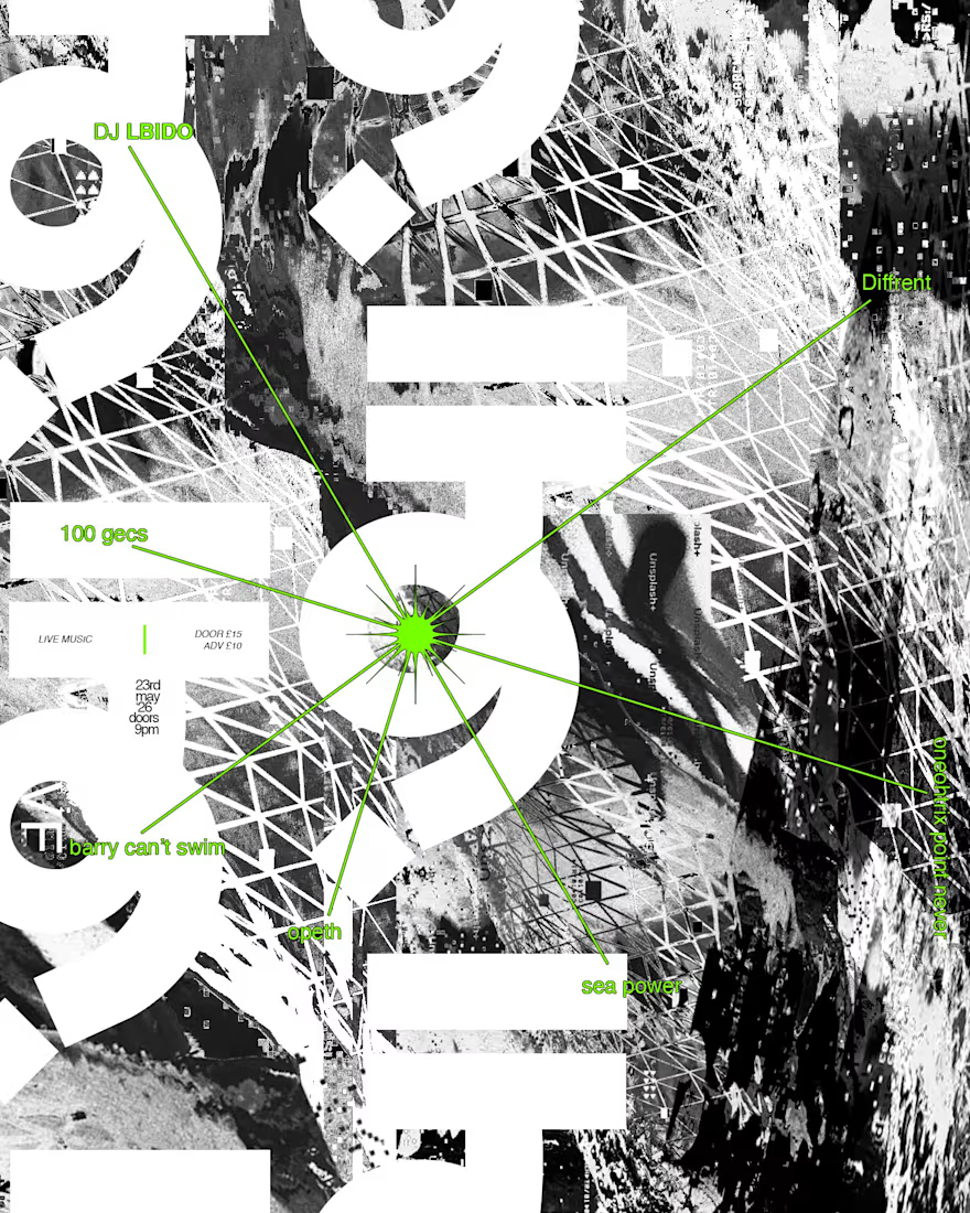
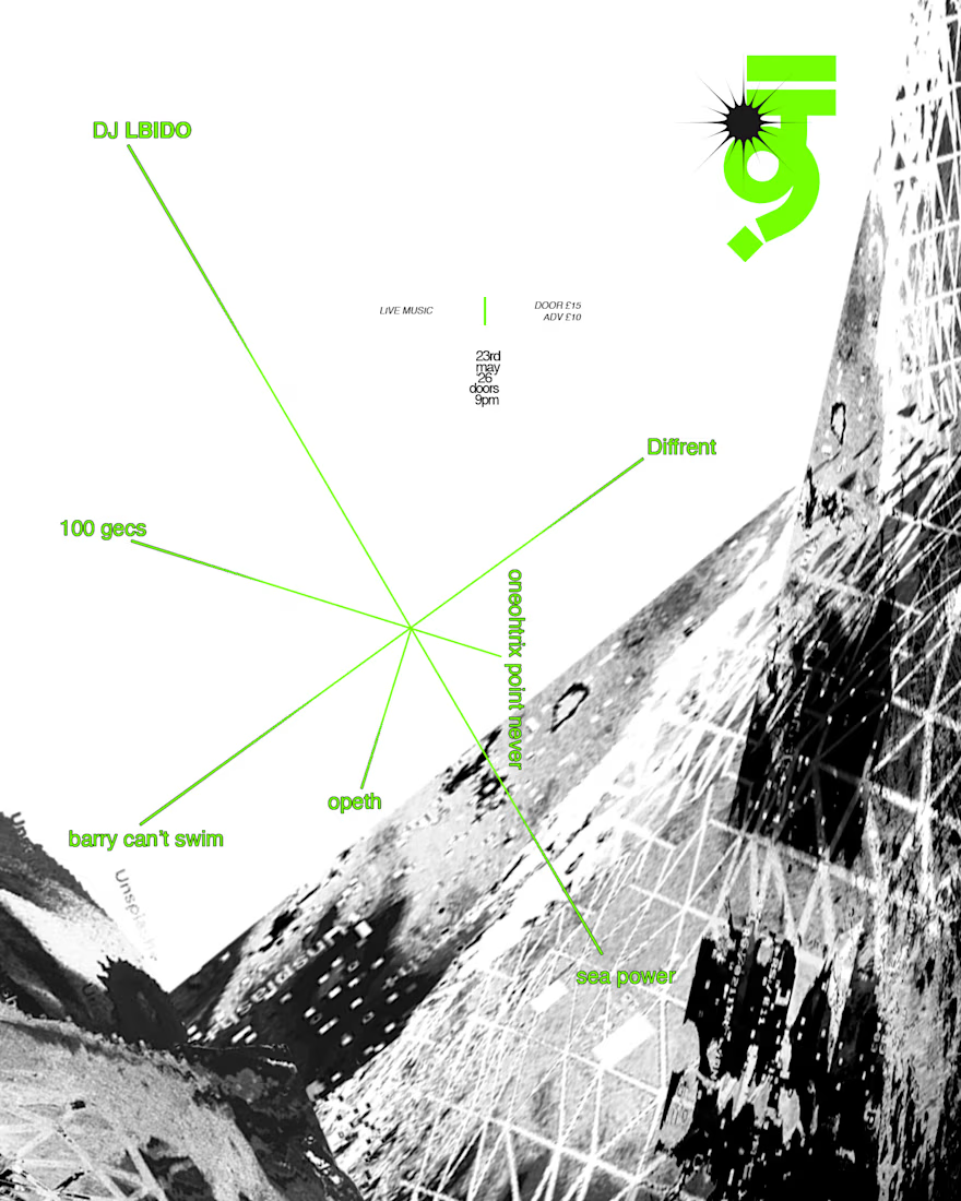
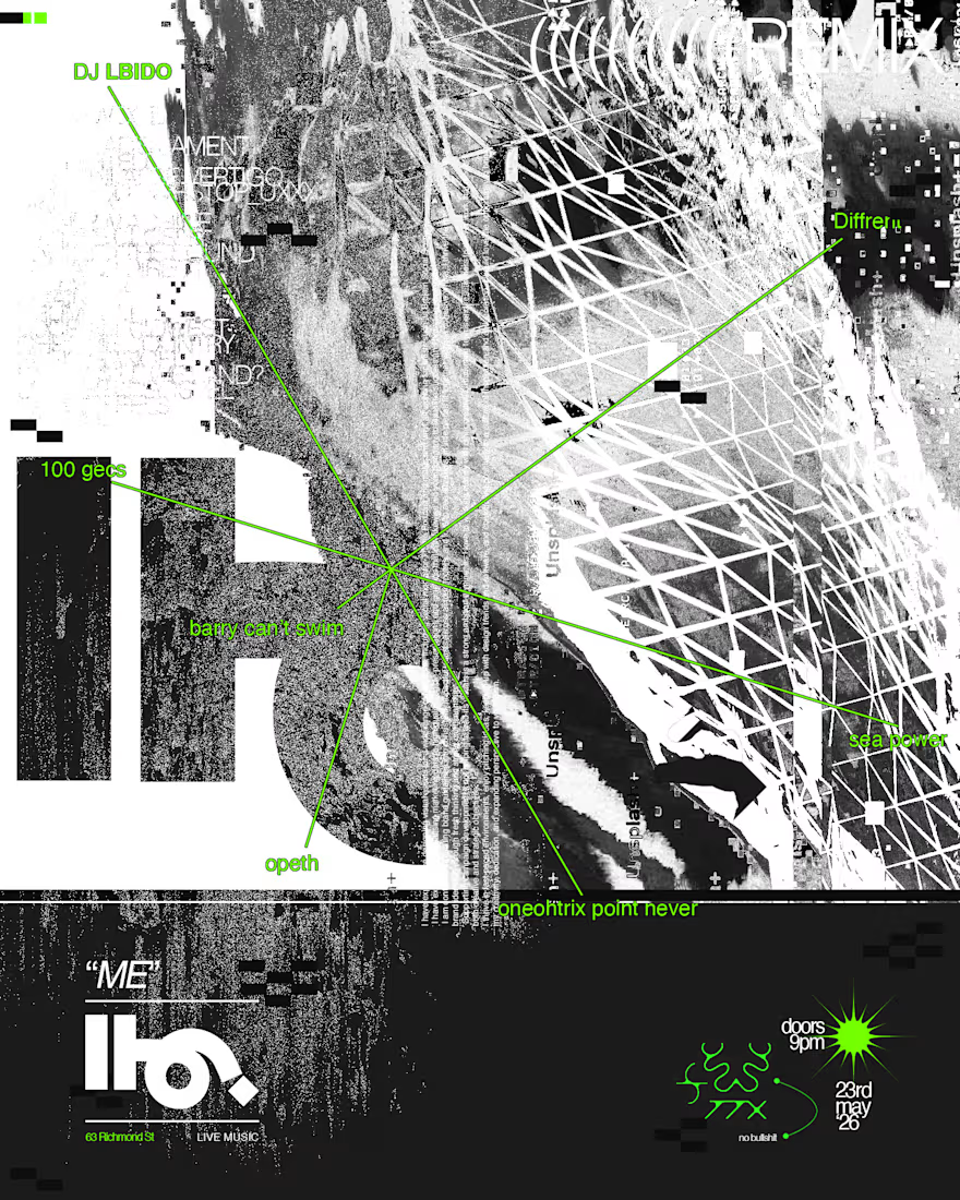
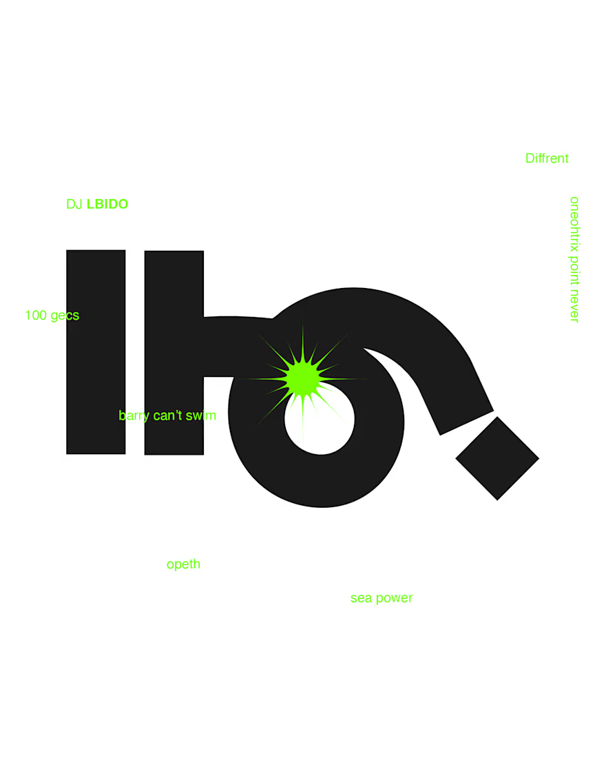
A spontaneous, auto-imaginal workflow inspired by glitching, the early internet and digital splicing. This week we took one of the lost A Palanvara symbols to create these rave posters for an event titled simply "Me" Live. Endeavouring to let go of conscious thought and "design thinking", we embraced the noise, hiding information in plain sight and rebelling against the clarity of information that advertisements usually place front and centre.
Been doing too much overthinking, and want to fill this page with more random, unimportant work. Do you think designers can thrive without order? Tell us what you think!








Trending

Claude
Claude has entered the design space. How are you using Claude Design?

Contra University
Learn from expert creatives how to earn more using next-gen AI tools.
creativeaiflow
Creative AI workflows are evolving. What tools do you use, and what are their strengths and weaknesses?
portfolioreview
The best portfolios tell a story, not just show a grid. Share yours for feedback.
freelancerlife
Freelancer life is wins, pivots, and everything in between. What’s yours right now?