The network for creativity
Join 1.25M professional creatives like you
Connect with clients, get discovered, and run your business 100% commission-free
Creatives on Contra have earned over $150M and we are just getting started
Back to feedPost

🚀 Available for Freelance & Remote Projects
I’m a Web Developer with 6+ years of experience building and improving websites and eCommerce platforms.
💻 What I work with:
• Shopify & Shopify Liquid
• WordPress & WooCommerce
• PHP & MySQL
• React & Next.js
• JavaScript, HTML & CSS
• Custom themes & functionality
• API integrations
• Website speed & performance optimization
I work with businesses, startups, agencies and individuals to build fast, responsive and conversion-focused websites.
Looking for a developer for your next project?
Let’s connect. 🤝
🌐 Portfolio: www.themanportfolio.in
📩 Open to freelance, contract and remote opportunities.
#FreelanceDeveloper #ShopifyDeveloper #WordPressDeveloper #WebDeveloper #Shopify #WordPress #WooCommerce #ReactJS #NextJS #Freelance #RemoteDeveloper #WebDevelopment

Shopify Liquid and WooCommerce is a good combo to offer - the two client conversations are almost opposite though: Shopify clients usually want speed and theme polish, WooCommerce ones are more often fighting plugin conflicts and hosting than the design. Do you find yourself...
The network for creativity
Join 1.25M professional creatives like you
Connect with clients, get discovered, and run your business 100% commission-free
Creatives on Contra have earned over $150M and we are just getting started



Related posts


What makes a website feel cohesive?
It’s not just the colors.
It’s not just the typography.
And it’s definitely not about making every section look the same.
A cohesive website is built when every visual decision feels like part of the same story, from typography and imagery to spacing, buttons, cards, and even the smallest details.
The goal isn’t repetition.
It’s creating a visual language that people recognize and remember.
That’s when a website starts to feel like a brand, not just a collection of sections.
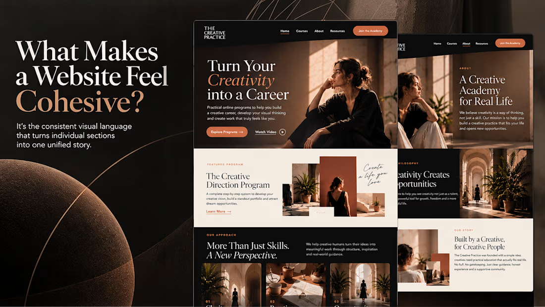

Well put, Serge. Consistent spacing, buttons and cards do more for that feeling than making sections match, and they are usually the first things to drift as a site grows.

Remotlin v1 website redesign is coming soon.
Join the waitlist and find your next remote job.

Smart to open a waitlist before the redesign ships, Alex. Curious whether the job search itself will sit right in the hero for v1.


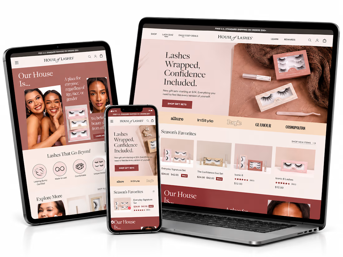
What if finding the perfect lash style was easier than ever? ✨
I’ve been exploring how a beauty eCommerce store can deliver a better shopping experience through thoughtful UI/UX design and conversion-focused strategies.
For this independent redesign concept, I explored a more engaging way to help beauty shoppers discover products, navigate collections, and make confident buying decisions.
A few things I focused on:
1. Clean, premium beauty storefront design.
2. Better product discovery and navigation.
3. Curated product collections.
4. A lash-finder quiz concept to guide shoppers.
5. Clear product presentation and shopping actions.
6. A responsive experience across devices.
My goal with this concept was simple: make the shopping journey feel effortless while keeping the brand visually engaging.
Because a beautiful store is great, but a store that makes shopping easier is even better.
Shopify founders and beauty brand owners: What's more important to you when designing a beauty store — visual experience or product discovery?
#Shopify #ShopifyDesign #ShopifyCRO #EcommerceDesign #UIDesign #UXDesign #ConversionOptimization


This is amazing. I would love to see more of your designs