The network for creativity
Join 1.25M professional creatives like you
Connect with clients, get discovered, and run your business 100% commission-free
Creatives on Contra have earned over $150M and we are just getting started
Back to feedPost

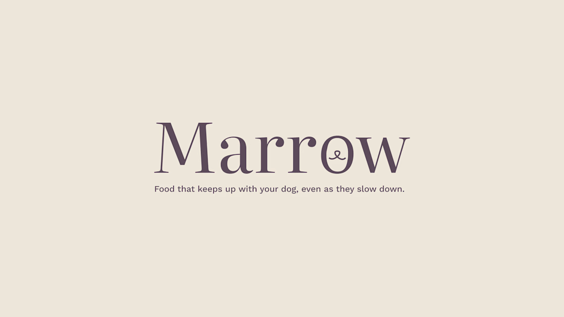
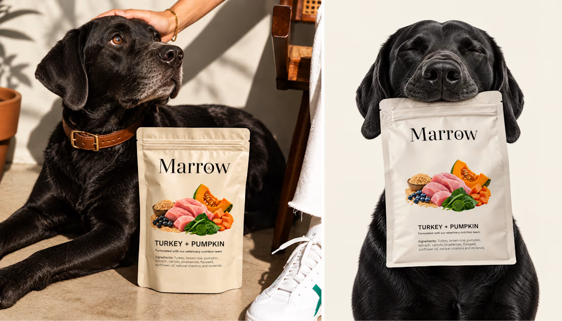
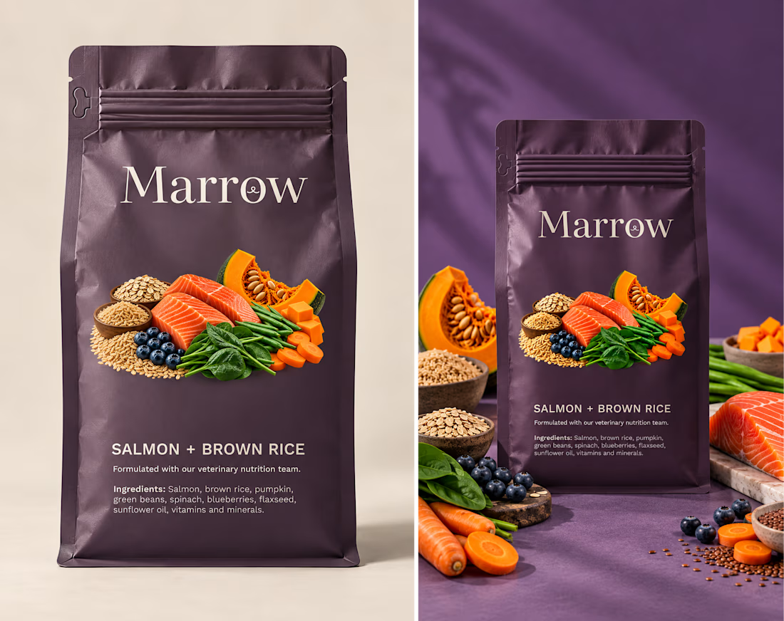
New spec project: Marrow.
Fresh dog food, but not "senior dog food." That distinction is the whole brand.
Every competitor in this category treats life stage like a checkbox on one base recipe. So I went looking for the actual gap — and it wasn't in the science. JustFoodForDogs already formulates real, vet-directed recipes for aging dogs. The gap was in the tone: nobody's doing that level of rigor and still feeling like a brand you'd trust with your dog's last good years.
That correction changed the whole project.
A few things I'm proud of:
→ A tone guardrail that never lets the copy say "aging" — the brand implies the life stage instead of naming it
→ A symbol that survived two rejected directions before landing on something quieter
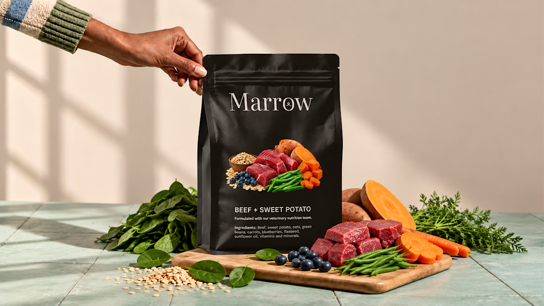
→ A four-color system where every flavor gets its own color, deliberately capping the lineup at four
If your brand needs this kind of strategic groundwork before a single pixel gets placed, that's the work I do.
The network for creativity
Join 1.25M professional creatives like you
Connect with clients, get discovered, and run your business 100% commission-free
Creatives on Contra have earned over $150M and we are just getting started


Related posts


We partnered with SaphoBio, a biotechnology company developing a rapid microbiological release platform for precision sterility testing, to build its brand identity and digital presence from the ground up.
Our work included brand strategy, visual identity, website design, Framer development, and investor-facing materials. The result is a cohesive brand and digital experience that clearly communicates its products, services, and technology.
Explore the full case study here.

This is nice

Interior Design Website
The white flowers on the mantel overlap the headline.
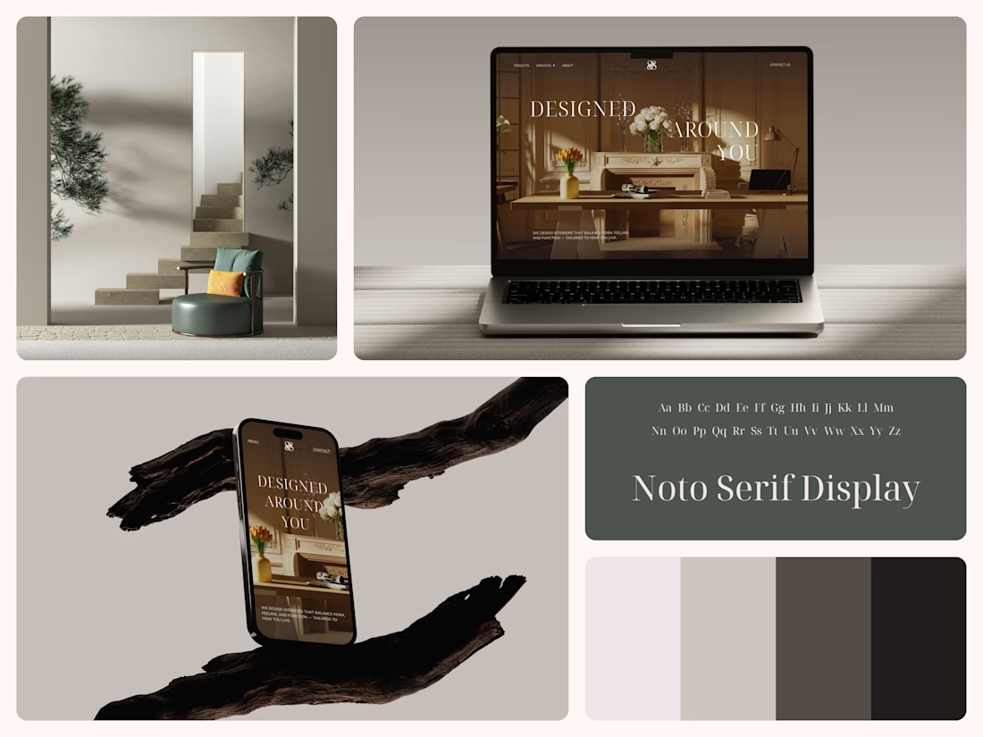
Thin Noto Serif Display capitals step down across one warm photo of a paneled room, so the space stays in view between the words. On the phone, the three words stack in a centered column, with Menu and Contact on either side of the monogram.
The palette runs from soft white to near black, which leaves the color to the photo: orange tulips and warm light on the walls.
The headline reads "Designed Around You", and the hero takes it literally, with the wall behind the type and the flowers in front of it.
Designed by the Hue & Machine team.
#InteriorDesign #InteriorStudio #WebsiteDesign #HomepageDesign #WebDesign #ResponsiveDesign #Typography #EditorialDesign #UIDesign #FigmaDesign


Nice!

Headquaters landing page web design 3D animation website icons


This clean design give a great vibes!!