The network for creativity
Join 1.25M professional creatives like you
Connect with clients, get discovered, and run your business 100% commission-free
Creatives on Contra have earned over $150M and we are just getting started
Back to feedPost

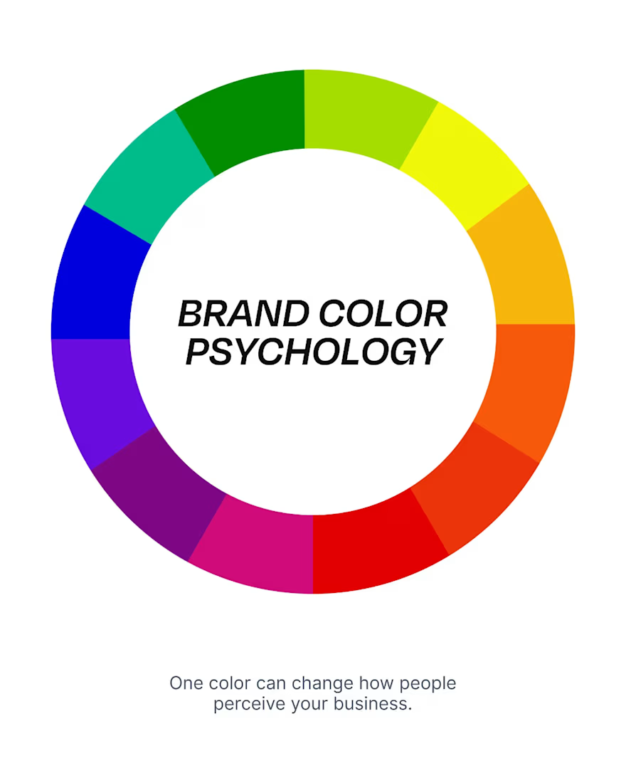
Your brand colors are influencing buying decisions before customers read a single word.
Many businesses choose colors based on personal taste instead of brand strategy. That often creates mixed signals and weakens customer trust.
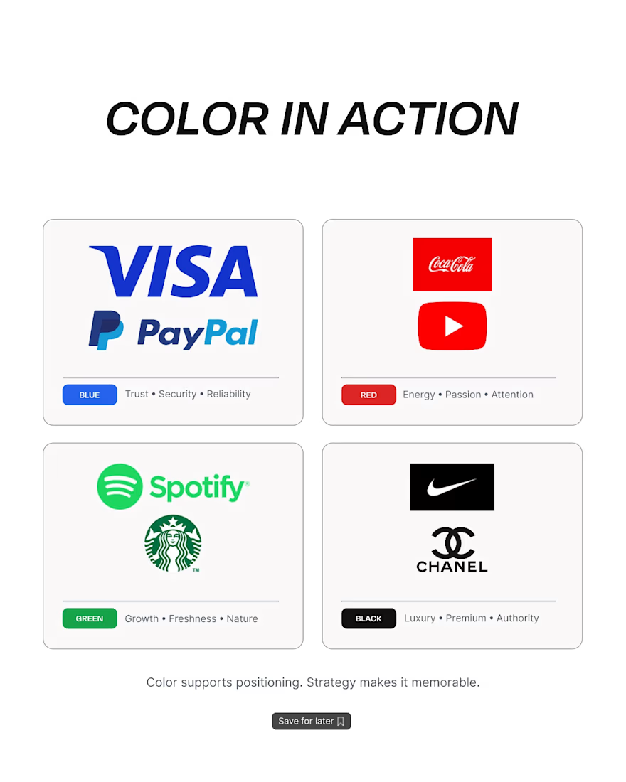
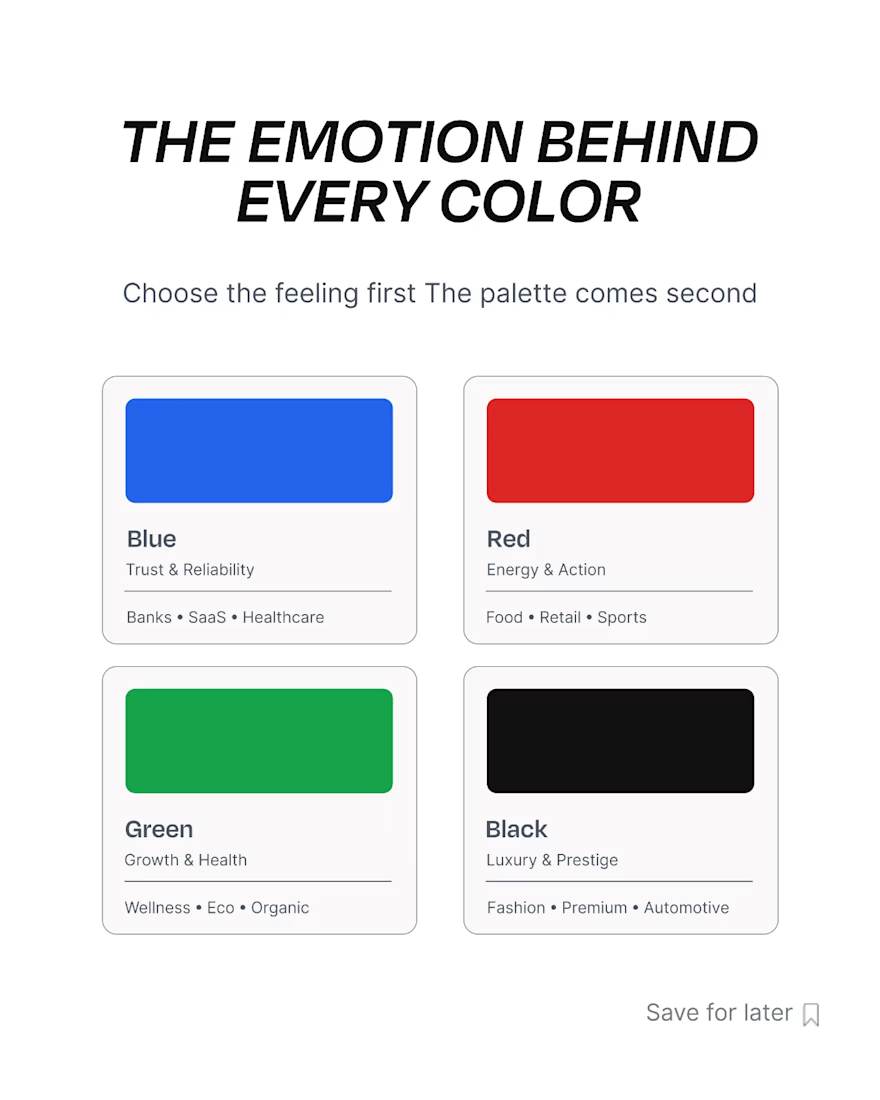
Every color communicates something. Blue builds confidence. Black suggests premium quality. Green represents growth. Red drives attention. The right palette strengthens your positioning. The wrong one creates confusion.
Good graphic design isn't about making a brand look better—it's about making the business more memorable, credible, and easier to trust across every touchpoint, from branding and packaging to social media.
Quick tip: Before choosing a color palette, define how you want customers to feel, not just how you want your brand to look.
What message are your brand colors sending today?
The network for creativity
Join 1.25M professional creatives like you
Connect with clients, get discovered, and run your business 100% commission-free
Creatives on Contra have earned over $150M and we are just getting started





Related posts

Puresip — a fresh identity taking shape.
Built around one idea: make a fruit brand feel refreshing, natural and full of personality without falling into the usual “healthy juice” look.
From Spain, direct to you.
A little preview of the identity and digital direction before the full case study.

Impressive work man


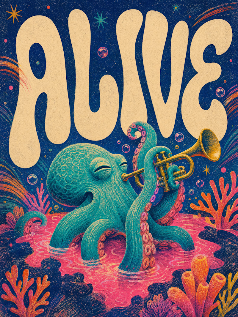
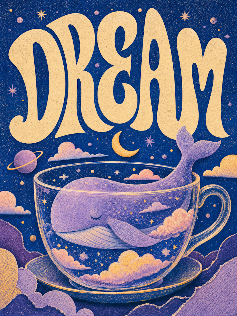
Only one will win, and you get to decide which.
Two AI-generated images. Same creative intent. Different visual outcomes.
The images were generated with AI, but the art direction, visual decisions, composition, styling, and overall creative direction came from me as the human behind the work.
Now comes the real taste test.
Which one has the stronger visual language? Which one feels more intentional, more refined, and more memorable?
11 voted
69%
5 voted
31%
16 votes
Closed

Outstanding work


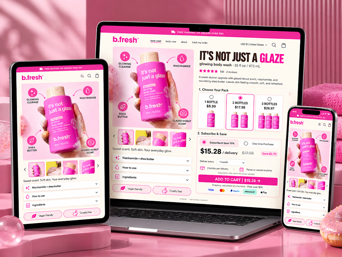
A product page shouldn’t make customers work to buy.
For this eCommerce PDP concept, I focused on removing the small points of friction that can quietly hurt conversions.
The experience brings the most important buying decisions together above the fold:
→ Clear product value proposition
→ Benefit-focused product visuals
→ Reviews and social proof
→ Pack/bundle selection to increase AOV
→ Subscribe & Save option for retention
→ Clear savings and pricing
→ Strong Add to Cart CTA
→ Payment trust signals
→ Shipping clarity
→ Ingredients & usage information
→ Mobile-friendly buying hierarchy
The goal wasn't simply to make the page look good.
It was to answer the questions a shopper has before buying:
What is this? Why do I need it? Can I trust it? Which option should I choose? What will it cost me?
Good eCommerce design reduces the distance between interest and purchase.
#eCommerce #Shopify #CRO #ProductDesign #UIUX #ShopifyDesign #ConversionRateOptimization



This is a really polished presentation. Nicely done!