The network for creativity
Join 1.25M professional creatives like you
Connect with clients, get discovered, and run your business 100% commission-free
Creatives on Contra have earned over $150M and we are just getting started
Back to feedPost

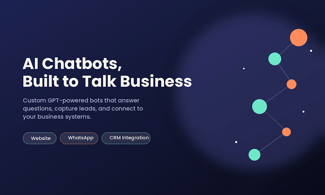
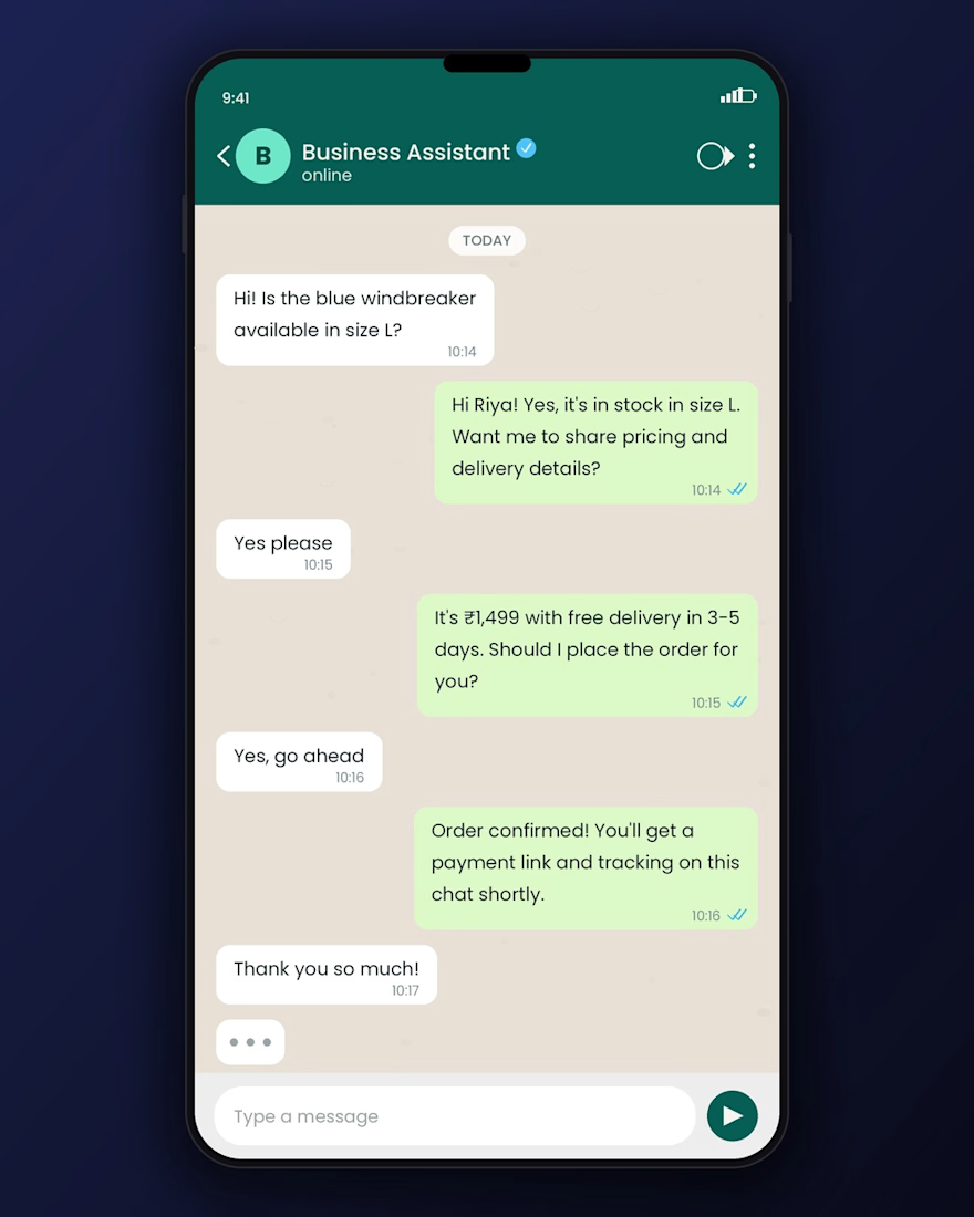
"I build up AI chatbots that handle customer queries 24/7 —"


The network for creativity
Join 1.25M professional creatives like you
Connect with clients, get discovered, and run your business 100% commission-free
Creatives on Contra have earned over $150M and we are just getting started







Related posts

I create clean attractive and professional flyers for businesses events, birthdays, product and more
📪 DM me if you need a design! Let bring your idea to life 🌅
#Graphicdesing#FlyerDesign #Branding#designer#smallBusiness


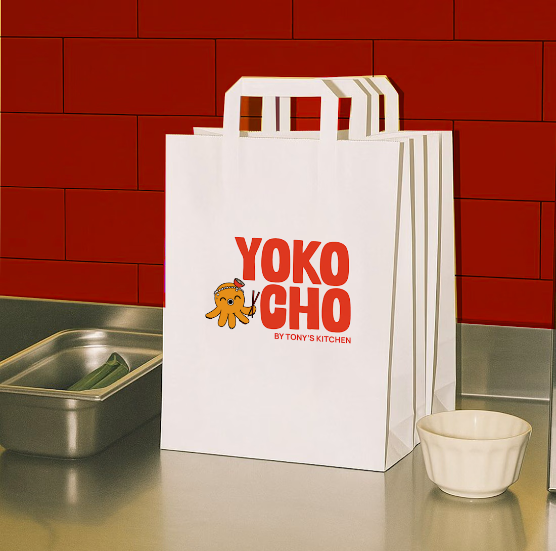
Inspired by the Japanese word "Yokocho (横丁)", meaning the lively side streets lined with small eateries and hidden food spots, this identity was designed to capture the warmth, energy, and charm of Asian street food culture.
The visual identity combines bold typography, a playful octopus mascot with a ramen bowl hat, and vibrant colors to create a brand that's approachable, memorable, and full of personality.
Every element was crafted to make Yokocho feel like more than just a place to eat, it's an experience that brings people together over comforting food and bold flavors.



Top work!!

Visual identity and editorial design for Maren Art Foundation, conceptual mixed media gallery

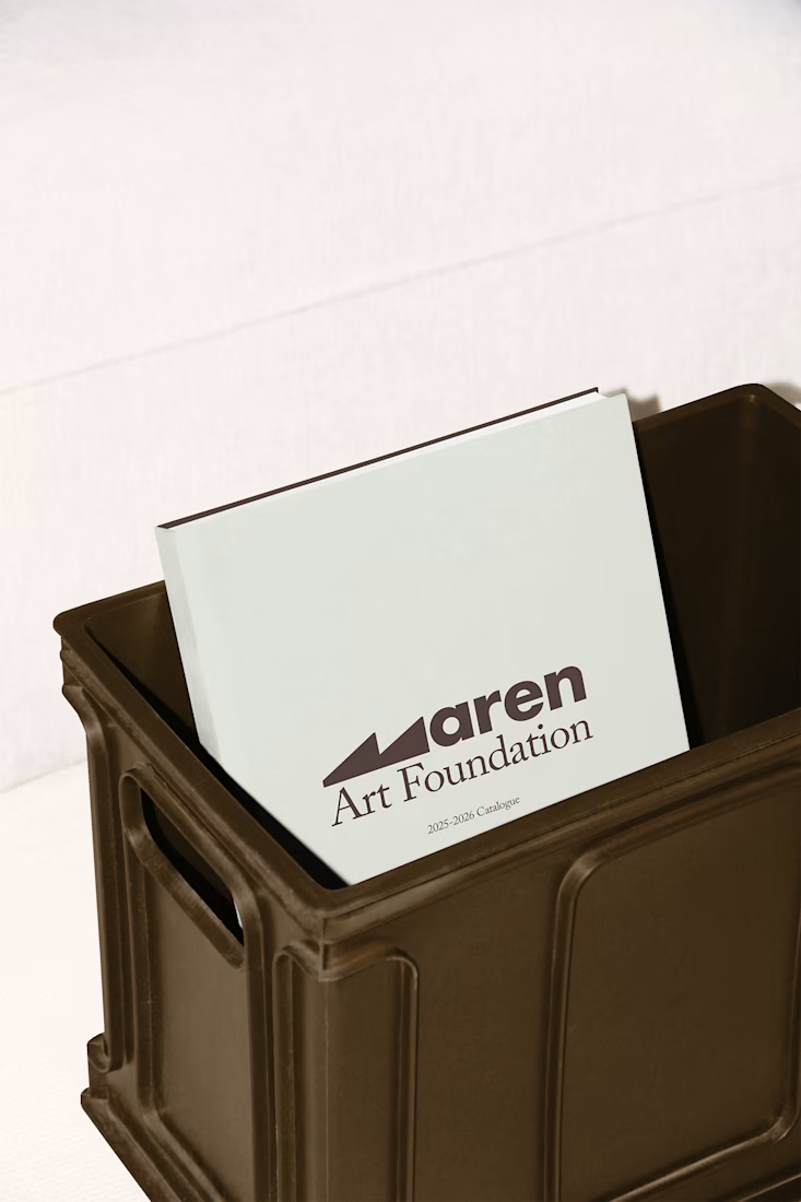
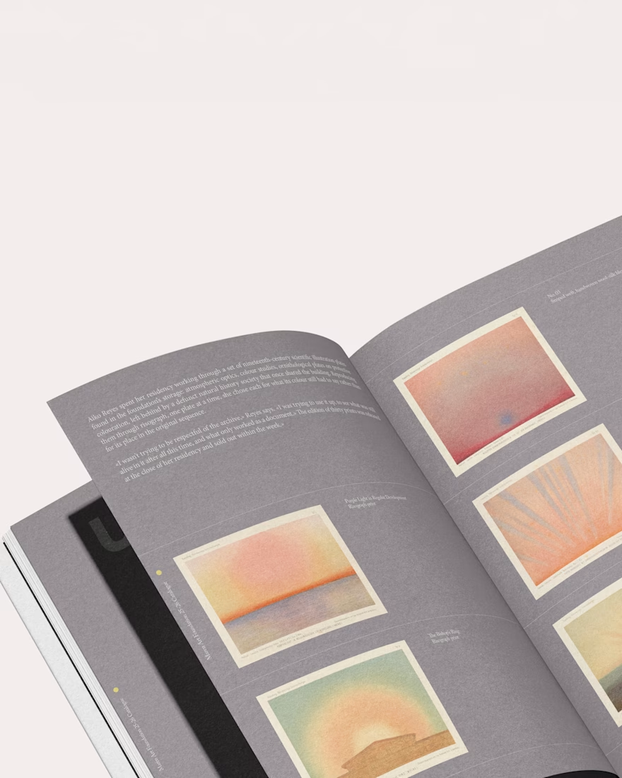
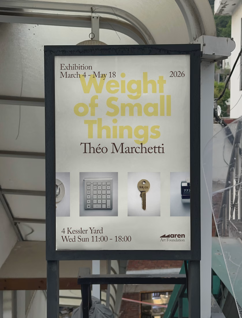
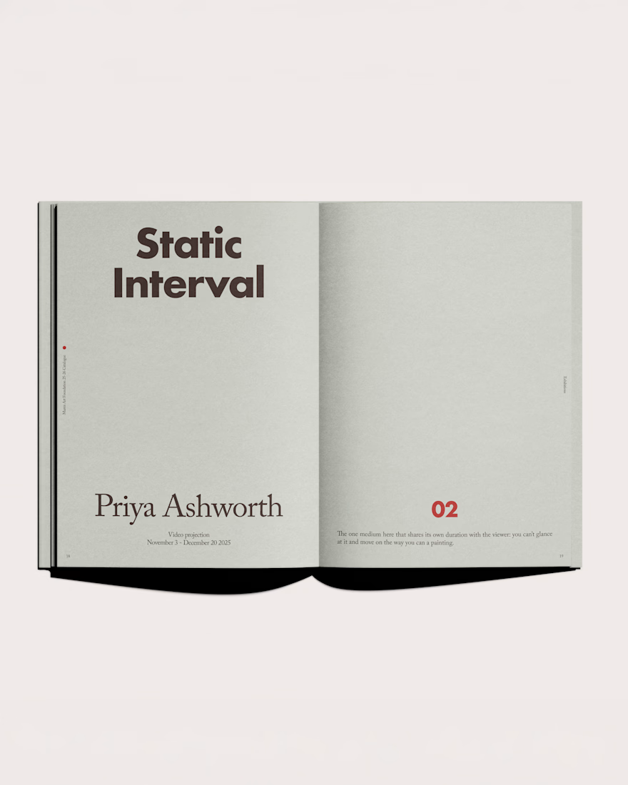

The pairing is doing the heavy lifting here: heavy grotesque for the show title, serif for the artist name, held steady across both exhibitions while the accent colour is the one thing allowed to move per show. That feels like the right place to put the flex for a gallery. Is...