The network for creativity
Join 1.25M professional creatives like you
Connect with clients, get discovered, and run your business 100% commission-free
Creatives on Contra have earned over $150M and we are just getting started
Back to feedPost

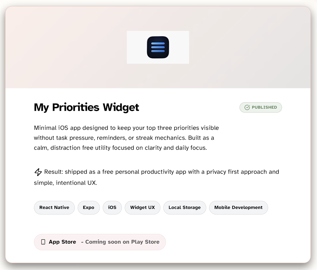
Published calm, privacy first iOS focus app with widget UX.


The network for creativity
Join 1.25M professional creatives like you
Connect with clients, get discovered, and run your business 100% commission-free
Creatives on Contra have earned over $150M and we are just getting started

Challenges
View all


Related posts


A look at my design work for Tithe, an app built around being more deliberate with your attention.
That idea carries into the design too. Soft blue and warm neutrals give the screens a quiet feel, while direct copy makes the next step clear.
There’s a lot happening across the product, from choosing what deserves your focus to earning your way back into blocked apps. The challenge is making each of those moments feel simple – @BrightStudios®


Amazing work Daniel🙌


Very good 😂

Designed and built a card purchase interaction for the iPhone Duo.

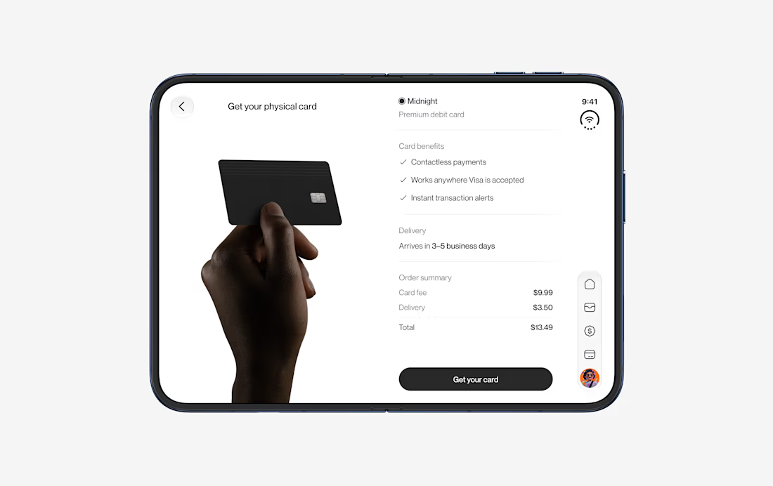
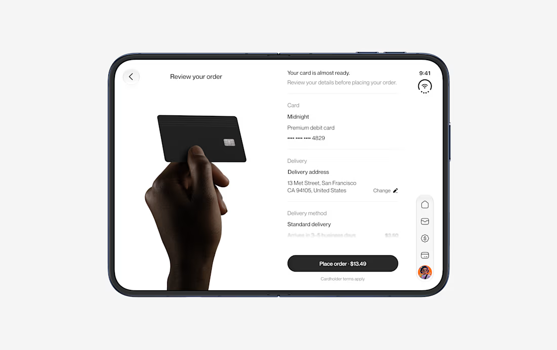
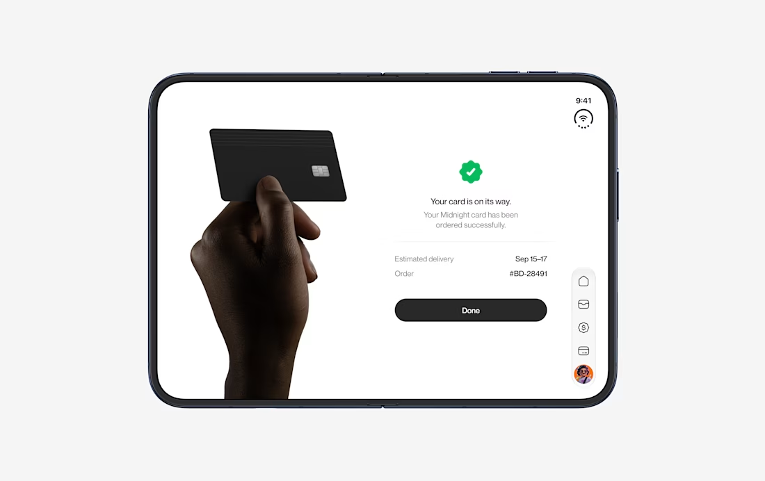

Love how the purchase flow stays focused while still showing the full iPhone Duo journey. The repeated card framing makes the interaction feel easy to follow.