The network for creativity
Join 1.25M professional creatives like you
Connect with clients, get discovered, and run your business 100% commission-free
Creatives on Contra have earned over $150M and we are just getting started
Back to feedPost


People keep saying "carousels are dead."
I don't think so. 𝗕𝗼𝗿𝗶𝗻𝗴 𝗼𝗻𝗲𝘀 𝗮𝗿𝗲. 💀
Here's what I've noticed: nobody has time to read. You get about 3 seconds before the scroll wins.
So I design every carousel around 4 things:
👁️ 𝗟𝗲𝘀𝘀 𝘁𝗲𝘅𝘁, 𝗺𝗼𝗿𝗲 𝘃𝗶𝘀𝘂𝗮𝗹𝘀.
Visuals do the talking, text only finishes the sentence.
🪝 𝗔 𝗵𝗼𝗼𝗸 𝘁𝗵𝗮𝘁 𝘀𝗽𝗮𝗿𝗸𝘀 𝗰𝘂𝗿𝗶𝗼𝘀𝗶𝘁𝘆 𝗼𝗿 𝗳𝗲𝗮𝗿.
Make them need to know more.
🎨 𝗦𝗶𝗺𝗽𝗹𝗲 𝗱𝗲𝘀𝗶𝗴𝗻 𝗿𝘂𝗹𝗲𝘀.
2 fonts, 3-4 colors, 1 idea per slide.
🧭 𝗔 𝘀𝘁𝗼𝗿𝘆 𝗳𝗹𝗼𝘄.
Hook → Tension → Value → CTA. Bullets, not paragraphs.
And end with one clear command. No long explanation needed.
If your carousels still look dead, send me a DM and let's bring them to life.
Follow me Naeem Sagheer, for more design and LinkedIn tips.
P.S. 𝗪𝗵𝗮𝘁'𝘀 𝘁𝗵𝗲 𝗳𝗶𝗿𝘀𝘁 𝘁𝗵𝗶𝗻𝗴 𝘆𝗼𝘂 𝗱𝗼 𝘄𝗵𝗲𝗻 𝗰𝗿𝗲𝗮𝘁𝗶𝗻𝗴 𝗮 𝗰𝗮𝗿𝗼𝘂𝘀𝗲𝗹? Tell me in the comments 👇
#LinkedInCarousel #CanvaDesign #GraphicDesign #ContentCreation #PersonalBranding #LinkedInTips


The network for creativity
Join 1.25M professional creatives like you
Connect with clients, get discovered, and run your business 100% commission-free
Creatives on Contra have earned over $150M and we are just getting started





Related posts




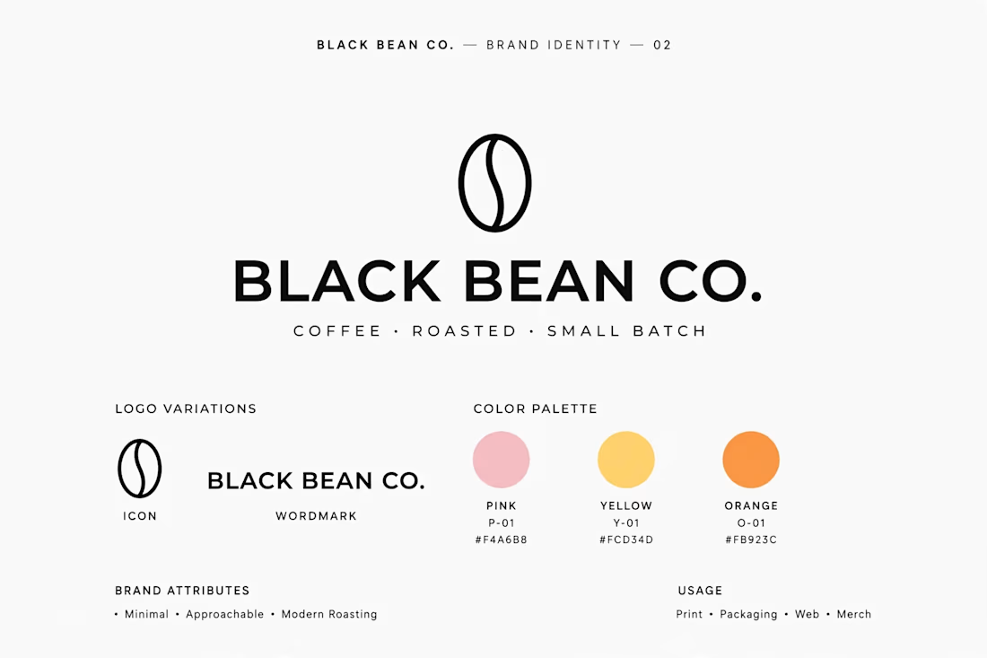
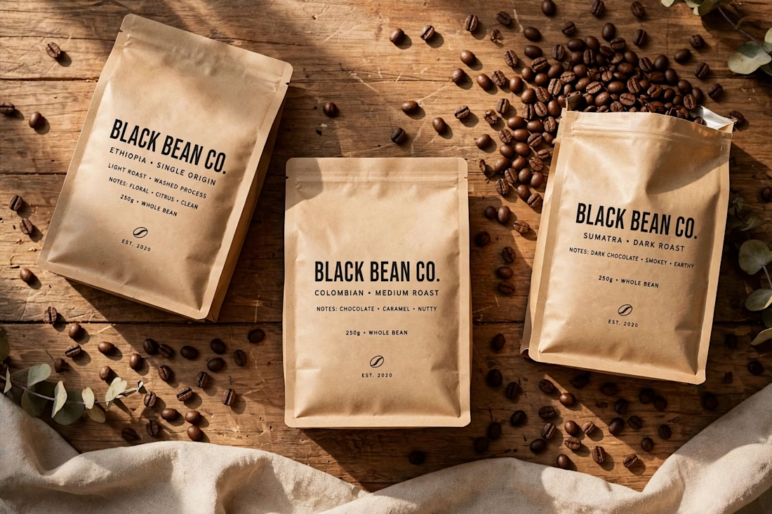
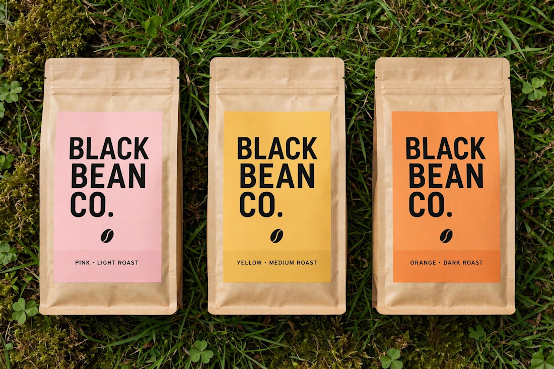

Love the clean, minimal aesthetic! The combination of a strong, simple coffee bean icon with warm pastels (pink, yellow, orange) gives it such an approachable and modern feel. Great identity system!

🎬 Raw Footage → Polished, Engaging Content
Here’s a quick Before vs. After from one of my talking-head video edits.
Clean cuts, better pacing, motion graphics, sound design, captions, and color grading can completely change the way a video feels — and how long viewers stay engaged.
I help creators, founders, and brands turn raw footage into professional content built to hold attention.
Currently open to freelance projects and long-term editing partnerships.
📩 Need a video editor for your content? DM me or send a connection request.
#VideoEditing #VideoMarketing #ContentCreation🔥


The pacing improvement is immediately clear.