The network for creativity
Join 1.25M professional creatives like you
Connect with clients, get discovered, and run your business 100% commission-free
Creatives on Contra have earned over $150M and we are just getting started
Back to feedPost
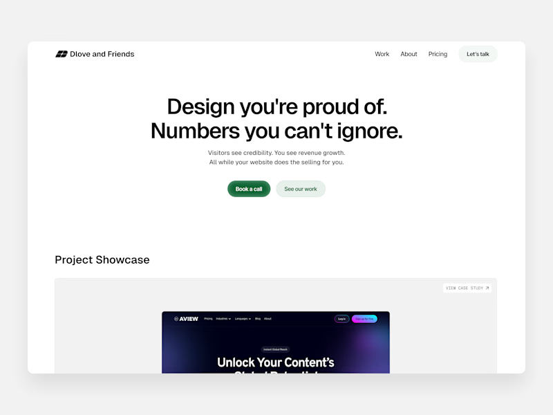
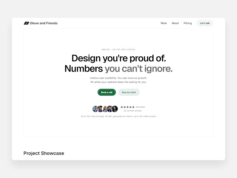
Taste Test
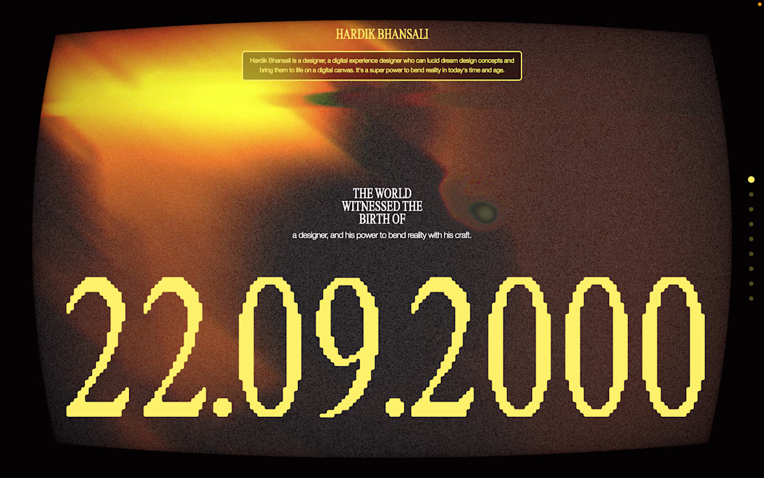
Took some time this past weekend to make some additions to my portfolio site
Two changes: Added eyebrow text to sit above my heading (a sneaky H1 for SEO), and social proof below the buttons to nudge visitors into booking a call or seeing my work
Which one looks better?
21 voted
28%
55 voted
72%
76 votes
Closed

after for sure! the social proof below the CTAs is a nice touch

Thanks Cameron!

after is good

I personally really like the space that it fills and how gives it a more complete feel.
I agree!

Surely before is better from a structure point of view because you can immediately see the work peeking above the fold.
Great point, teasing and getting straight to the work is the easiest way to get users to scroll usually lol

My same thoughts!

The redesign looks great and better.
Thank you!

Yes, the social proof makes a world of difference. This is really good work!
I think so too! Just a little change makes so much difference haha. Thanks!

I like that the before allows you to see the projects directly from the hero section, making visitors curious and want to scroll.
That's a fair insight!

Putting on my critical hat. Outline seems unnecessary. I prefer seeing a peak of the project. Not sure anyone's reading that tiny text, and it's a lot to digest. A bit unsure what you do. I see Webflow, SEO, Design. What numbers? Why can't I ignore them?
Broadly, I wonder if...
Thanks for the input! I appreciate the honest feedback haha
I wonder about the headline as well, maybe I can tweak it to be more straightforward instead of trying to get too cute with it

Instead of
"Which one looks better?"
Build both, A/B test then ask
"Which one performs better?"
Good idea!

Looking neat and simple!
Thanks!

I like the after

Hierarchy is excellent — everything is clear at first glance.
Thanks Shanto!

The settle change are clean! I like the adding grey scale to parts typography.
-
Thanks Scott!
The network for creativity
Join 1.25M professional creatives like you
Connect with clients, get discovered, and run your business 100% commission-free
Creatives on Contra have earned over $150M and we are just getting started
Related posts
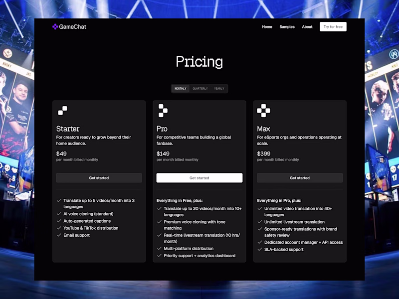
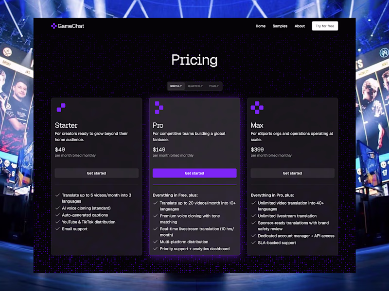
Pricing pages for an eSports focused AI translation SaaS. One that is more minimal or the more detailed version.Which pricing page looks the best, and why do you think so?


39 voted
43%
52 voted
57%
91 votes
Closed

The icons looks like the logo, so it should also take the colour


The fastest way to know your brand is broken isn't a survey. It's listening to your sales team's first 30 seconds on a call.
If they're saying anything that contradicts the homepage, the brand is already losing deals.
I worked with a B2B platform last year where the founder kept apologizing on calls: "ignore the website, it's a bit out of date." Eight months out of date, in fact. They'd repositioned, moved upmarket, added a second product. The site was still selling to the company they used to be.
The "rebrand" they thought they needed was a homepage that didn't make their own sales team flinch.
We killed the identity scope mid-project. Locked the positioning. Rewrote the narrative around the new buyer. Rebuilt the homepage and one product page in Framer. Tuned the existing visual system to match.
Three weeks of work. The apology disappeared from sales calls. The "rebrand" conversation went with it.
Most brand problems aren't brand problems. They're surface problems wearing a brand costume. And the surface that lies loudest is almost always the one your sales team is trying to hide.

Looks great


This is nice and interesting


Trending


FLORA
Reusable workflows are replacing one-off prompts in creative AI. Share what you're building in FLORA.

Contra University
Learn from expert creatives how to earn more using next-gen AI tools.
creativeaiflow
Creative AI workflows are evolving. What tools do you use, and what are their strengths and weaknesses?
portfolioreview
The best portfolios tell a story, not just show a grid. Share yours for feedback.
freelancerlife
Freelancer life is wins, pivots, and everything in between. What’s yours right now?