The network for creativity
Join 1.25M professional creatives like you
Connect with clients, get discovered, and run your business 100% commission-free
Creatives on Contra have earned over $150M and we are just getting started
Back to feedPost
Most startup websites are judged before they are fully understood.
The founder may know the product is strong.
The technology may be impressive.
The team may be credible.
But the visitor does not know any of that yet.
They begin with fragments:
A headline.
A visual style.
A logo.
A few interface details.
A general feeling of quality or lack of it.
That first impression determines how generously the rest of the website is interpreted.
If the company feels credible, people are more willing to explore.
If it feels unclear or unfinished, every claim has to work harder.
A practical five-second review:
What does the company appear to do?
Who does it appear to be for?
What level of company does it feel like?
What is the most obvious next action?
What emotion does the page create?
Do not evaluate only whether the hero looks good.
Evaluate the assumptions it encourages the visitor to make.
People often decide how seriously to take a company before they understand the details.
Design that moment deliberately.


Great design but presentation is even better. Good work!


Thank you for your kind words.

The network for creativity
Join 1.25M professional creatives like you
Connect with clients, get discovered, and run your business 100% commission-free
Creatives on Contra have earned over $150M and we are just getting started








Related posts


Three weeks into building the Pasted website, after the design was approved, an 11-page document arrived with a whole new vision.
It was beautiful work, and it described a different project at the agreed price.
I asked them to decide: keep the approved scope, or pause and price the new idea separately. On day six, they chose the original. We shipped two weeks later.


Offering to price the new vision as its own phase also lets the client see what the idea costs without it feeling like a no. Was a change-order process already written into your contract, or did you build that path on the spot?

AURIXIT — Luxury Headphones Landing Page 🎧💗
A vibrant landing page concept for a premium audio brand, combining luxury sound, fashion-inspired visuals, and a bold digital experience
The design brings together bright magenta tones, oversized typography, lifestyle photography, and clean UI elements to create a modern, eye-catching aesthetic
Special attention was given to:
• Bold lifestyle-focused hero composition
• Vibrant pink and magenta color palette
• Clean, oversized typography
• Music playlist and suggested tracks
• Premium headphone presentation
• Clear CTA and minimal navigation
• Responsive mobile experience
The result is a fresh, stylish landing page that connects premium audio technology with fashion, music, and personal expression ✨

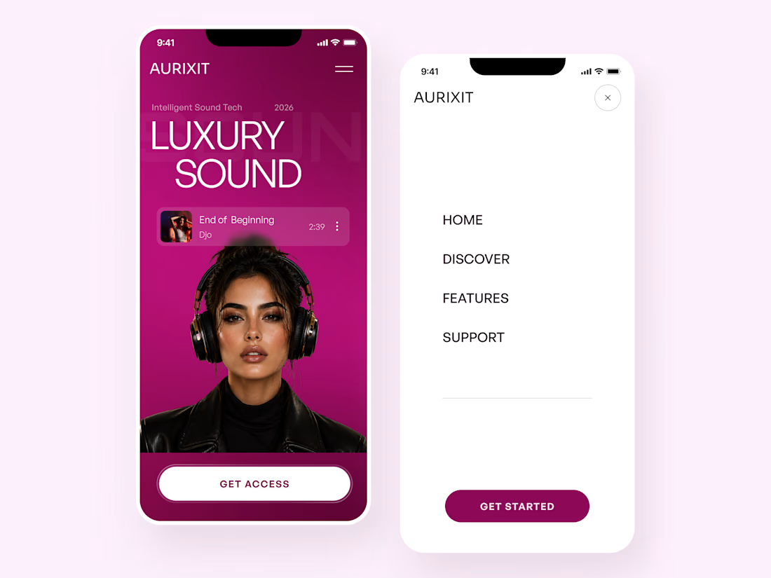
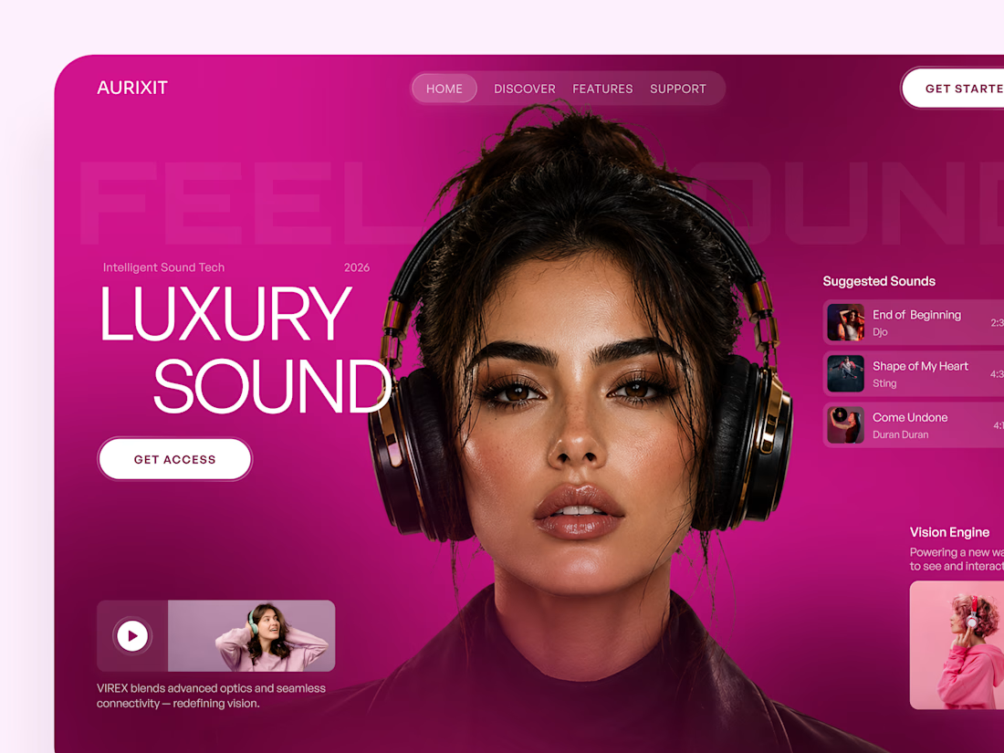
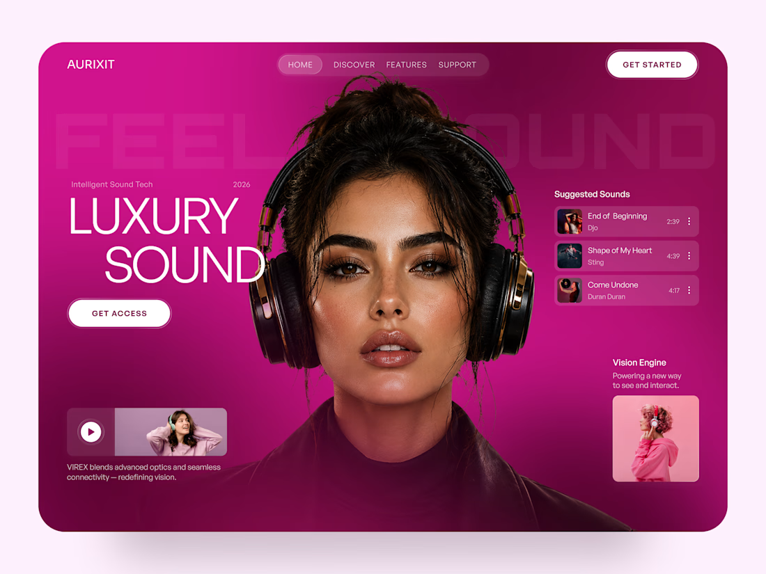

Magenta with the black headphones really pops. Was the small playlist text on pink tricky for contrast?


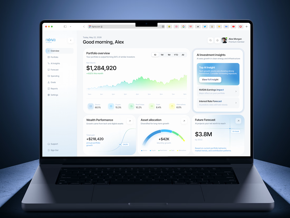
Insanely smooth and elegant dashboard concept! Love the color palette and typography. Outstanding work!