The network for creativity
Join 1.25M professional creatives like you
Connect with clients, get discovered, and run your business 100% commission-free
Creatives on Contra have earned over $150M and we are just getting started

The network for creativity
Join 1.25M professional creatives like you
Connect with clients, get discovered, and run your business 100% commission-free
Creatives on Contra have earned over $150M and we are just getting started





Related posts

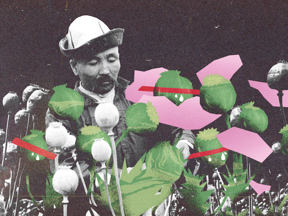
Three editorial collages from my archive.
I combine archival photography, bold graphic shapes, and grainy textures. These pieces were built digitally, with the rough edges and layered feel of printed cutouts.
Open to editorial illustration and cover commissions.





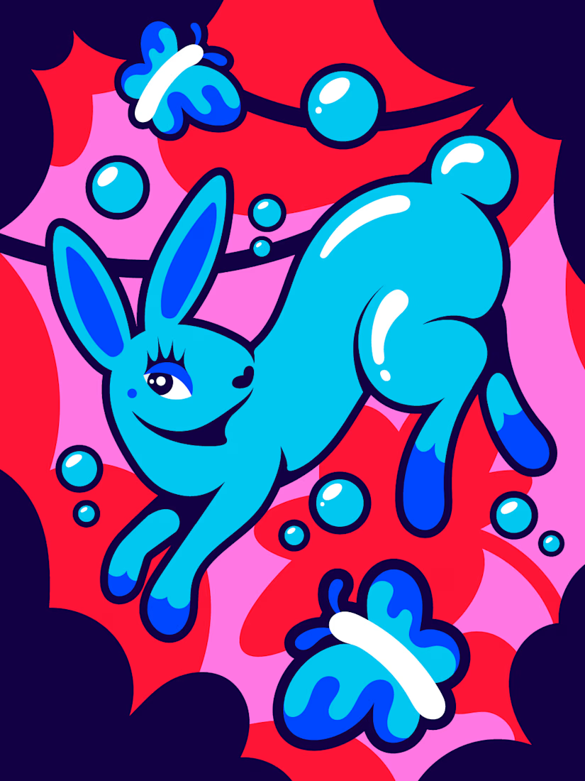

I truly love the the illustration

Illustrations grab attention.
Text explains what you're looking at.
It's that simple.
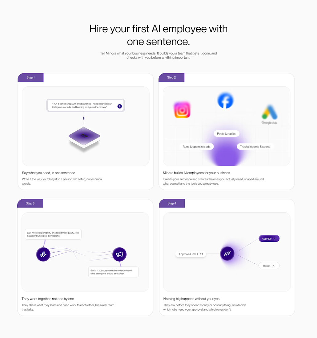
A good illustration can communicate most of the intent before the user even reads the text.
So instead of using illustrations just to make a section look good
I designed them to visually explain what the product does and what the user is looking at.
The idea was simple:
Show the intent visually.
Use the text to add context.
When the illustration and copy work together, users can understand the concept without having to read through a wall of text.
This is the idea behind my “How it works” design concept.

professional