The network for creativity
Join 1.25M professional creatives like you
Connect with clients, get discovered, and run your business 100% commission-free
Creatives on Contra have earned over $150M and we are just getting started
Back to feedPost

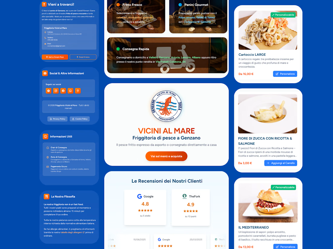
Friggitoria Vicini al Mare is a seafood restaurant in Genzano di Roma serving nearby areas such as Velletri, Ariccia and Albano. The client needed a controlled delivery system due to different zones and logistical constraints.
The challenge was managing rules like minimum order amounts, time slots and availability based on location. Without strict control, orders risked becoming inefficient and unprofitable.
I developed a custom web application that allows the restaurant to define delivery areas and enforce specific rules for each zone. Customers can place orders for delivery or pickup through a simple interface, with payments handled via Stripe.
The system ensures each order res:pects operational constraints, improving efficiency and protecting margins.
Technologies: Laravel, Stripe


The network for creativity
Join 1.25M professional creatives like you
Connect with clients, get discovered, and run your business 100% commission-free
Creatives on Contra have earned over $150M and we are just getting started

Challenges
View all


Related posts

What if construction felt as clear as the space it creates?
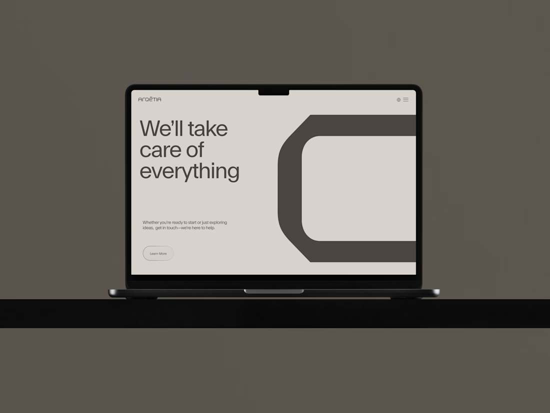
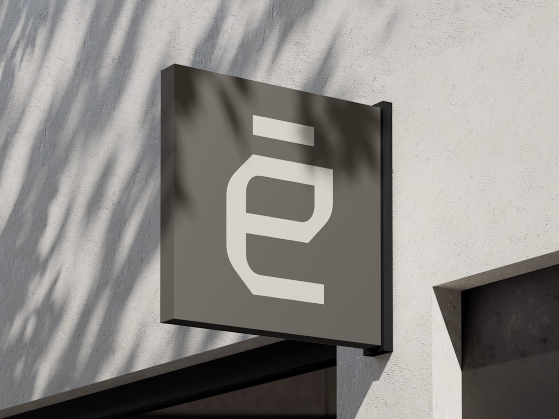
For Arqētia, we built a visual identity around one of the industry's most important client needs: transparency. A direct response to the uncertainty often associated with construction, from unclear processes and budgets to timelines and decision-making.
The concept makes transparency tangible, translating it into a visual system that feels open, structured and precise.
check it out



Very clean identity work


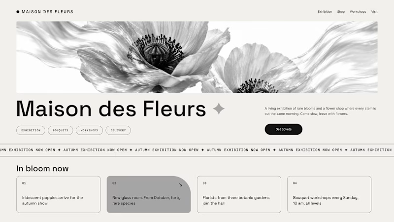
Should a flower shop ever go black and white?
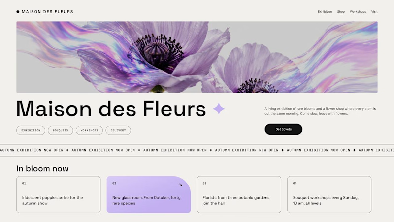
Same flower house, same layout. We only took the color out.
1. Full color. The iridescent petals do the selling: lilac, pink, a little shimmer. The photo is the brand, and every accent on the page borrows from it.
2. Monochrome. No color at all. Shape, texture and typography have to carry everything, and the page suddenly reads like a gallery catalogue.
Color sells the flower. Monochrome sells the exhibition.
Which one would get you through the door?
67 voted
91%
7 voted
9%
74 votes
Closed

The problem with monochrome is that, throughout computer history, it has conditioned users to associate gray and monochrome with being disabled, dysfunctional, or something to ignore and avoid.

Hi :) This is a journey through asteroids into the heart of a star. Built with Three.js, React Three Fiber, and custom GLSL shaders. Liquid images, interactive particle typography, and a core that opens under your cursor.


Man... this is cool. 😍