The network for creativity
Join 1.25M professional creatives like you
Connect with clients, get discovered, and run your business 100% commission-free
Creatives on Contra have earned over $150M and we are just getting started
Back to feedPost

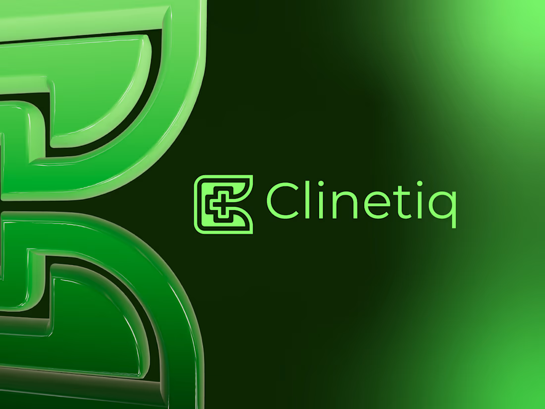
Clinetiq is a redesigned medical logo concept created with a cleaner geometric structure and improved visual balance. The symbol combines the letter C with a medical cross, representing healthcare, care, trust, and professional medical services. The redesigned mark focuses on simplicity, scalability, and strong recognition, making it suitable for clinics, hospitals, health technology companies, medical centers, and digital healthcare platforms. Its modern minimalist style ensures consistent performance across both digital and print applications.


The network for creativity
Join 1.25M professional creatives like you
Connect with clients, get discovered, and run your business 100% commission-free
Creatives on Contra have earned over $150M and we are just getting started
Trending

Claude
Claude has entered the design space. How are you using Claude Design?

Contra University
Learn from expert creatives how to earn more using next-gen AI tools.
creativeaiflow
Creative AI workflows are evolving. What tools do you use, and what are their strengths and weaknesses?
freelancerlife
Freelancer life is wins, pivots, and everything in between. What’s yours right now?












Related posts

Exclusive Letter A With Spark Logo — available for purchase.
An abstract letter A crafted from clean geometric shapes, with a clever negative-space spark at the apex evoking innovation, insight, and rapid activation. Designed for AI startups, tech platforms, educational tools, and energy innovators. Sold exclusively to one buyer with full copyright transfer.
🔗 https://brandforma.com/work/letter-a-with-spark-logo-for-sale
Design by Bohdan Harbaruk // Brandforma Studio
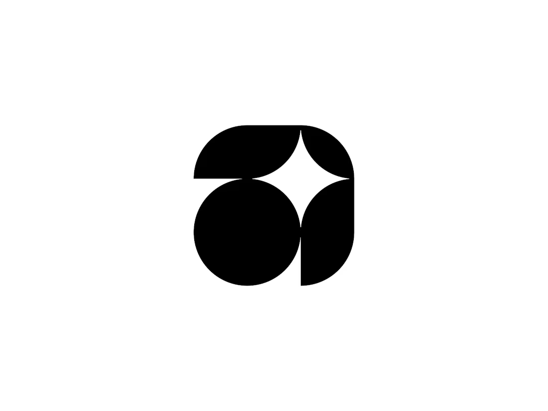
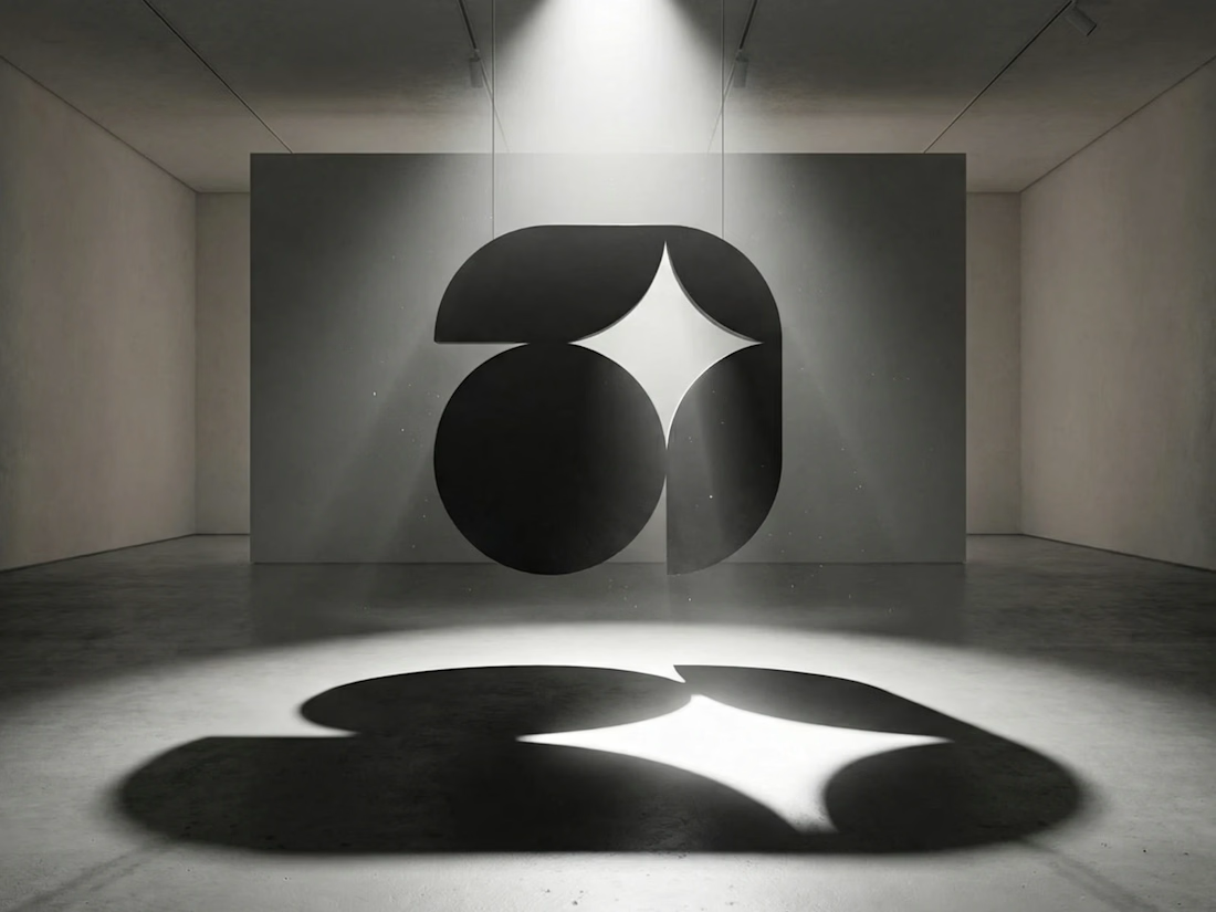
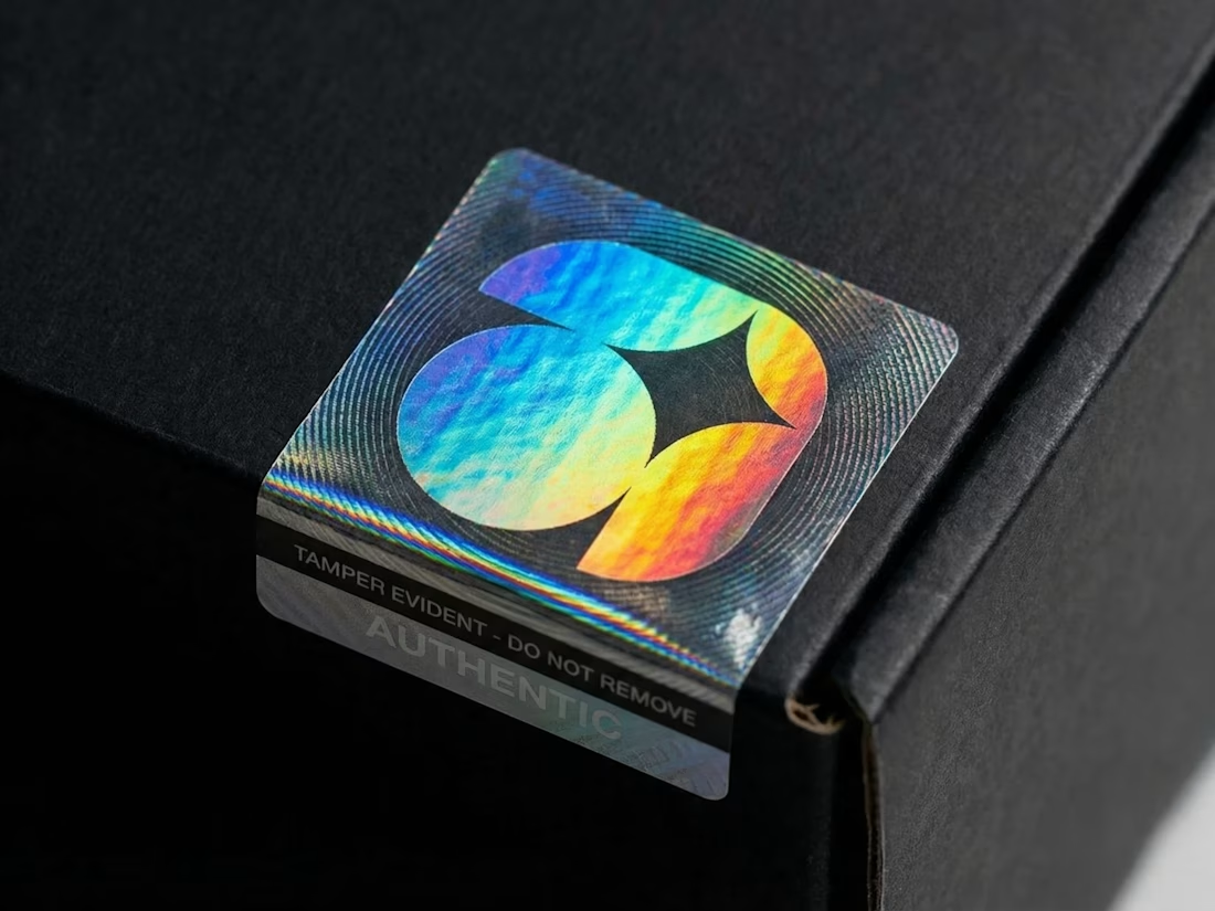

The negative space spark reads instantly without needing the caption to explain it, that's the real test for a mark like this. Selling pre-made logos exclusively seems like such a smart side channel, does it actually move at a pace worth the design time, or is it more of a portfolio play?

🌿 Which OPTIMA design grabs your attention?
Vote for your favorite and tell me why! 👇
🟢 01 – Botanical Calm 🌼
🟢 02 – Creamy Soy 🥛
Your feedback helps shape better designs. 💚
25 voted
31%
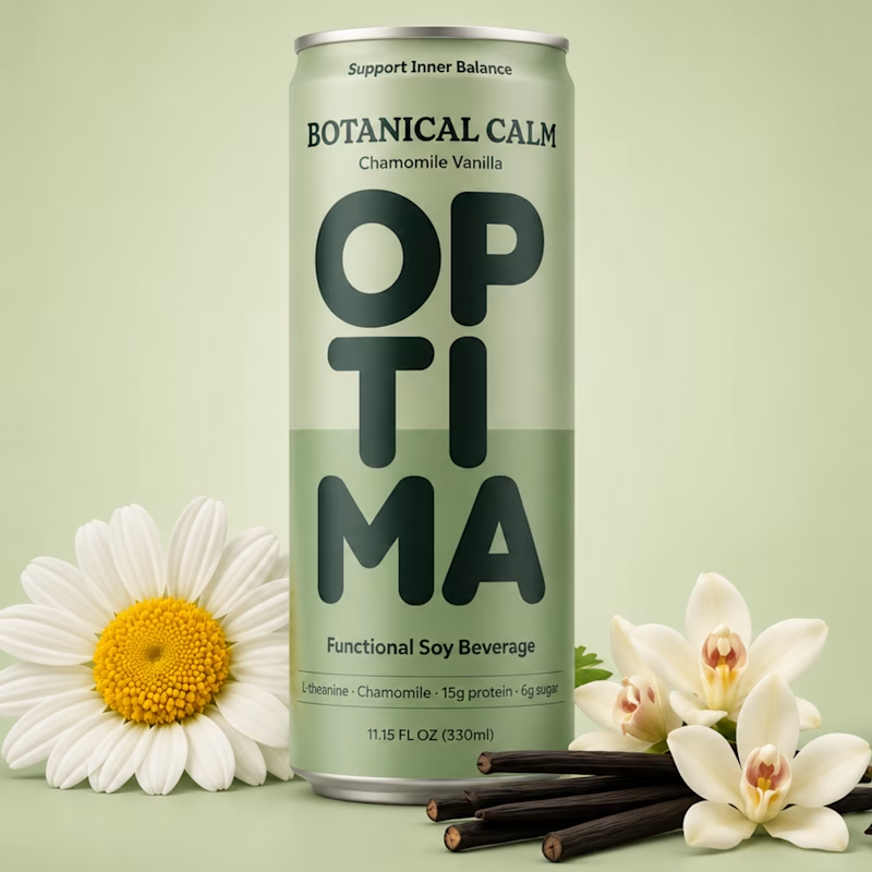
56 voted
69%
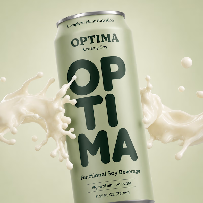
81 votes
Closed

Gopi I love this style 😍

Nine Volt Coffee Logo
9 Volt Coffee is a high-performance specialty coffee brand built to energize ideas, creativity, and everyday moments. Crafted for those who seek quality, character, and a powerful start to their day.

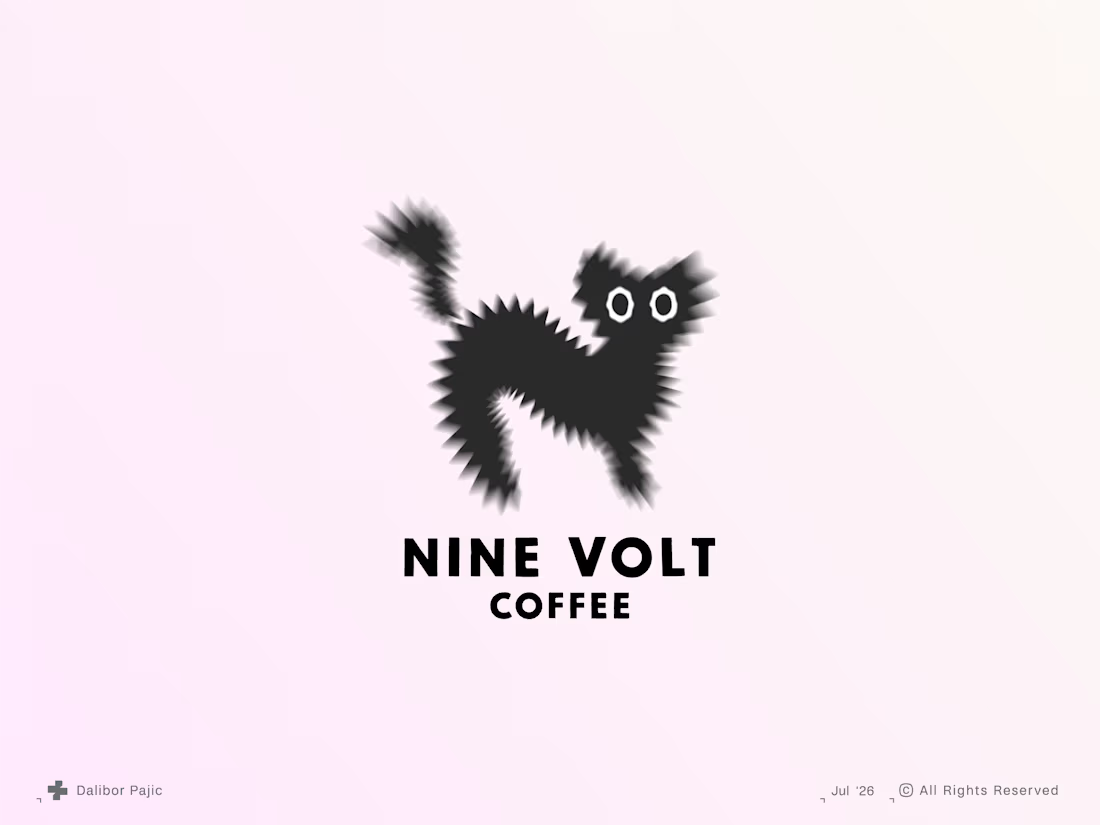
The high-performance idea fits the 9 Volt Coffee name perfectly. Did the symbol or the typography come first when you built the identity?