The network for creativity
Join 1.25M professional creatives like you
Connect with clients, get discovered, and run your business 100% commission-free
Creatives on Contra have earned over $150M and we are just getting started
Back to feedPost


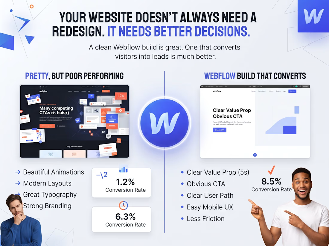
Your website doesn’t always need a redesign.
Sometimes it just needs better decisions.
I’ve seen websites with:
→ Beautiful animations
→ Modern layouts
→ Great typography
→ Strong branding
…and still very few conversions.
Why?
Because design and conversion are two different things.
Before rebuilding a website, I usually look at:
• Is the value proposition clear within 5 seconds?
• Is the CTA obvious?
• Does the page guide visitors toward one action?
• Is the mobile experience actually easy to use?
• Are there unnecessary sections creating friction?
This is especially important with Webflow.
A clean Webflow build is great.
A clean Webflow build that turns visitors into leads is much better.
What’s one website element you think is most overlooked when it comes to conversions?
The network for creativity
Join 1.25M professional creatives like you
Connect with clients, get discovered, and run your business 100% commission-free
Creatives on Contra have earned over $150M and we are just getting started






Related posts

Founders, if you need a website done by someone who has already worked with YC, A16z backed startups...well, I’m here. Send me a message.
I will help you figure out how to present your product and get your message across to the right people.

Great work!

Which 3 seconds would sell you the lens?
Same lens, two ways in. I built FOCAL, a launch page for a 50 mm lens that doesn't exist. Everything you see is live 3D running in the browser, not renders or video.
Left: it comes apart into seven pieces of glass, and light traces through every one to a single point.
Right: nine blades close to f/16, then you dive straight through the iris.
If the page only had room for one, which one makes you want to buy? Vote, then tell me why in the comments. The full page is live at https://focal-lens.netlify.app

23 voted
72%
9 voted
28%
32 votes
Closed

Inside the glass is league ahead in term of clarity and helping us understand the structure of the lens. Win by K.O 😂 Not even close.


New project shipped, new case study added 🚀
https://contra.com/p/6Z6UQ27O-centi-pack-design-and-astro-marketing-site


Congrats on shipping it. The box shots do a lot of the selling on that page.