The network for creativity
Join 1.25M professional creatives like you
Connect with clients, get discovered, and run your business 100% commission-free
Creatives on Contra have earned over $150M and we are just getting started
Back to feedPost

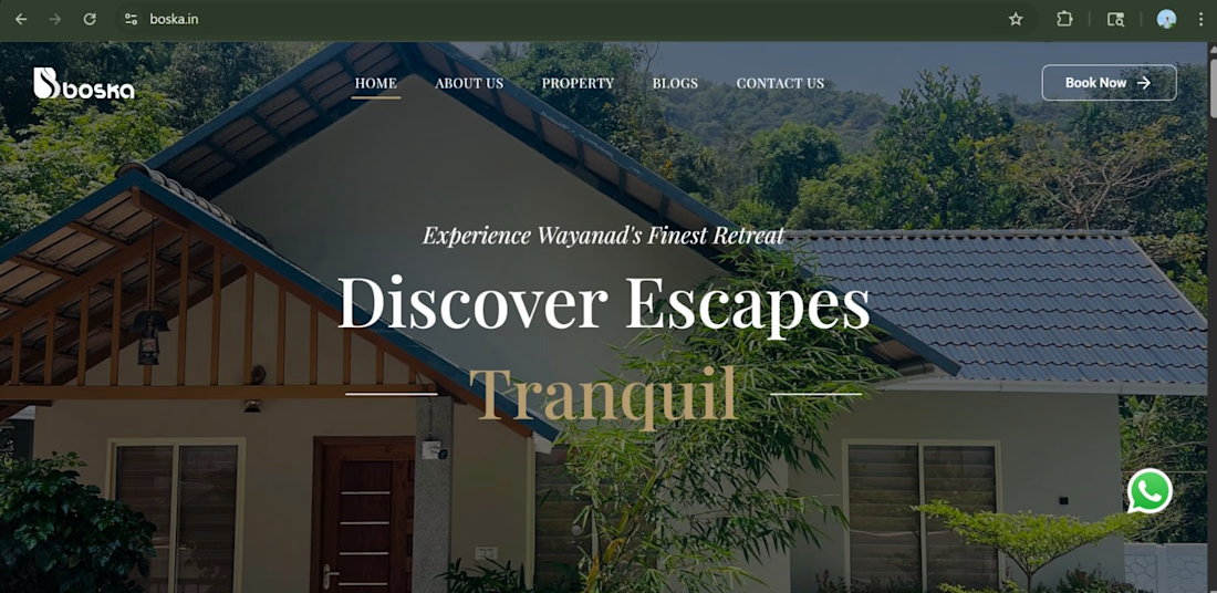
We designed and developed a premium website for a beautiful resort in Wayanad — Boska 🌿
The website is crafted to reflect the calm, natural vibe of the destination, with a clean design, smooth user experience, and visually rich layout that showcases the resort’s ambience, stay options, and amenities.
From easy navigation to an engaging booking experience, every detail is built to help visitors explore, connect, and plan their perfect getaway.
✨ Turning peaceful destinations into powerful digital experiences.
🔗 Explore the website: https://boska.in/


The network for creativity
Join 1.25M professional creatives like you
Connect with clients, get discovered, and run your business 100% commission-free
Creatives on Contra have earned over $150M and we are just getting started

Challenges
View all


Related posts

Working on the homepage for Still Blooming, a wedding and floral studio, I explored two different layout directions for the hero section. Same brand, same copy, just a different structure and visual rhythm.
Option 1 : Left Aligned. Text sits on the left with supporting content beside it, giving an editorial, asymmetrical feel.
Option 2 : Centered. Everything is stacked and centered, giving a clean, balanced, more classic hero layout.
Would love your honest UX/UI take which direction feels more elegant, functional, and true to a wedding/floral brand, and why?
22 voted
41%
32 voted
59%
54 votes
Closed

Great Design :)

Designed a dashboard concept for tracking net worth across every asset type — stocks, crypto, property, pensions, funds, cash, and liabilities — all in one place.
Instead of the usual pie chart or bar graph, the centerpiece is a dial: a single, glanceable gauge showing where your wealth actually sits. Behind it, a quiet grid of every asset category fades in and out of visibility, reinforcing that everything's accounted for even when it's not the focus.
Dark UI, a single confident green accent, and a lot of negative space — built to make a genuinely overwhelming task (seeing your entire financial picture at once) feel calm instead of cluttered.


wow the animation feels super smooth, what is this animation for?

Creating immersive digital experiences with smooth website animations ✨
Designed & developed by Usman DevHub Tech & Creative Studio.
We create premium websites with modern UI, interactive animations, and unique visual experiences that help brands stand out. 🚀
Want a website like this for your brand?
DM us and let's discuss your project.
#WebDesign #WebDevelopment #WebsiteAnimation #UIDesign #CreativeStudio #DigitalAgency #UsmanDevHub


Love this, Usman! You drop something amazing every single time.