The network for creativity
Join 1.25M professional creatives like you
Connect with clients, get discovered, and run your business 100% commission-free
Creatives on Contra have earned over $150M and we are just getting started
Back to feedPost

Most brands are content with just a logo.
Koloni needed an ecosystem.
Designed to reflect a new way of organizing work and collaboration in the tech sector, this identity combines structure and fluidity:
a precise typographic framework + a dynamic, evolving gradient.
The goal: to create something immediately recognizable, yet never static.
→ Identity
→ Brand system
→ Applications
I'm really excited about this collaboration and can't wait to see Koloni grow.


The network for creativity
Join 1.25M professional creatives like you
Connect with clients, get discovered, and run your business 100% commission-free
Creatives on Contra have earned over $150M and we are just getting started








Related posts

Last year, I had the privilege of designing the logo for Quantavo. It’s always a win when technical precision meets clean design.
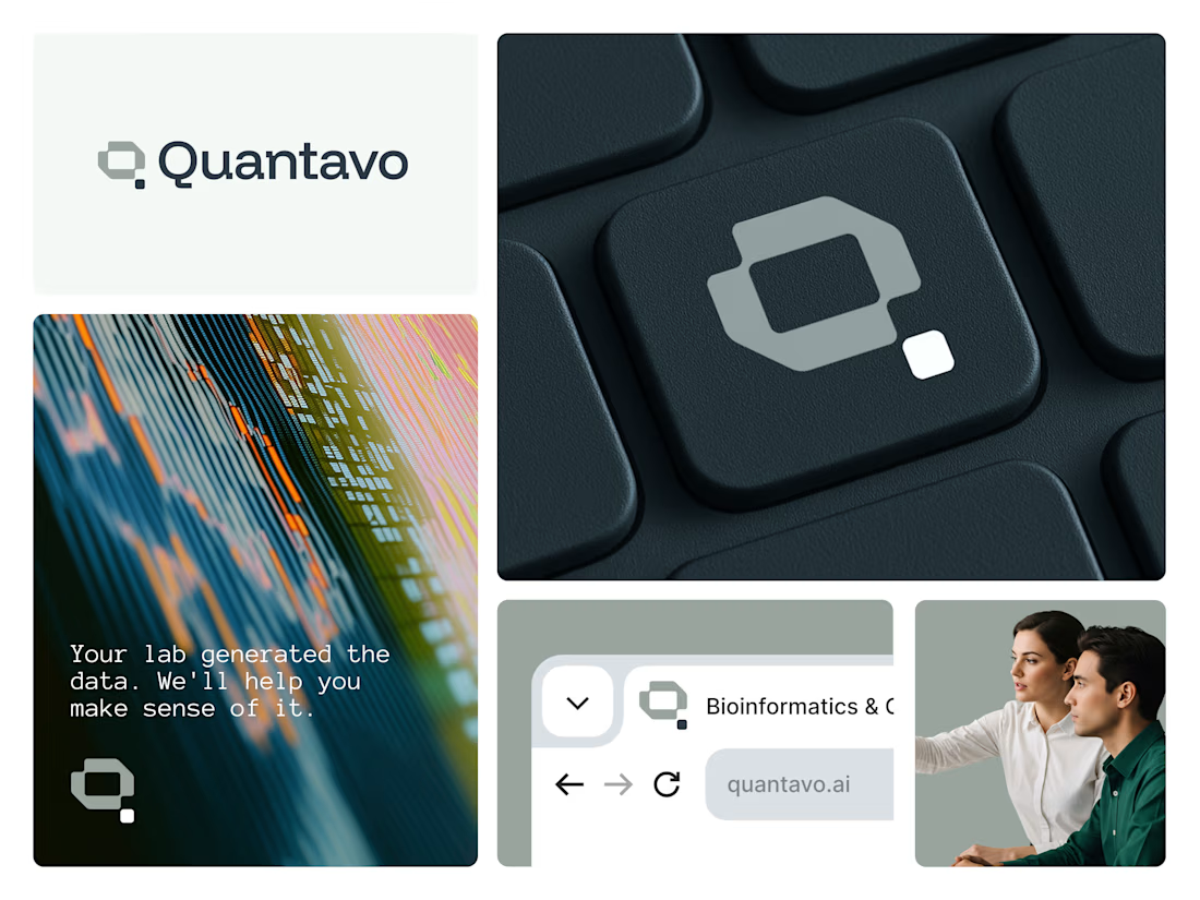

That geometric Q is such a confident mark, Illia. Technical precision is exactly the right read for Quantavo, and the way it holds up on the keycap and site shots shows real craft.


Same brand. Same palette. Two completely different proposals for a real estate developer.
A: An isotype built from blocks. Geometric, precise, the language of construction. It says we build.
B: Custom lettering with movement. Warmer, more editorial. It says we build places you’d want to live in.
36 voted
51%

35 voted
49%

71 votes
Closed
My vote is B, Milagros. Custom lettering with movement has real editorial warmth, which suits a developer selling places people actually want to live in.

Brand identity exploration
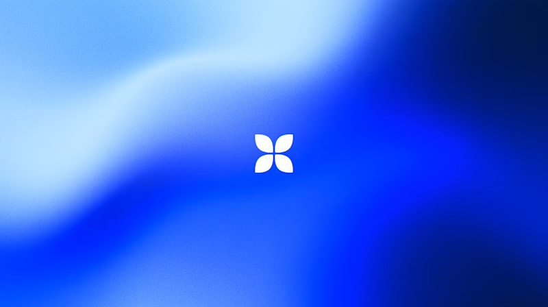
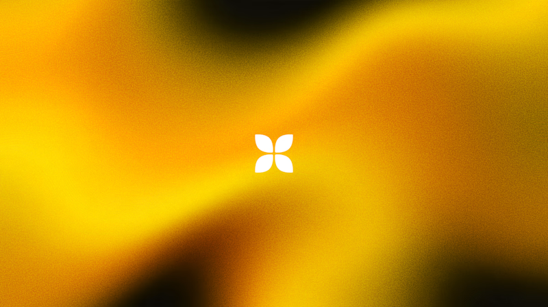
Which one do you think it fits better?
36 voted
77%
11 voted
23%
47 votes
Closed

Cobalt is great Gold is unique 🎉🎉🔥🔥