The network for creativity
Join 1.25M professional creatives like you
Connect with clients, get discovered, and run your business 100% commission-free
Creatives on Contra have earned over $150M and we are just getting started
Back to feedPost
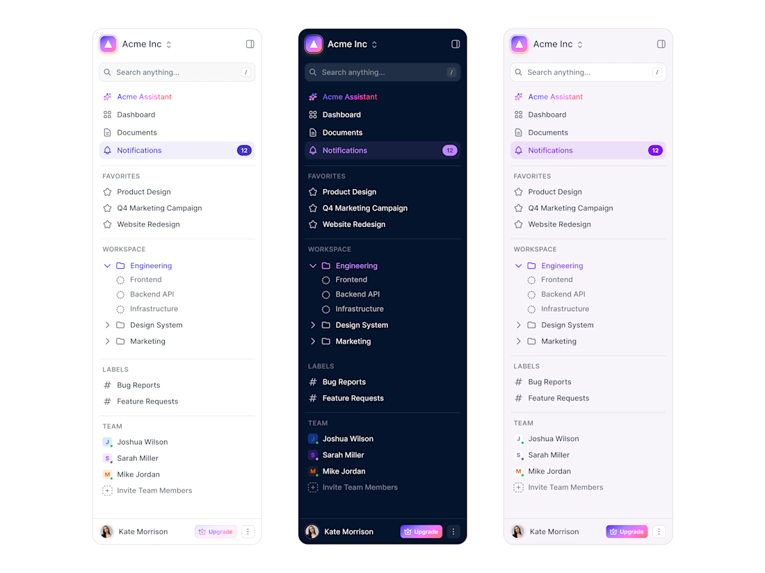
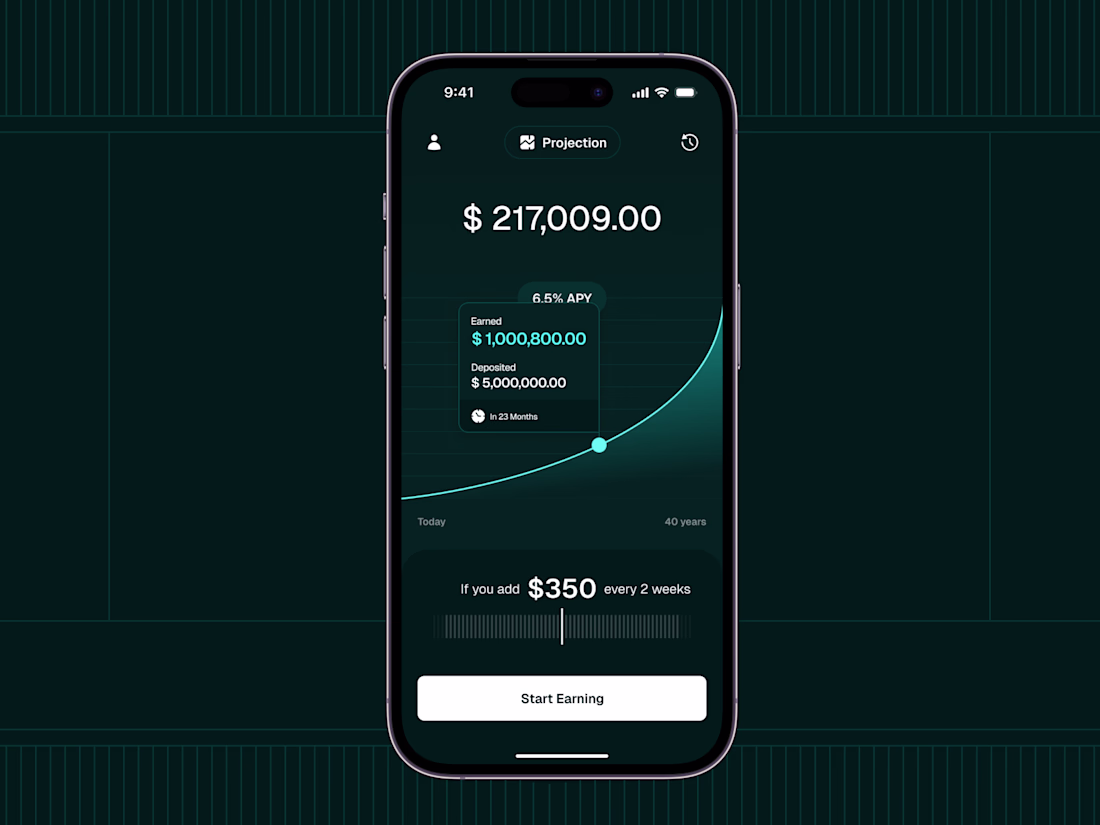
Been deep in dashboard design mode lately. Here's a sidemenu concept I'm pretty happy with. 🎯
Everyone wants to design flashy charts. But the sidebar? That's where users actually live. It's home base. If it's cluttered, nothing else matters.
This one's for a B2B workspace. Here's the thinking:
Top = speed. Search and Favorites. Power users hate clicking around.
Middle = structure. Workspace + Labels. Organized but not rigid.
Bottom = people. Team avatars with status. Remote work is lonely—let me see who's online. And that "Invite" button? Small touch, big impact.
Upgrade badge lives next to the avatar. Visible but not annoying. You see it, but it's not screaming at you.
Still tweaking. Curious—what's a sidebar you actually enjoyed using? I'm taking notes. 👇
#SaaS #UI #UX #DashboardDesign #Sidebar #SaaS #Figma #ProductDesign
The network for creativity
Join 1.25M professional creatives like you
Connect with clients, get discovered, and run your business 100% commission-free
Creatives on Contra have earned over $150M and we are just getting started
Related posts
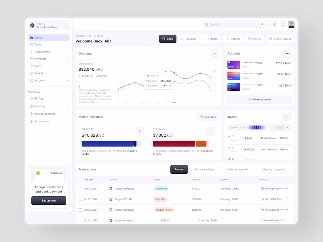
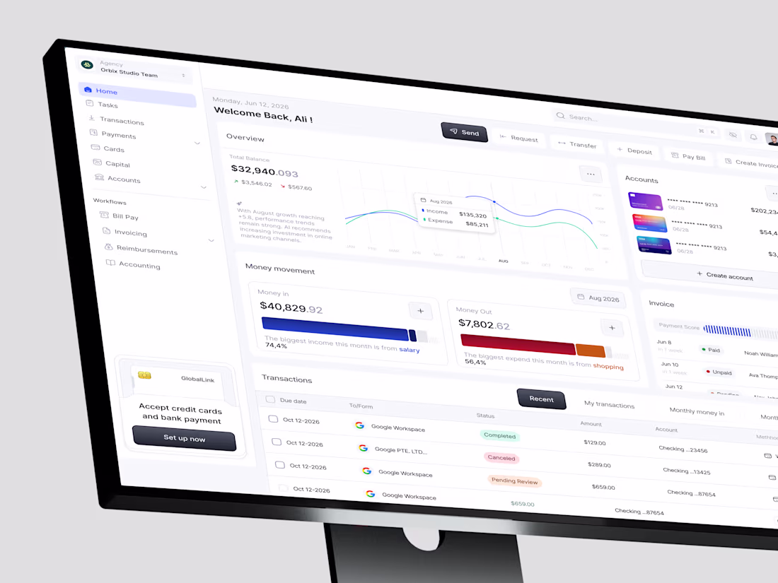
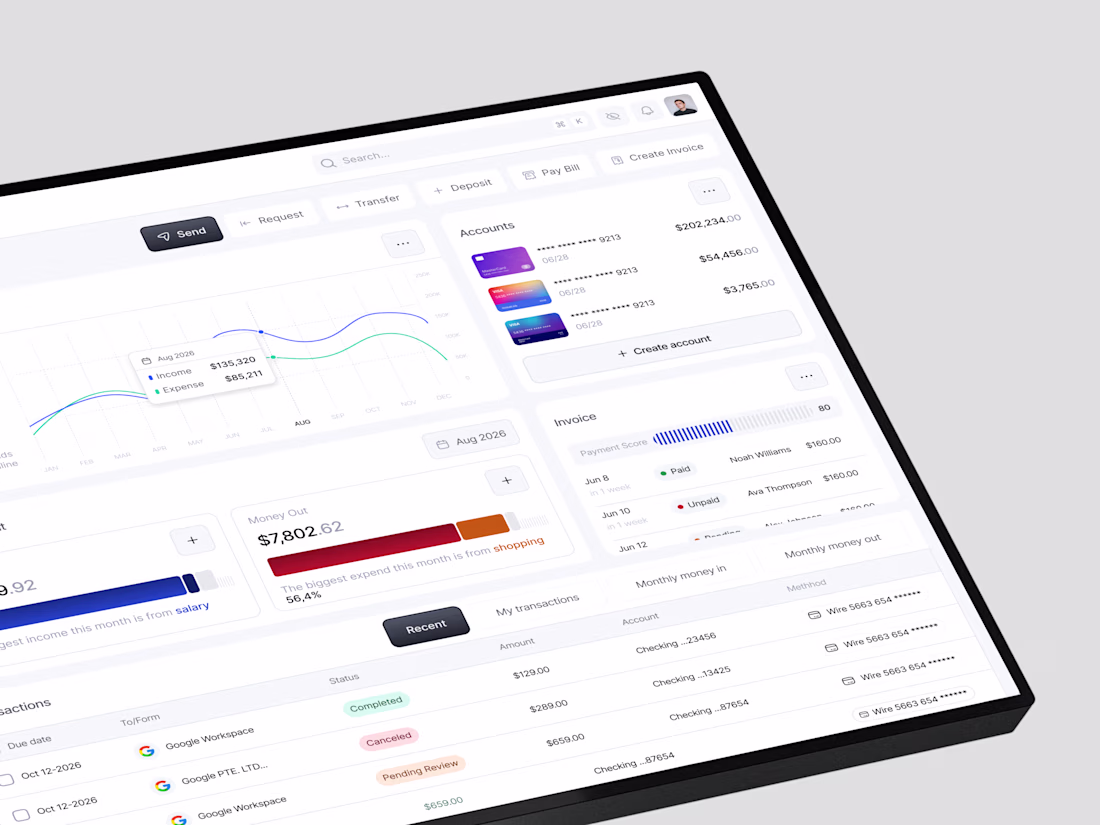
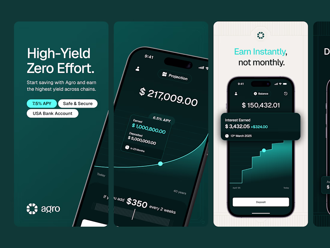
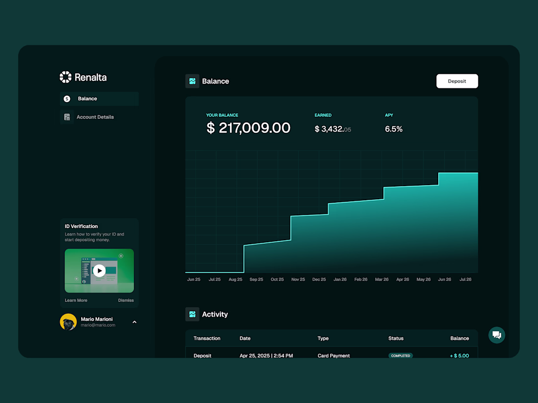
Agency finances have always been complex. The dashboards built around them never made it feel any simpler.
This finance dashboard was designed for operators and growing teams who need every account, transaction, invoice, and cash flow insight in one place. Total balance overview, money movement split, multi-card account management, real-time invoice tracking, AI-powered financial insights, and six quick actions always within reach.
Clean. Actionable. Ready to scale.
Designing a finance or SaaS dashboard that needs to feel this considered? Let's build it together.
Tools: Figma · Jitter
#DashboardDesign #FinanceUI #SaaSUI #UIDesign #ContraFreelance #ProductDesign
Amazing
Need amazing app designs AND appstore screens? Look no further!
Nice
Trending
Claude
Claude has entered the design space. How are you using Claude Design?
Contra University
Learn from expert creatives how to earn more using next-gen AI tools.
fifaworldcup2026
The World Cup is here and the whole world's watching. How are you designing for the world stage?
creativeaiflow
Creative AI workflows are evolving. What tools do you use, and what are their strengths and weaknesses?
freelancerlife
Freelancer life is wins, pivots, and everything in between. What’s yours right now?