The network for creativity
Join 1.25M professional creatives like you
Connect with clients, get discovered, and run your business 100% commission-free
Creatives on Contra have earned over $150M and we are just getting started
Back to feedPost

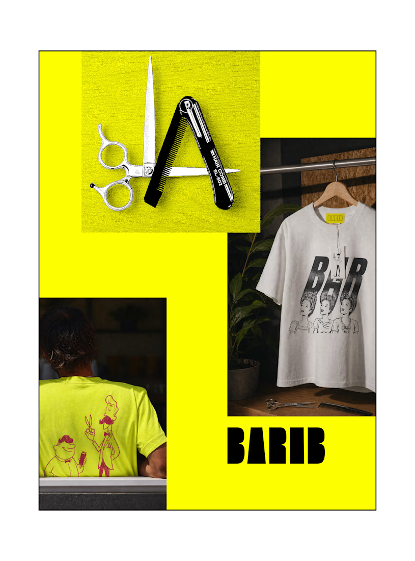
BAR & BER, Branding for a Local Barber Shop
I created a barber shop landing page where the UI itself becomes the product.
Starting from the idea of creating a duo—Bar and Ber—using iconic references, I used Fuser’s image tools to develop playful barber characters. With the Compositor Node, I shaped the overall visual theme, built the brand identity, and created graphic T-shirt mockups.
For the interaction, I used GPT to refine prompts for the Claude Coding Node, then implemented everything through the Creative Code Node. Using Three.js, I built a pixel-based particle system to simulate falling hair fragments.
In this system, users can shave the interface in real time—playing with the surface and revealing hidden messages underneath.
The whole point was to transform a static brand into something fun and interactive.
#fusercocreate @fuserstudio @contra

The network for creativity
Join 1.25M professional creatives like you
Connect with clients, get discovered, and run your business 100% commission-free
Creatives on Contra have earned over $150M and we are just getting started





Related posts

Brand identity work for WesoftAI




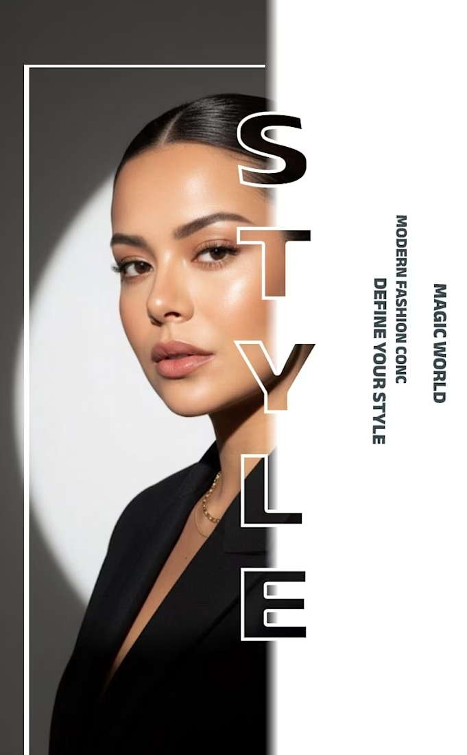
✨ Modern Fashion Poster Design - STYLE ✨
Designed a clean, high-fashion poster concept focusing on bold typography and minimalist aesthetics.
Concept: Modern Fashion | Define Your Style
Tool: Canva / Photoshop
Style: Luxury, Minimal, Editorial
Open to feedback and freelance work!
#GraphicDesign #PosterDesign #FashionDesign #Canva #ContraCommunity




The way you let the bold type dominate the empty space really drives the luxury feel.

A little Three.js experiment — a torn-edge reveal built with a custom shader and Sobel edge detection.
I wanted the transition to feel more organic and physical than a typical image reveal.


Custom shader + Sobel edge for a torn reveal is the kind of WebGL detail people feel even if they can't name it.