The network for creativity
Join 1.25M professional creatives like you
Connect with clients, get discovered, and run your business 100% commission-free
Creatives on Contra have earned over $150M and we are just getting started
Back to feedPost
What’s the one project you keep promising yourself you’ll “get back to”? 👀
This was mine. An eyewear concept I started a while ago: dark water, wet hair, one bold black frame. I had the mood and a few stills, but nothing that moved.
Why I stopped: client work took over. What got it moving again: the urge to see it finished ⚡
What’s sitting in your “almost done” folder? Drop it below, or finish it and tag me. I’d love to see it!


What’s the one project you keep promising yourself you’ll “get back to”? 👀
This was mine. An eyewear concept I started a while ago: dark water, wet hair, one bold black frame. I had the mood and a few stills, but nothing that moved.
Why I stopped: client work took over.
What got...

The dark water mood with the single bold black frame is striking. Hope you get back to it!

Thanks Shubhank! The dark water mood was the whole idea, so glad it came through. Yes, I'm planning to get back to this concept and finish it properly. Stay tuned!
The network for creativity
Join 1.25M professional creatives like you
Connect with clients, get discovered, and run your business 100% commission-free
Creatives on Contra have earned over $150M and we are just getting started






Related posts

What’s the one project you keep promising yourself you’ll “get back to”? 👀
This was mine. An eyewear concept I started a while ago: dark water, wet hair, one bold black frame. I had the mood and a few stills, but nothing that moved.
Why I stopped: client work took over.
What got it moving again: the urge to see it finished ⚡
💫 All made with FLORA. If you want to give it a try, I have a 25% discount for you: https://refer.flora.ai/julia-calabrese
What’s sitting in your “almost done” folder? Drop it below, or finish it and tag me. I’d love to see it!

Ever postponed delivering to a client because you couldn’t figure out what was missing in your designs? 🥹
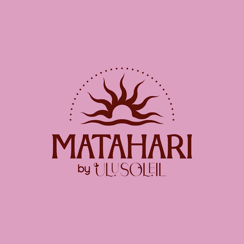
Earlier this year, I worked on Matahari, a secondary brand under Ulu Soleil. Every direction looked good, but none of them felt right, and I was getting frustrated. 😩
I stepped away.
Coming back with fresh eyes, I stopped trying to rescue every original idea and started a moodboard from scratch focused on what was ACTUALLY working.
What started as a few logo explorations turned into testing typefaces, adjusting letterforms and refining proportions to find the balance between personality and simplicity.
Here’s where it started vs. where it ended up.
What’s the hardest part of logo design for you: the initial concept or the final refinements?
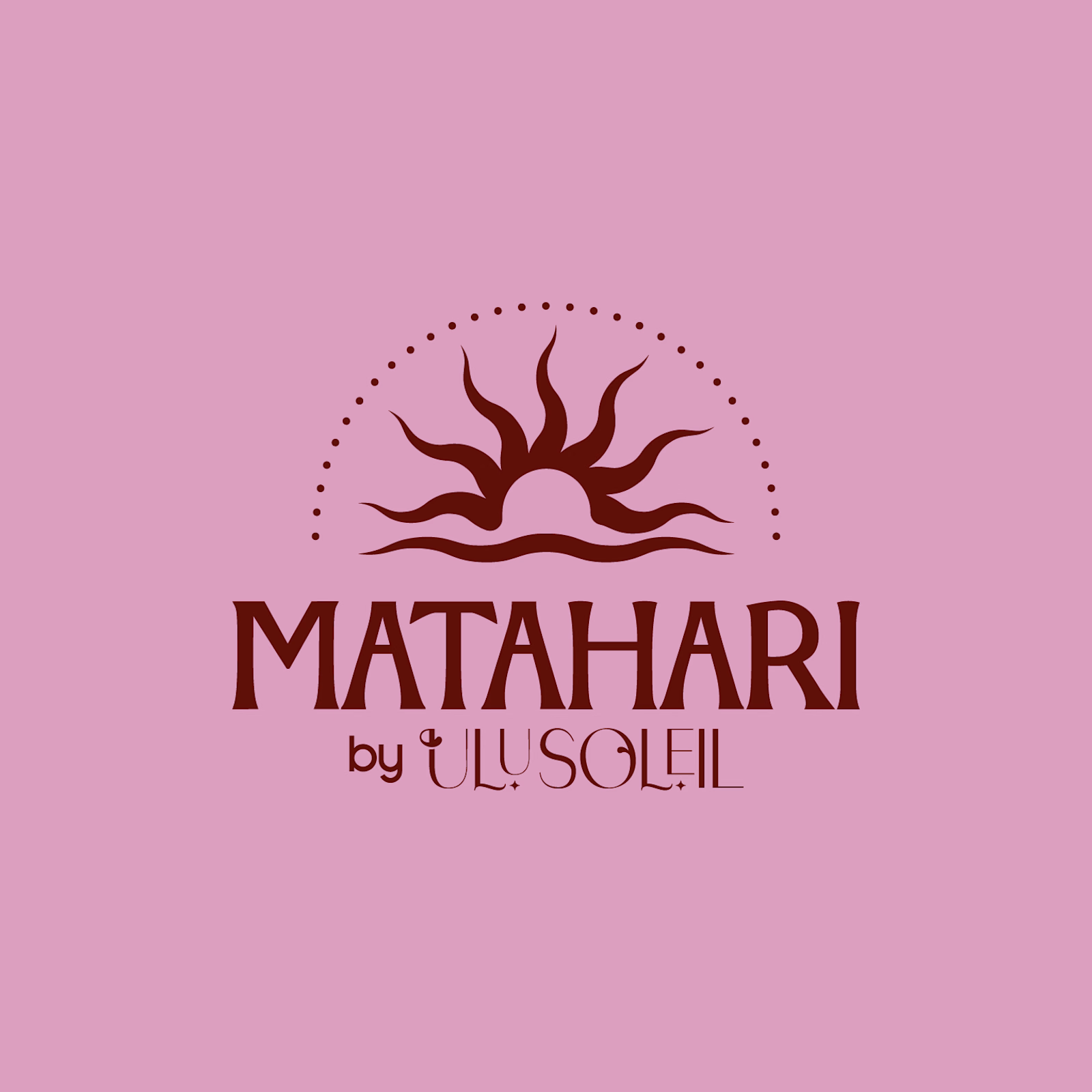
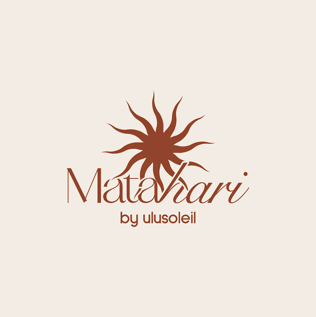
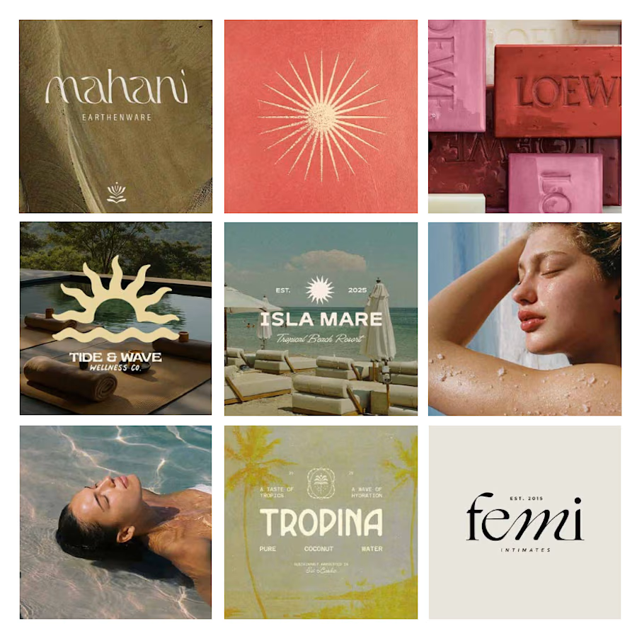

Starting the moodboard from scratch instead of rescuing every original direction is such a good call. The letterform refinements on Matahari show that patience paid off.
Final Delivery vs Initial Concept
Which Matahari logo would you pick for a brand like this?
Matahari is an everyday skincare brand inspired by the warmth of the tropics, offering feel-good, effective essentials that keep skin soft, hydrated, and naturally radiant through simple, effortless daily care.
Vote and tell me why. Does the final refinement make a difference, or was the first concept already enough?
33 voted
70%
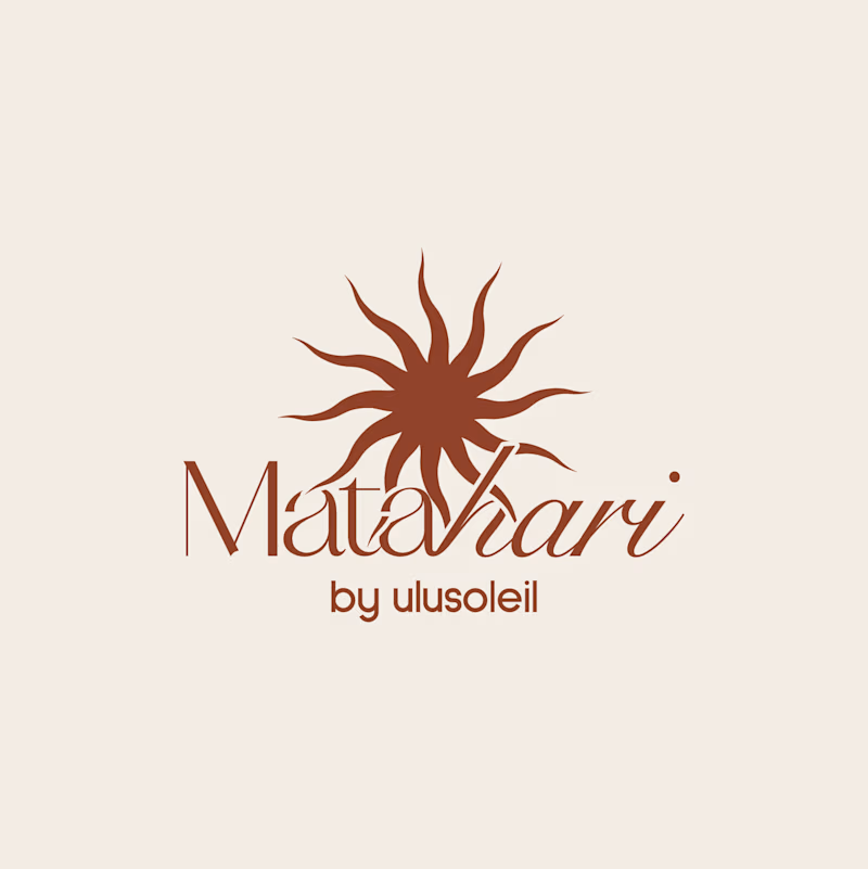
14 voted
30%
47 votes
Closed

Initial Concept. The caps wordmark stays readable when it shrinks to an email header or a jar lid, where the thin script starts to blur. The final has more warmth, but the sun mark already carries that in both.