The network for creativity
Join 1.25M professional creatives like you
Connect with clients, get discovered, and run your business 100% commission-free
Creatives on Contra have earned over $150M and we are just getting started
Back to feedPost

Authors: is your Amazon book page actually helping the right readers understand why they should pick up your book?
Sometimes the problem isn't the book itself. It can be the way the book is positioned, described, or presented to the reader.
I’m offering a few authors a focused review of their Amazon book listing, looking at the description, reader positioning, presentation, and comparable books.
If you'd like me to take a look at yours, DM me the Amazon link.
The network for creativity
Join 1.25M professional creatives like you
Connect with clients, get discovered, and run your business 100% commission-free
Creatives on Contra have earned over $150M and we are just getting started



Related posts

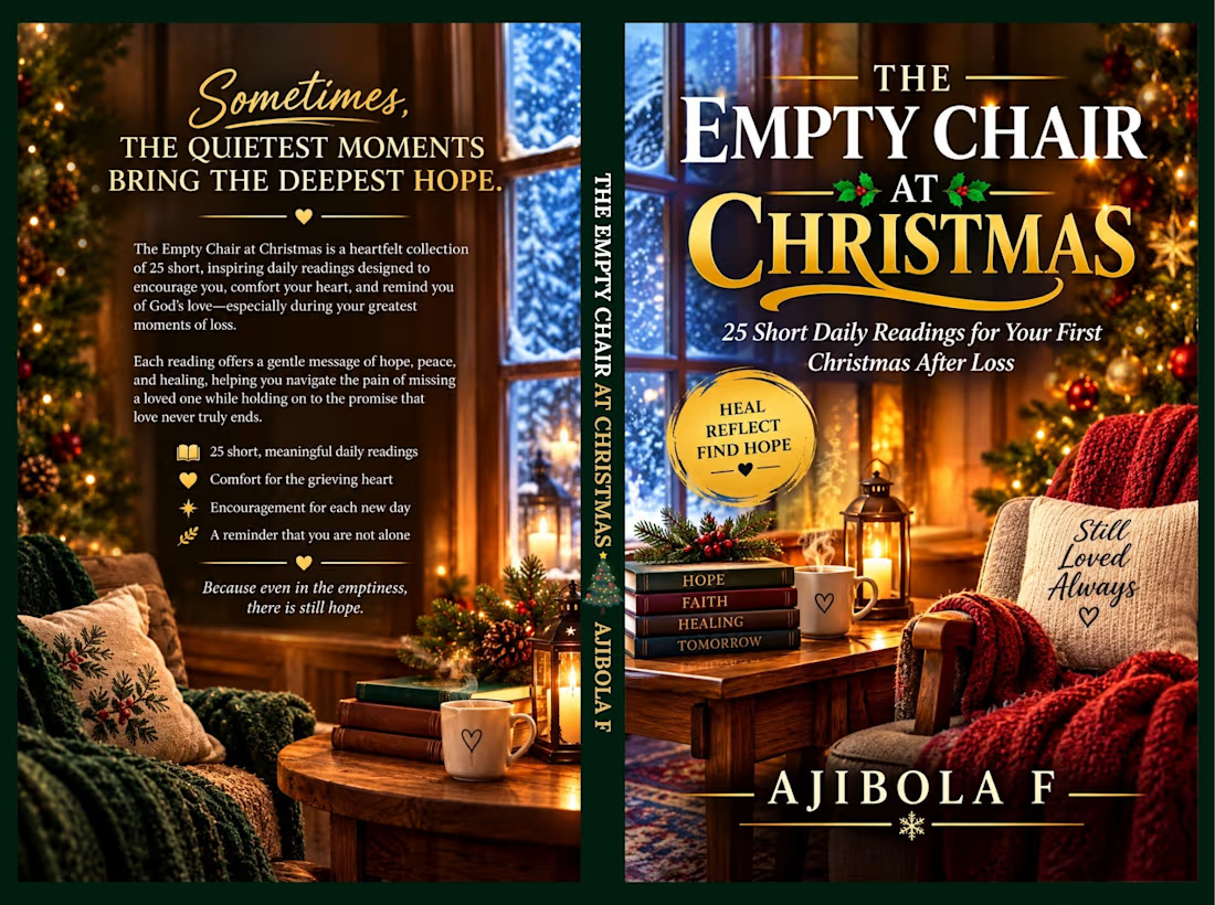
I'm designing a paperback cover for the nnook titled: "The Empty Chair at Christmas" for Amazon KDP Book Publishing.




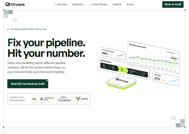

One page makes every design decision count.
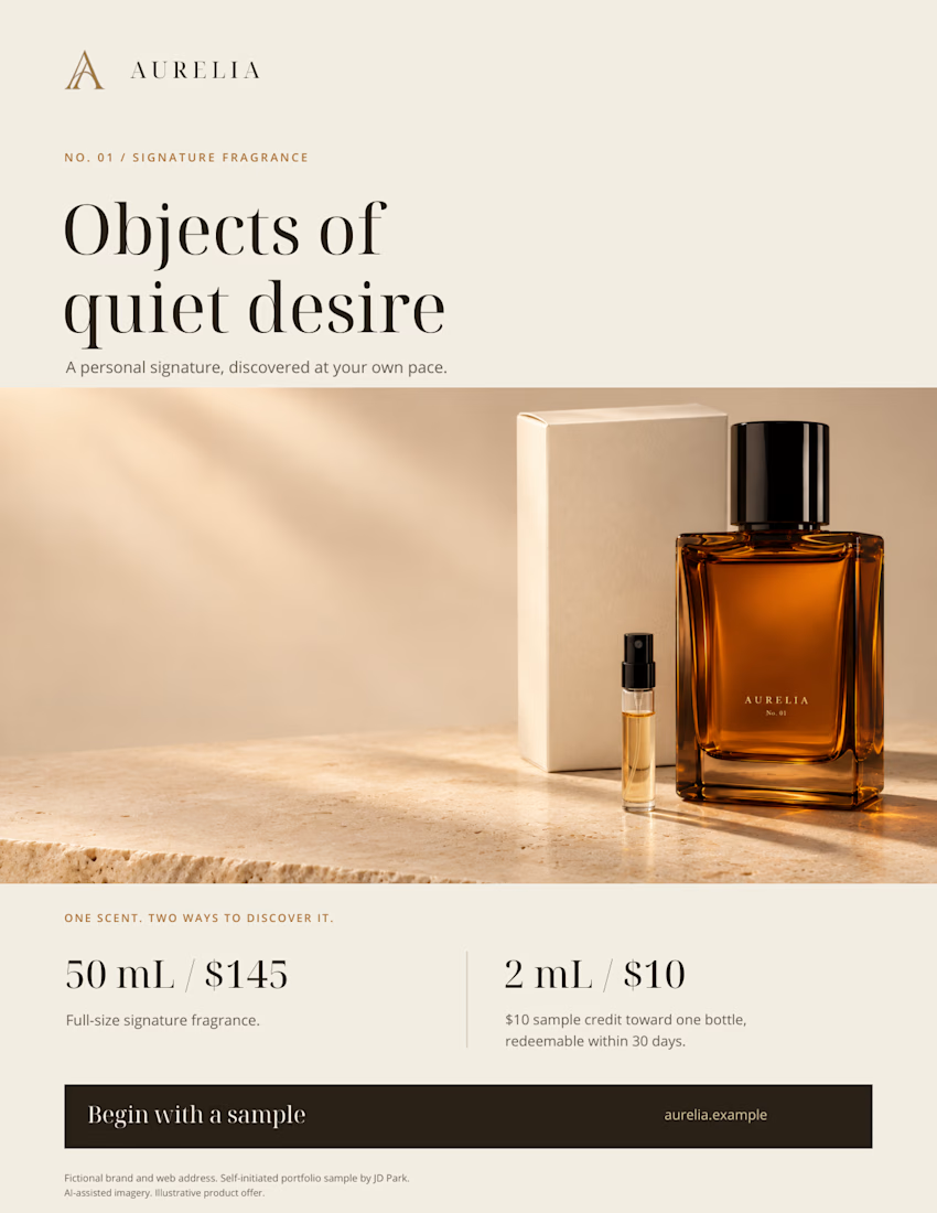
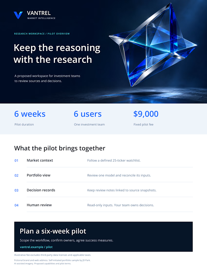
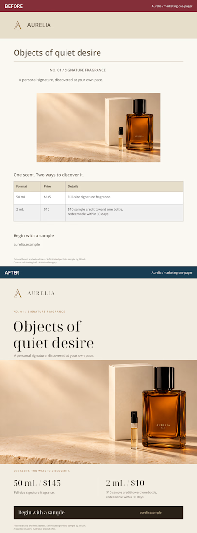
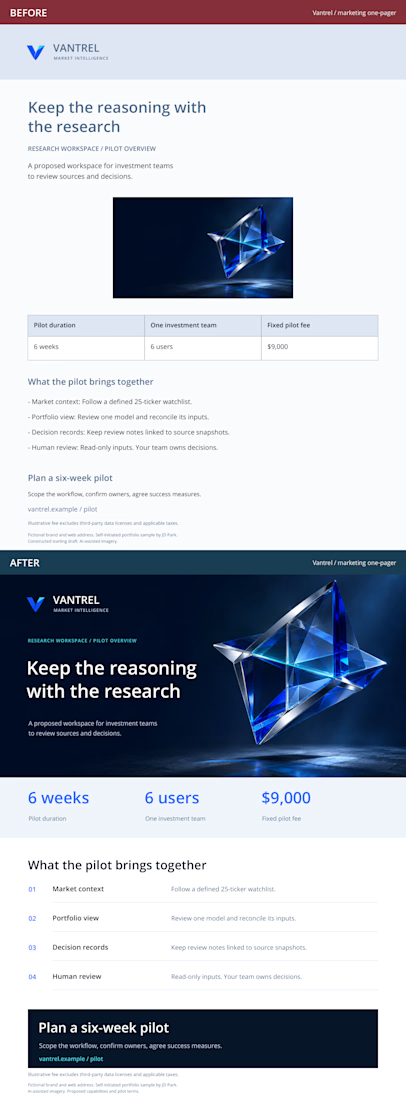
I adapted two fictional brand concepts into marketing one-pagers: an Aurelia fragrance product sheet and a Vantrel business sales sheet.
The constructed starting drafts and finished versions carry the same offer and facts. The redesign focuses on reading order, typography, imagery and a clear next step.
These are self-initiated, AI-assisted portfolio studies. The full case includes a downloadable PDF with both BEFORE and AFTER pages.
What catches your attention first in the AFTER versions, and does it help you understand the offer?
Have a rough marketing page? Send the page, audience and deadline for a scoped redesign quote.
https://contra.com/s/rve3lr7Y-marketing-one-pager-redesign