The network for creativity
Join 1.25M professional creatives like you
Connect with clients, get discovered, and run your business 100% commission-free
Creatives on Contra have earned over $150M and we are just getting started
Back to feedPost

One of my earlier projects, created while taking a Figma course and exploring e-commerce design. This furniture store prototype features an interactive hero section, collections, product cards, and a concept for product filters.
There are many things I would refine today, but I still think it's a solid result for one of my first experiences designing this kind of product. Projects like this played an important role in building my design skills and understanding of e-commerce interfaces.


Amazing

Looks great 💯 👍🏻

It’s so rewarding to look back and see how far you’ve come! For an early project, the structure and interface elements look incredibly solid. Great job! 🛋️

Every designer has that project they look back at and think, "I'd redesign half of this today" 😄
But honestly, that's probably the best sign of growth.
I'm curious — if you had only one hour to improve this project today, what would you change first?
The network for creativity
Join 1.25M professional creatives like you
Connect with clients, get discovered, and run your business 100% commission-free
Creatives on Contra have earned over $150M and we are just getting started








Related posts

Cantor: AI Coordination Landing Page:-
I designed a clean, modern landing page with a strong layout, clear hierarchy, and focused visual elements. I added smooth scrolling, section transitions, and subtle motion to guide users through the experience.
I kept the animation simple and purposeful, making the website feel polished, interactive, and easy to navigate without overwhelming the content.


Love how the UI feels alive here without getting cluttered.

Should I go for left or right? Focusing on updating and finishing up my portfolio... and then I came across this crossroads. Another alternative is to make them switchable themes through a toggle, but I still need to decide which should be the default.
27 voted
75%
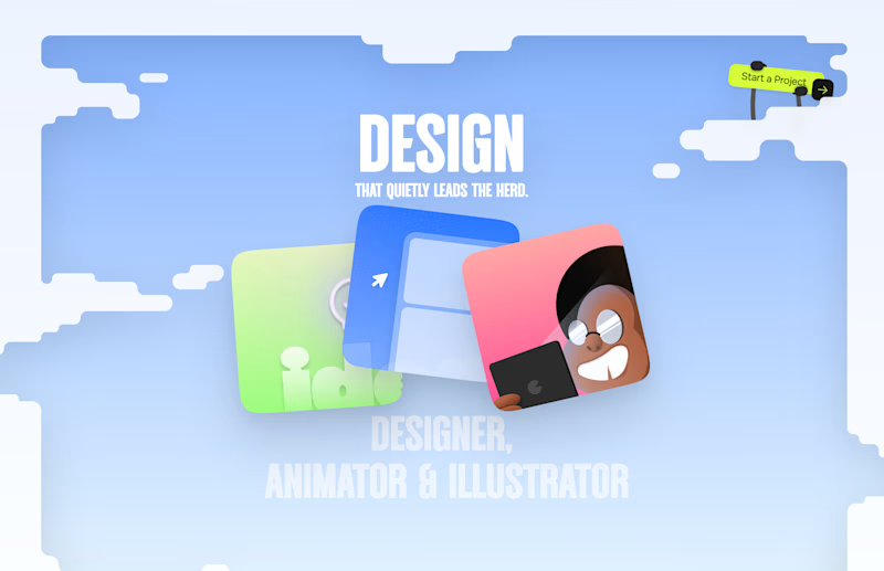
9 voted
25%
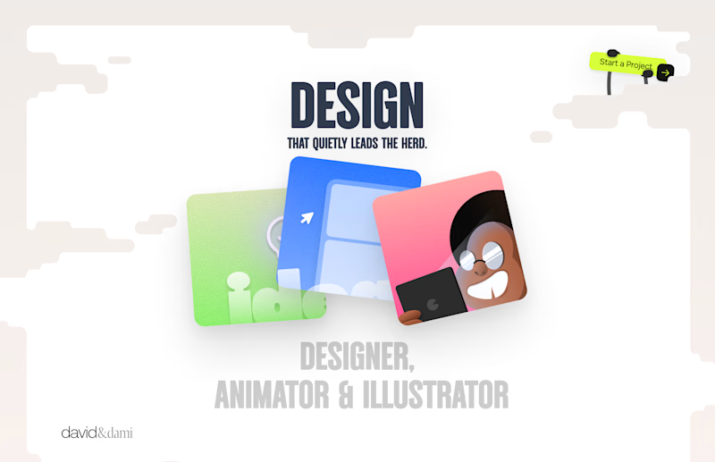
36 votes
Closed

Left is better because the text is readable, the overall blue background is not flashing to the eyes as compared to the right one.
For the top right button " Start a project ", you can add some animation so that it stands out and encourage users to click on it.


The app looks amazing, but do you think the number font might be a bit hard for people to read quickly when checking their money?