The network for creativity
Join 1.25M professional creatives like you
Connect with clients, get discovered, and run your business 100% commission-free
Creatives on Contra have earned over $150M and we are just getting started
Back to feedPost

Quick concept exploration of today 🍝
A cookbook with your version.
As a food enthusiast, I always struggle to keep recipes in one place… and if you’re anything like me, you probably swap ingredients all the time too. But somehow, you never remember exactly what you changed last time.
This concept explores a more personal type of cookbook.
You can upload recipes from a link, a photo, or create them from scratch. Using AI, the app can generate the recipe automatically, and once you start cooking, you can edit ingredients, add notes, and save your version of it.
The app could also suggest ingredient substitutions that work specifically for that recipe, based on what you already have at home.
So the next time you make it, all your tweaks, substitutions, and little discoveries are already there.
Less “recipe storage”, more evolving cooking experience.
What do you think — could this work?


The network for creativity
Join 1.25M professional creatives like you
Connect with clients, get discovered, and run your business 100% commission-free
Creatives on Contra have earned over $150M and we are just getting started





Related posts

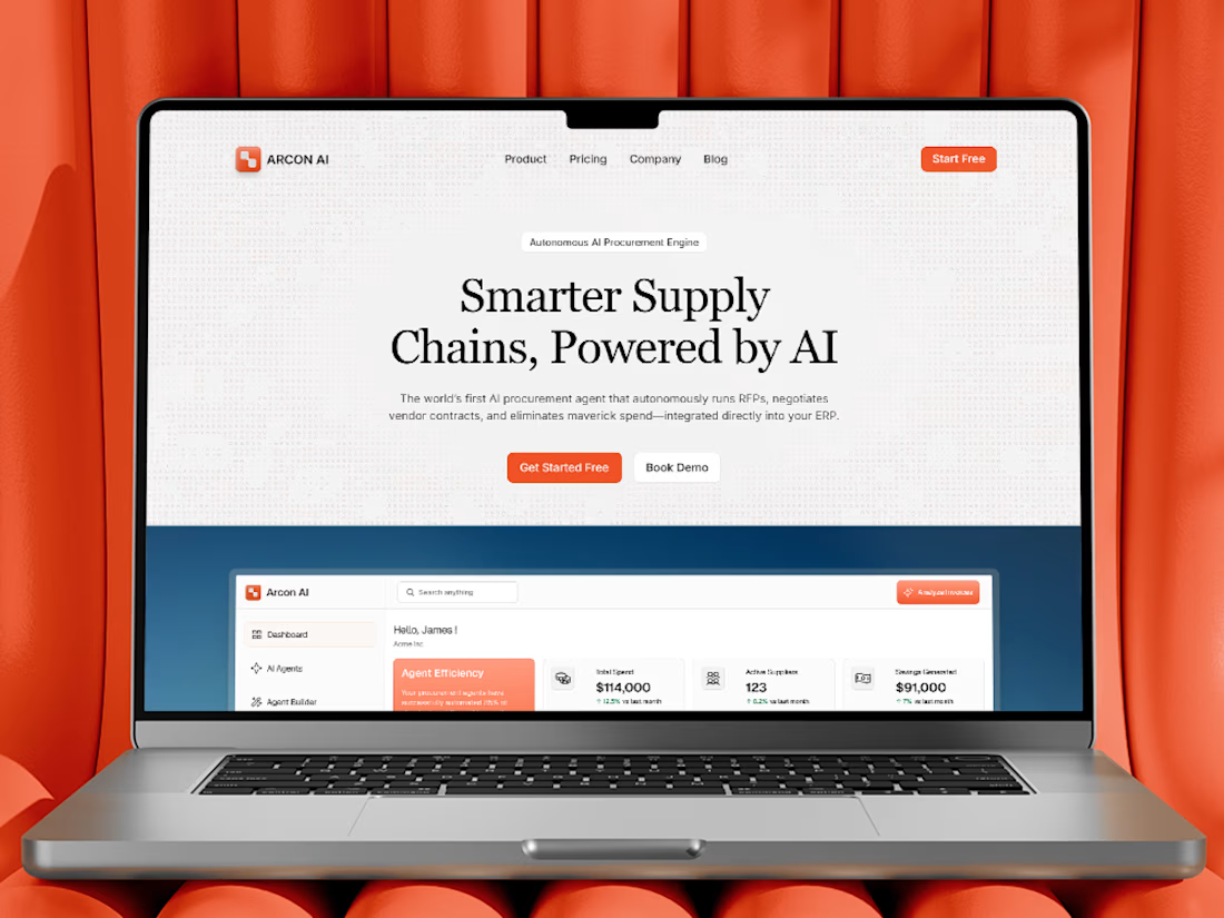
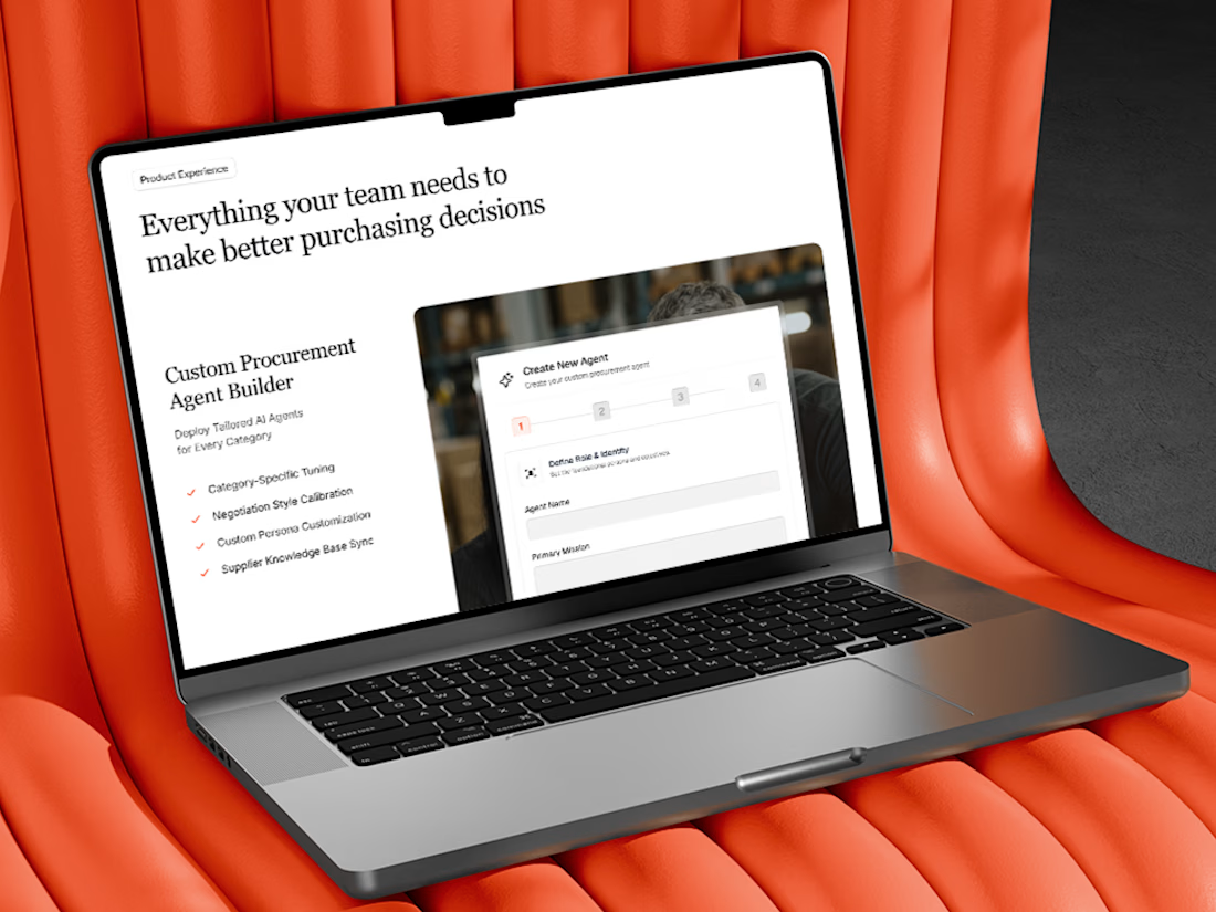
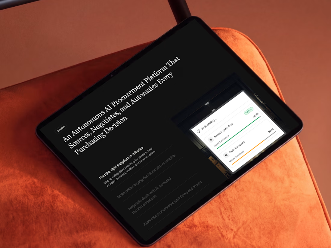
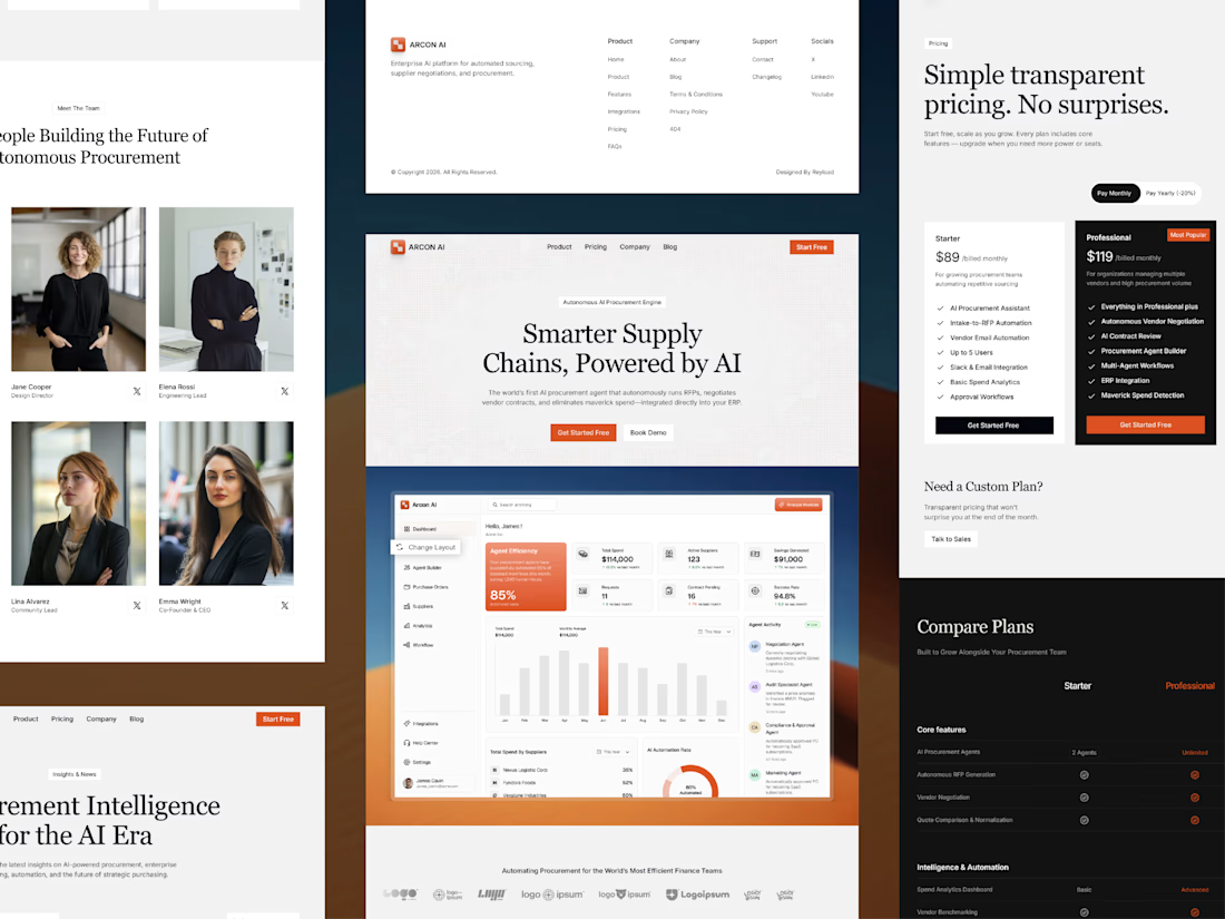
Free AI Framer template we designed for B2B SaaS.
Arcon AI is a premium Framer template built for AI startups, procurement platforms, enterprise SaaS, AI agents, workflow automation, supply chain technology, and B2B software. Designed with a modern enterprise aesthetic, it helps you launch a professional website that builds trust, showcases your product, and drives conversions.
Get it for free: https://www.framer.com/marketplace/templates/arconai/


Lovely work

Which hero direction feels right for this founder-focused brand?
While working on the homepage for Sean Parsons, a brand focused on empowering non-technical founders to launch tech startups, I explored two different visual directions for the hero section. Same message, same structure, just a different mood and color system.
Option 1 - Warm Olive. Dark, grounded, and editorial, giving a warm, established, expert feel.
Option 2 - Light Purple. Clean, modern, and vibrant, giving a fresh, SaaS-like, approachable feel.
Would love your honest UX/UI take, which direction feels more trustworthy, engaging, and aligned with a founder-focused brand, and why?
25 voted
69%
11 voted
31%
36 votes
Closed

I like worm Olive most because it has different personality

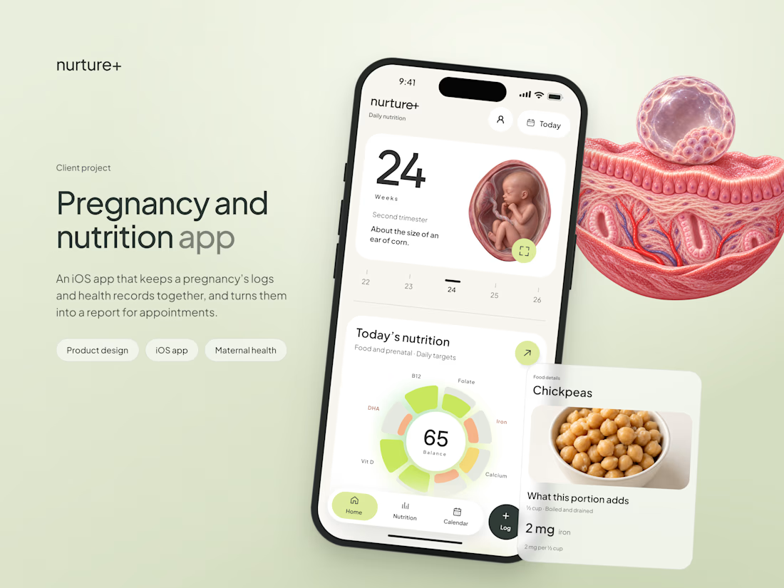
A very elaborate app study is out, I share my entire process and a lot of fun UI details along the way! Done this for https://nurtureplus.app/