The network for creativity
Join 1.25M professional creatives like you
Connect with clients, get discovered, and run your business 100% commission-free
Creatives on Contra have earned over $150M and we are just getting started
Back to feedPost

Before I look at colors, typography, animations, or whether the hero needs a redesign, I’d check three things first.
Can I understand what the product does?
Not after reading five sections. Within the first few moments.
Can I understand why it matters?
Features explain what a product has. Value explains why someone should care.
And finally:
Why should I believe you?
That might come from real product visuals, results, customers, expertise, data, or simply a much clearer explanation of how the product works.
If those three things aren’t working, polishing the interface won’t solve the core problem.
Visual design matters a lot.
But it works best when there is already something clear and convincing underneath it.
Before asking how the homepage should look, I’d first ask what it needs to make people understand, believe, and do.
The network for creativity
Join 1.25M professional creatives like you
Connect with clients, get discovered, and run your business 100% commission-free
Creatives on Contra have earned over $150M and we are just getting started



Related posts

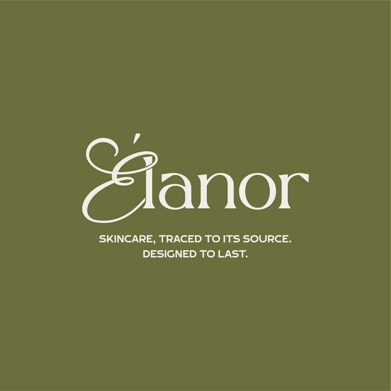
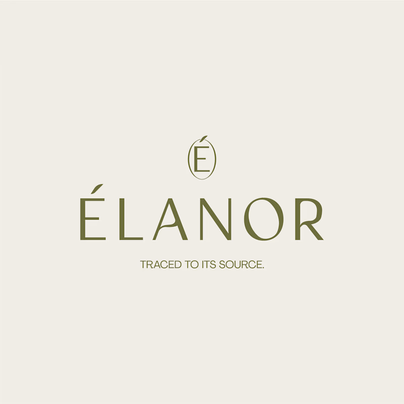
Can two different typographic directions change how you perceive the same skincare brand? 👀
For Elanor, a skincare brand I’ve worked on, I’m putting two wordmark directions head to head.
A. Script Combo brings more personality and a distinctive, expressive touch.
B. Contemporary feels cleaner, more restrained, and modern.
Now I want your honest opinion: A or B? Which direction feels right for Elanor, and why?
26 voted
58%
19 voted
42%
45 votes
Closed

Absolutely! Typography changes everything. For Élanor, I love the contemporary direction - it feels elegant, clean and very premium for a skincare brand like this. The É icon on top is a beautiful touch! Script has personality but contemporary feels more timeless for skincare. Great exploration!


One prompt → a whole store. We designed what that should feel like 😉🛒✨
WithNation is an AI platform that builds and runs your online store for you.
⚡ We went bold: oversized type, editorial product shots and a product wall that counts up to 2000+ items as you watch.
What do you think of the concept?
Rate it 1-10 👇
creativeaiworkflowwebdesignbranddesignerBrand DesignMotion DesignWeb DesignAdobe After EffectsClaudeFigma


10/10 🔥 the moment the photo turns into that whole product wall got me, I replayed it like 3 times.

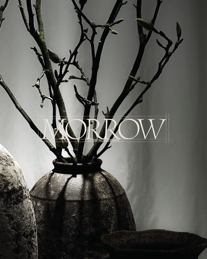
MORROW | Brand Identity & Art Direction
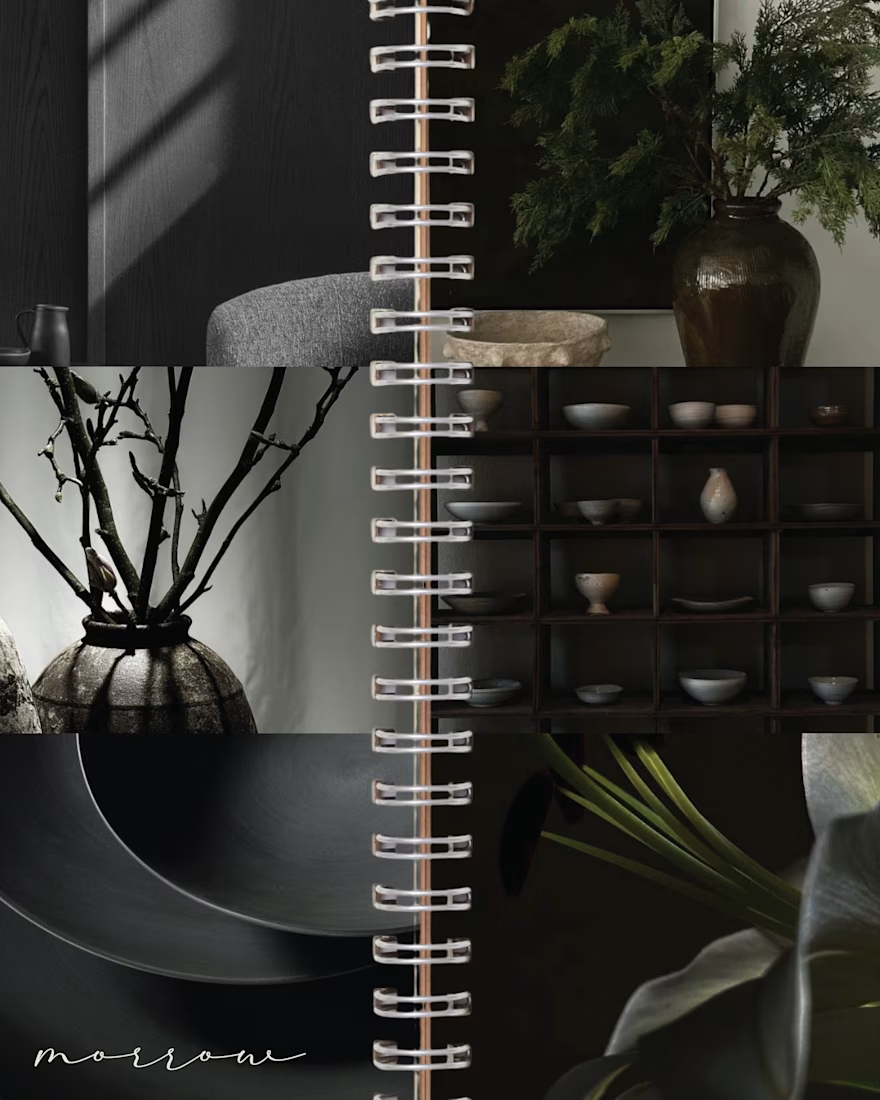
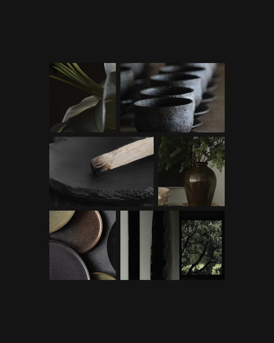
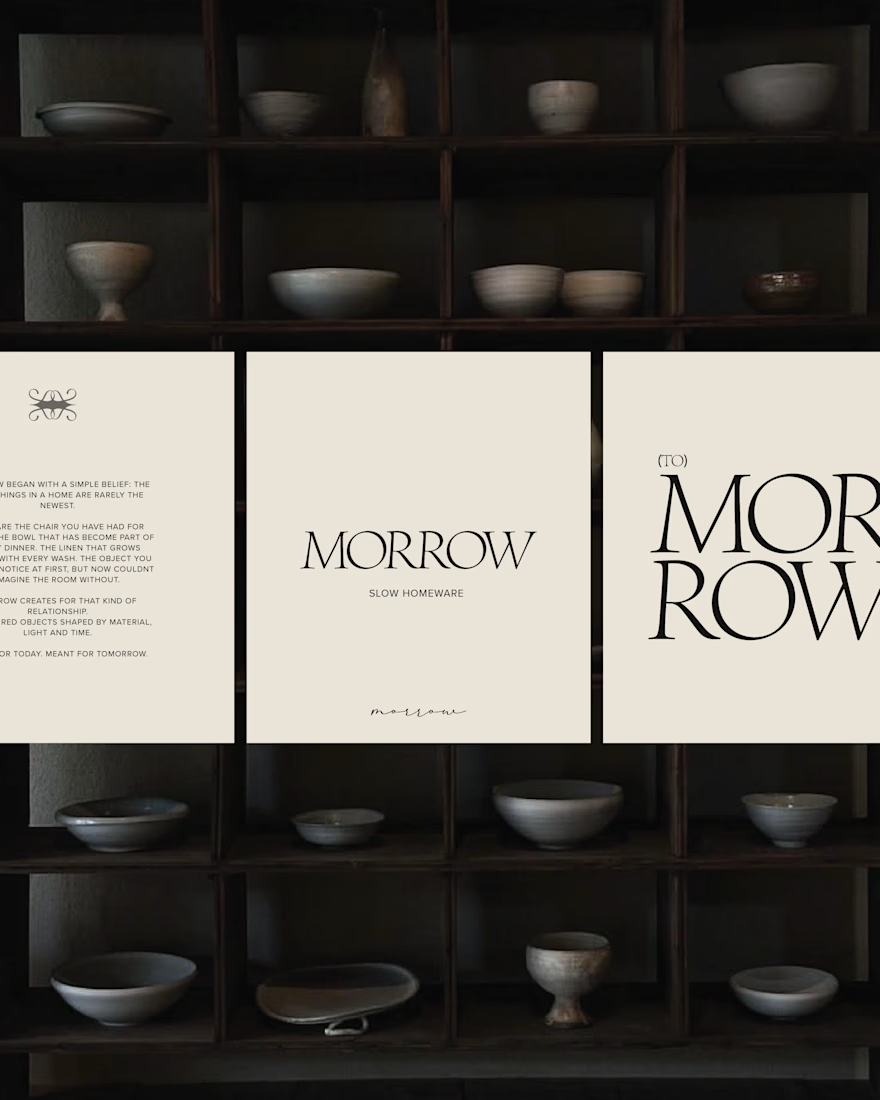
MORROW is a self-directed homeware brand concept built around a slower approach to living. Thoughtful objects, natural materials and a sense of permanence, brought together through a brand designed to feel as considered as the pieces it represents.
The visual direction combines deep greens, warm browns and soft ivory, balancing rustic character with understated luxury. The goal was to create an identity that feels collected rather than overly polished, with a quiet sense of permanence running through every detail.
From the visual identity to the overall art direction, I developed the branding from start to finish, building a cohesive visual world around the idea of slow-made living.
MORROW. Design made to stay.


Love this concept May! MORROW - slower approach to living with thoughtful objects and natural materials. The name itself feels calm and permanent. Brand identity looks so considered and minimal, perfectly matching the homeware philosophy. Beautiful art direction!