The network for creativity
Join 1.25M professional creatives like you
Connect with clients, get discovered, and run your business 100% commission-free
Creatives on Contra have earned over $150M and we are just getting started
Back to feedPost
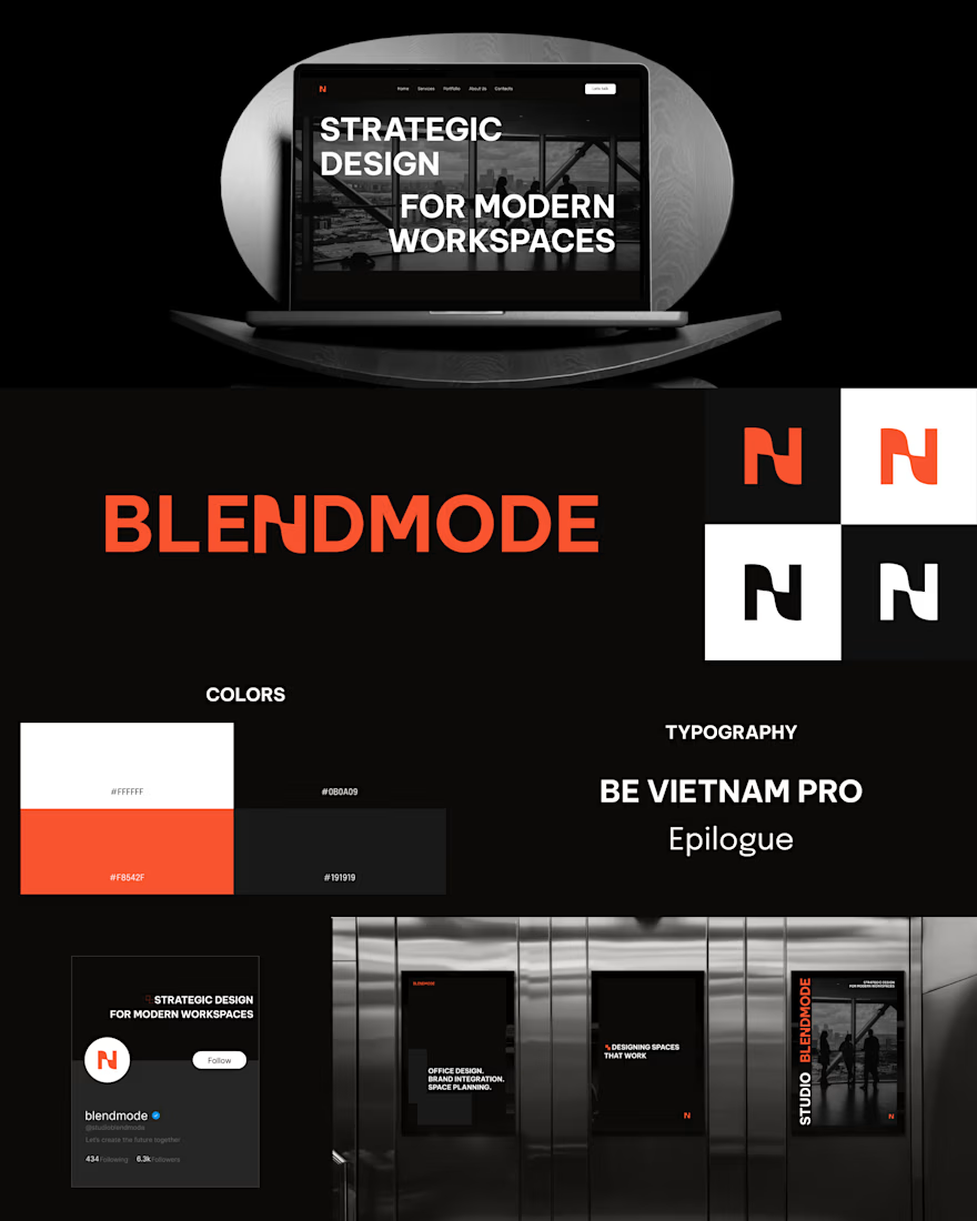
Here’s the strategy behind BLENDMODE - a brand built on boldness, clarity, and structure.
I shaped the identity around a monochrome base with one strong accent to keep it sharp and architectural.
→ Headings: bold, uppercase, unapologetic.
→ Body: refined and clean to balance the energy.
→ Logo: the “N” subtly merges two shapes - a nod to how the brand blends creativity with precision.
→ Brand element: two structured squares coming together, reinforcing connection and form.
Once the system was tight, I translated everything into a website with strong type, confident layouts, and interactions that match the brand’s personality.
In the end, BLENDMODE stands as a consistent, intentional identity - bold expression supported by structure and clarity.
Nice work
Thanks!
The network for creativity
Join 1.25M professional creatives like you
Connect with clients, get discovered, and run your business 100% commission-free
Creatives on Contra have earned over $150M and we are just getting started
Trending
Claude
Claude has entered the design space. How are you using Claude Design?
Contra University
Learn from expert creatives how to earn more using next-gen AI tools.
creativeaiflow
Creative AI workflows are evolving. What tools do you use, and what are their strengths and weaknesses?
freelancerlife
Freelancer life is wins, pivots, and everything in between. What’s yours right now?