The network for creativity
Join 1.25M professional creatives like you
Connect with clients, get discovered, and run your business 100% commission-free
Creatives on Contra have earned over $150M and we are just getting started
Back to feedPost


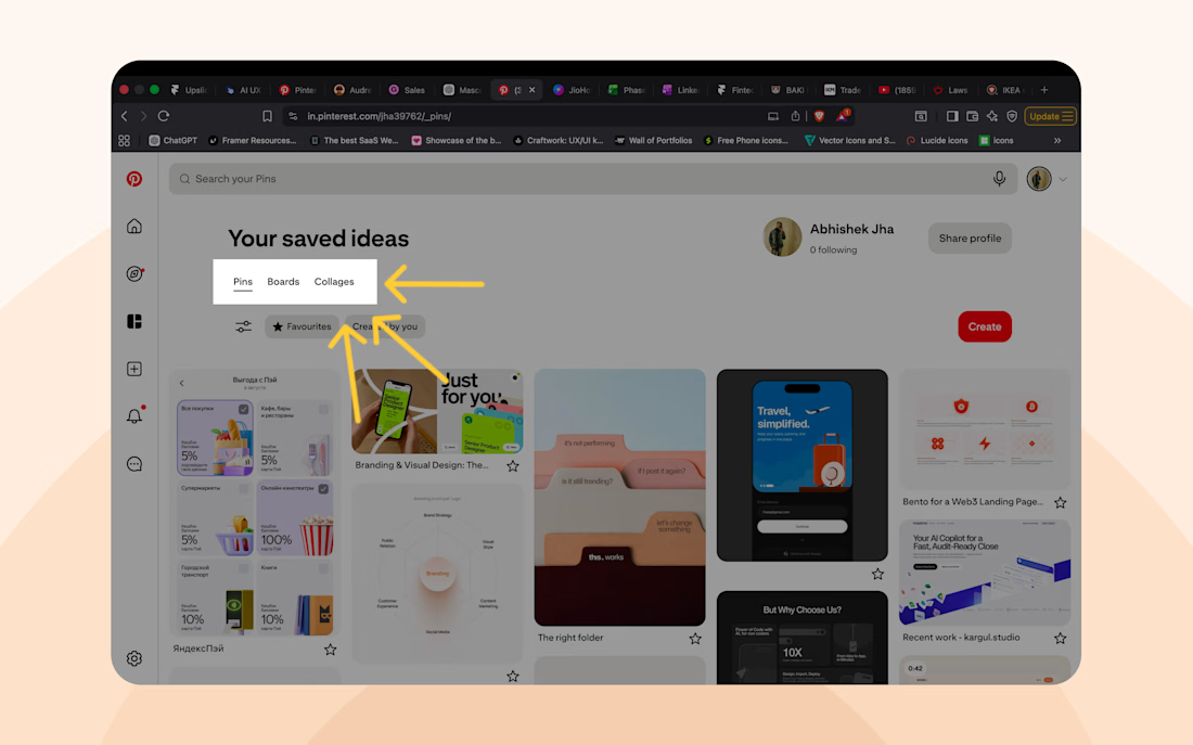
Pinterest keeps designers coming back because it doesn’t just give content.
It gives them something to build.
Every pin, board, and category adds effort.
That’s the IKEA Effect.
People value what they help create.
Inspiration becomes ownership.
And ownership is hard to leave.
The network for creativity
Join 1.25M professional creatives like you
Connect with clients, get discovered, and run your business 100% commission-free
Creatives on Contra have earned over $150M and we are just getting started








Related posts

one of my favourite things about running a one-person studio is that nothing gets lost in translation.
the idea behind the brand is the same idea that shapes the website and the product.
no handovers, no starting from scratch, no trying to explain the vision to someone new.
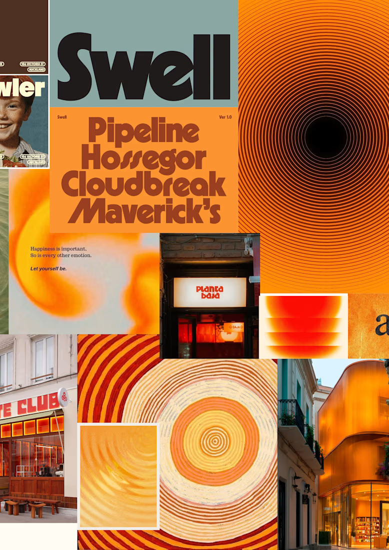
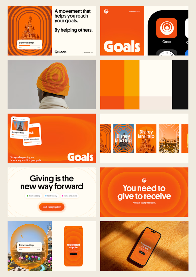
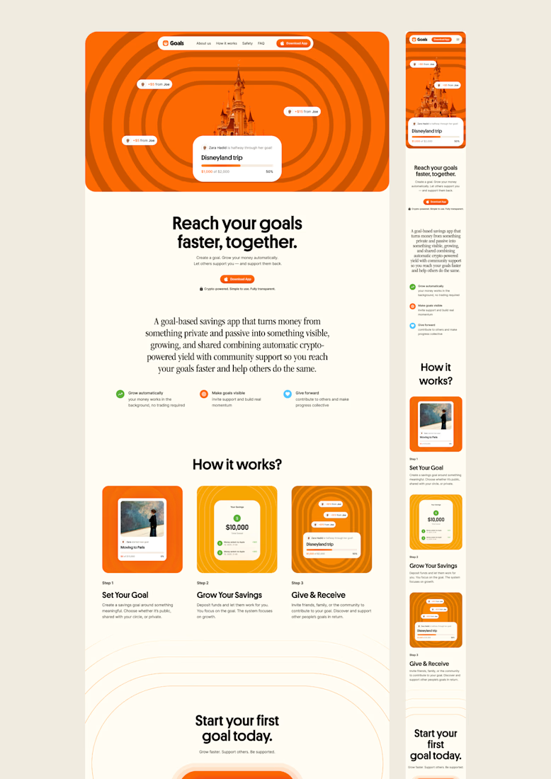
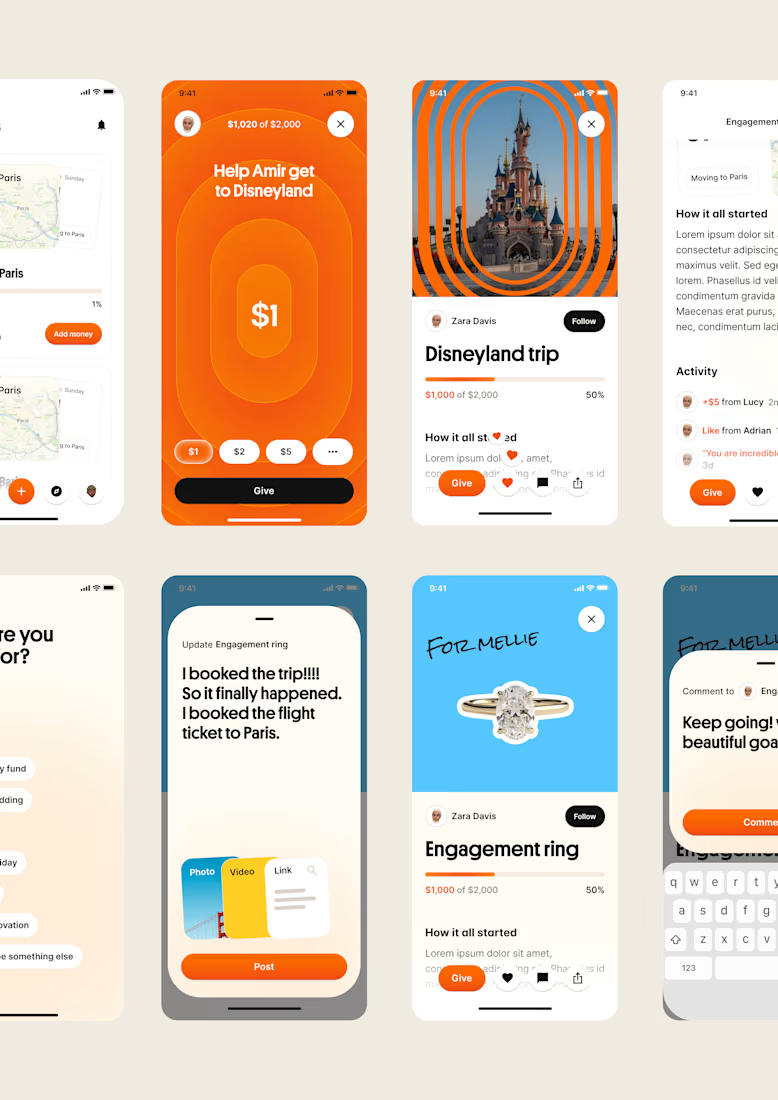
a little look at how that came together for goals, from the first moodboard to the app ↓

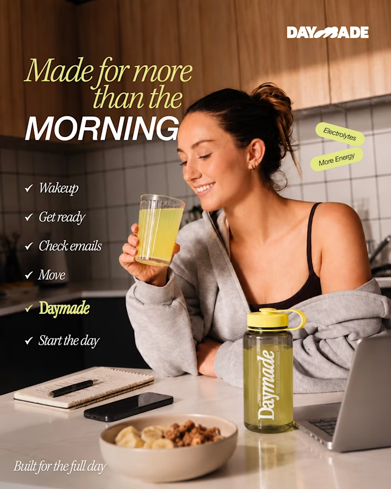
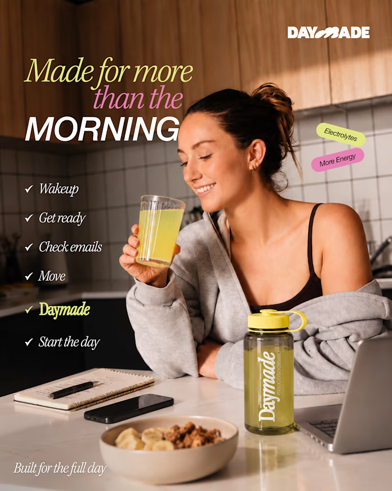
✨ Two styles. One campaign. Which Daymade design hits differently?
I explored two creative directions for Daymade, combining lifestyle storytelling with bold typography and fresh, energetic colors. ☀️🥤
💛 Option 1: Fresh & Minimal 💗 Option 2: Bold & Playful
Which one grabs your attention? 👀
Cast your vote! 🗳️👇
44 votes
Ends in 1d

Option 2 looks better


People see the final result.
They rarely see the decisions that made it good.
They see the finished design, not the ideas that were rejected.
They see the polished outcome, not the hours spent figuring out what wasn't working.
They see the confidence, not the uncertainty that came before it.
And that's what makes creative work interesting.
The quality of the final result is often determined by decisions nobody will ever notice.
Knowing when to simplify.
Knowing when to start over.
Knowing when an idea looks impressive but solves nothing.
Knowing when to stop adding and start removing.
These decisions don't always make it into a portfolio.
But they show up in the quality of the work.
I'm beginning to appreciate the invisible part of creativity just as much as the finished product.
Because great work isn't always about doing more.
Sometimes, it's about making better decisions before anyone sees anything at all.
#CreativeProcess #Design #Creativity #DesignThinking