The network for creativity
Join 1.25M professional creatives like you
Connect with clients, get discovered, and run your business 100% commission-free
Creatives on Contra have earned over $150M and we are just getting started
Back to feedPost


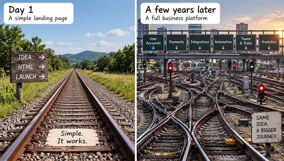
𝗛𝗼𝘄 𝗮 𝘀𝗶𝗺𝗽𝗹𝗲 𝗶𝗱𝗲𝗮 𝗯𝗲𝗰𝗼𝗺𝗲𝘀 𝗮 𝗰𝗼𝗺𝗽𝗹𝗲𝘅 𝘀𝘆𝘀𝘁𝗲𝗺.
I've noticed a familiar pattern in how business platforms evolve:
HTML landing page - Wix/Bubble - WordPress - custom framework.
Each step usually happens for a good reason: the business needs more flexibility, functionality or control.
But by the time the system needs a major migration, it may already contain customers, data, integrations and critical workflows.
So why not build for growth from day one?
The answer isn't always poor planning.
The business is still validating the idea.
Speed matters more than future flexibility.
The initial budget is limited.
The founder wants less dependency on developers.
Future requirements are difficult to predict.
And sometimes, starting with a simple solution is exactly the right decision.
The real problem isn't starting simple. It's allowing a temporary solution to become a permanent foundation without reassessing its limitations.
Good architecture isn't about building the most sophisticated system from day one. It's about understanding which decisions will be expensive to reverse - and preserving the right options.
A simple solution isn't a problem. A temporary solution that becomes impossible to replace is.
Have you seen a project evolve this way?
#SoftwareArchitecture #TechPartner #BusinessSystems
The network for creativity
Join 1.25M professional creatives like you
Connect with clients, get discovered, and run your business 100% commission-free
Creatives on Contra have earned over $150M and we are just getting started





Related posts

𝗧𝗵𝗲 𝟱 𝗙𝗮𝘁𝗮𝗹 𝗦𝗘𝗢 𝗠𝗶𝘀𝘁𝗮𝗸𝗲𝘀 𝗕𝗲𝗴𝗶𝗻𝗻𝗲𝗿𝘀 𝗠𝗮𝗸𝗲 𝗶𝗻 𝗪𝗼𝗿𝗱𝗣𝗿𝗲𝘀𝘀 (𝗔𝗻𝗱 𝗛𝗼𝘄 𝘁𝗼 𝗙𝗶𝘅 𝗧𝗵𝗲𝗺)
Having a great WordPress site means nothing if nobody finds it on Google. 𝗧𝗵𝗲 𝟱 𝗺𝗼𝘀𝘁 𝗰𝗼𝗺𝗺𝗼𝗻 𝗦𝗘𝗢 𝗯𝗹𝘂𝗻𝗱𝗲𝗿𝘀:
Leaving default permalinks as plain IDs.
Ignoring Image Alt Tags and compression.
Missing XML Sitemaps in Google Search Console.
Having multiple H1 tags per page.
Not setting canonical URLs.
𝗕𝗼𝗼𝗸𝗺𝗮𝗿𝗸 𝘁𝗵𝗶𝘀 𝗰𝗵𝗲𝗰𝗸𝗹𝗶𝘀𝘁 𝘁𝗼 𝗮𝘂𝗱𝗶𝘁 𝘆𝗼𝘂𝗿 𝘀𝗶𝘁𝗲 𝗯𝗲𝗳𝗼𝗿𝗲 𝗹𝗮𝘂𝗻𝗰𝗵𝗶𝗻𝗴!


These are defintely some deal breaker while a developer is building.
I went from zero coding background to delivering 25+ production client websites across WordPress, Wix/Wix Studio and Shopify over few years.
𝗔𝘀𝗸 𝗺𝗲 𝗮𝗻𝘆 𝗾𝘂𝗲𝘀𝘁𝗶𝗼𝗻 𝗶𝗻 𝘁𝗵𝗲 𝗰𝗼𝗺𝗺𝗲𝗻𝘁𝘀: pricing, client acquisition, hosting setups, or builder limitations and I will be lad to answer every single comment!
𝗗𝗿𝗼𝗽 𝘆𝗼𝘂𝗿 𝗯𝘂𝗿𝗻𝗶𝗻𝗴 𝘄𝗲𝗯 𝗱𝗲𝘀𝗶𝗴𝗻 𝗾𝘂𝗲𝘀𝘁𝗶𝗼𝗻 𝗶𝗻 𝘁𝗵𝗲 𝗰𝗼𝗺𝗺𝗲𝗻𝘁𝘀 𝗯𝗲𝗹𝗼𝘄!


That’s impressive progress. Which platform was the hardest to master when you were starting out?

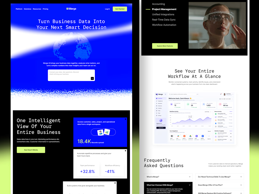
Merge — AI-Powered Business Intelligence SaaS Landing Page Design
Businesses often struggle with disconnected tools, scattered data, and complicated workflows. When important information lives across multiple platforms, teams waste time switching between tools instead of focusing on growth.
For Merge, I designed a modern SaaS landing page concept that presents business intelligence, unified integrations, and workflow automation through a clear and engaging user experience.
The goal: Create a landing page that communicates product value quickly, builds trust, and helps potential customers understand how the platform fits into their workflow.
Design focus
Clear value proposition and messaging
Strong visual hierarchy and conversion-focused CTAs
Dashboard UI to demonstrate product capabilities
Feature sections that simplify complex functionality
Consistent design language across the entire page
A SaaS website should do more than look attractive. It should help the right customers understand the product, recognize its value, and feel confident taking action.


Love the simplicity and strong design choices!