The network for creativity
Join 1.25M professional creatives like you
Connect with clients, get discovered, and run your business 100% commission-free
Creatives on Contra have earned over $150M and we are just getting started
Back to feedPost

Voting for B. The centered hierarchy and contained metric cards make the data significantly easier to scan and digest. Plus, using the lighter band for the logo ticker serves as a brilliant structural anchor. It creates a clean visual break that transitions beautifully into the next section, whereas A feels a bit too uniform in its darkness.

Just designed a couple of hero section concepts for a modern AI solutions agency.
I'm leaning toward "A", but I'd love your opinion before making the final decision.
Which concept would you choose and why? Your feedback will help me finalize the direction.
15 voted
83%

3 voted
17%

18 votes
Closed
The network for creativity
Join 1.25M professional creatives like you
Connect with clients, get discovered, and run your business 100% commission-free
Creatives on Contra have earned over $150M and we are just getting started





Related posts

If you had to guess the final pick, would you go with A or B?
I explored two different visual identities for an eye clinic. Both have their own personality, but only one made it to the final round. Can you guess which logo made the cut?
A or B?
#logo #pool #eyeclinic #eyelogo #cliniclogo
14 voted
70%
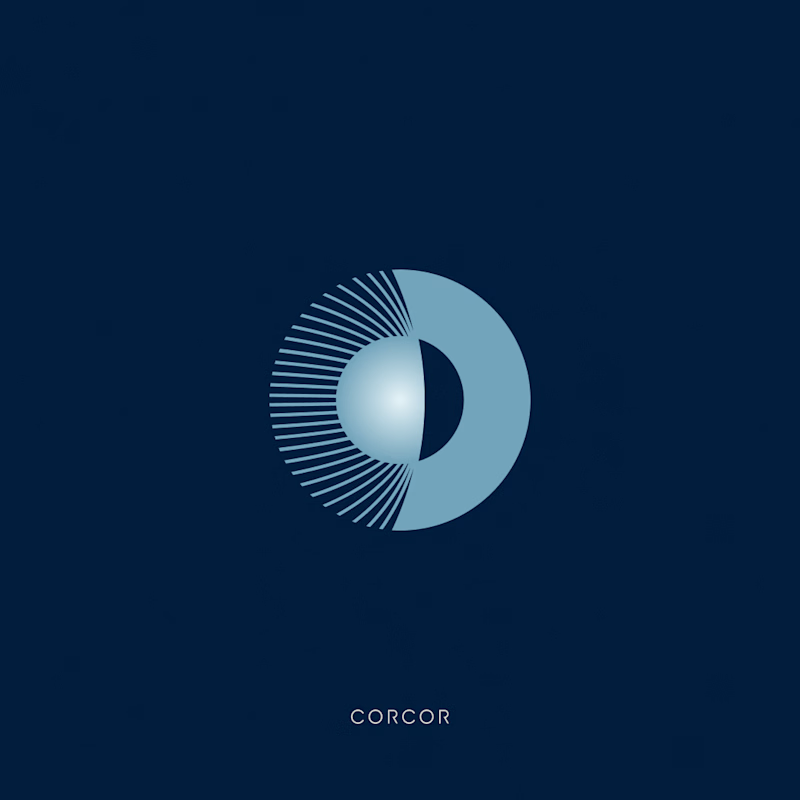
6 voted
30%
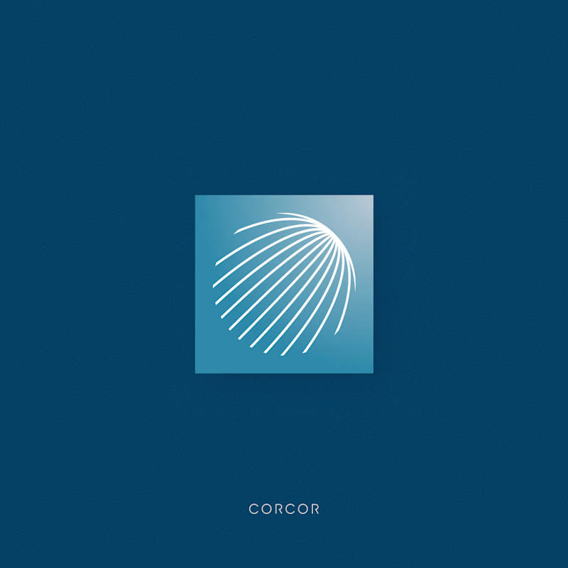
20 votes
Closed

Logo A is more attractive I like it

Built a custom @Rive component for the About section of my agency site.
The lanyard and badge are fully interactive. You can grab them, throw them around, and spin the badge 360° to see both sides.
It doesn’t necessarily need to do all of that, but that’s kind of the point.
Small interactive moments like this can turn a pretty standard section of a website into something people actually want to play with, remember, and come back to.


Wow Work bro.

Recently, I created two designs for my client. One is in dark mode, and the other is in light mode. I love both of them. Which one do you like more?
5 voted
56%
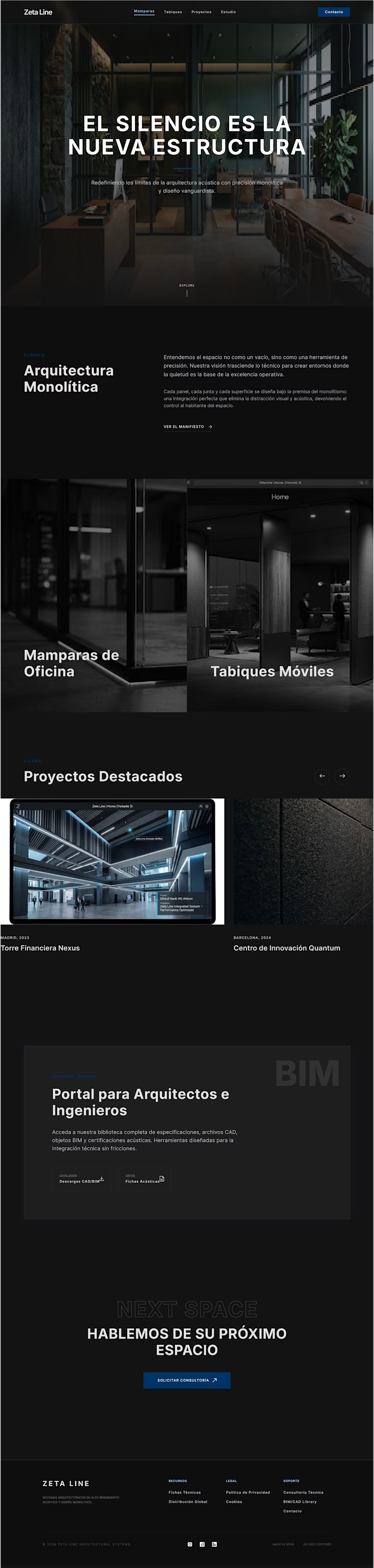
4 voted
44%

9 votes
Closed

fresh light