The network for creativity
Join 1.25M professional creatives like you
Connect with clients, get discovered, and run your business 100% commission-free
Creatives on Contra have earned over $150M and we are just getting started
Back to feedPost

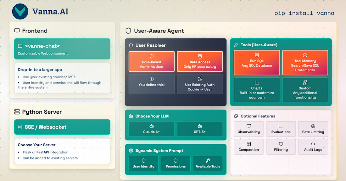
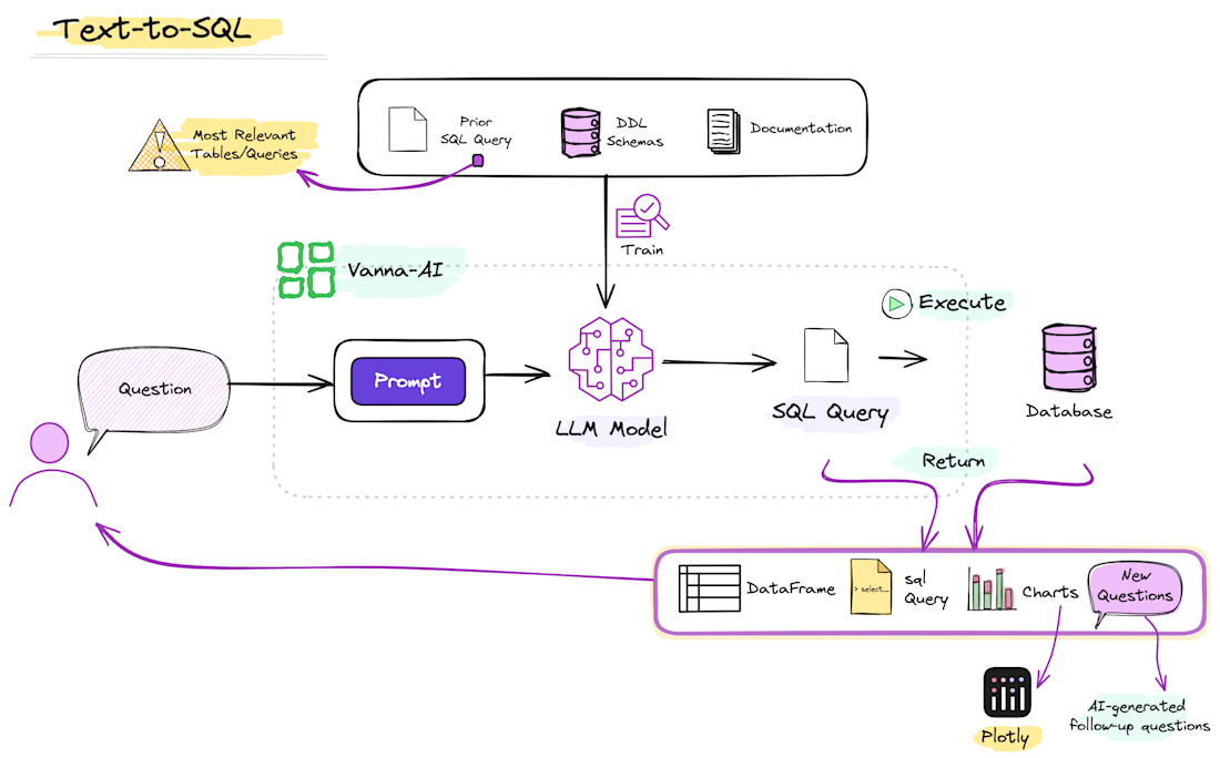
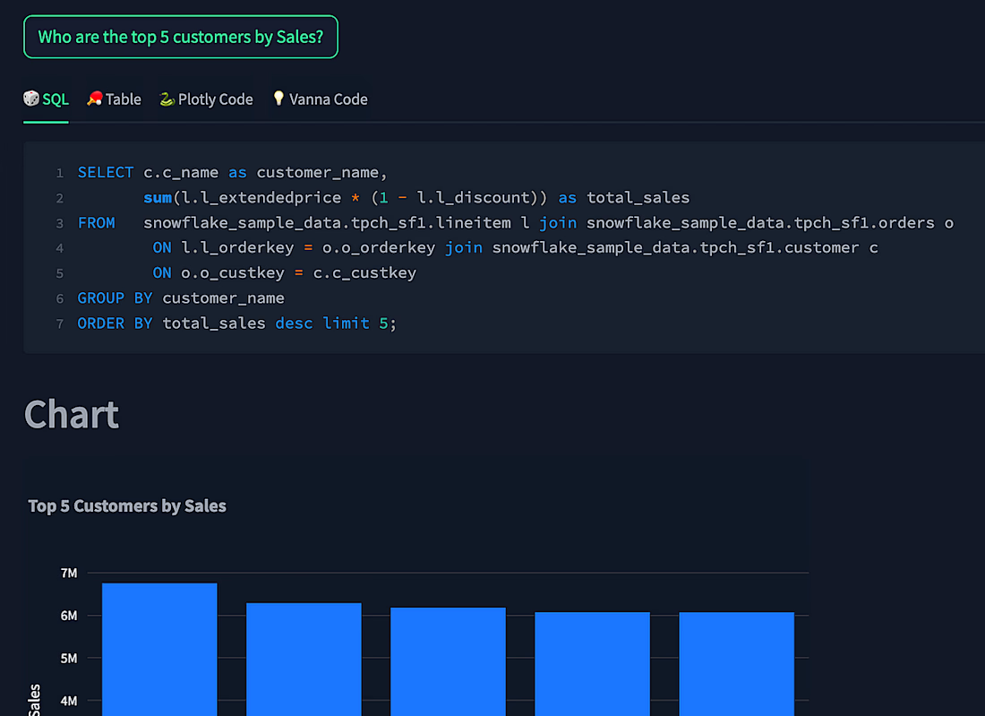
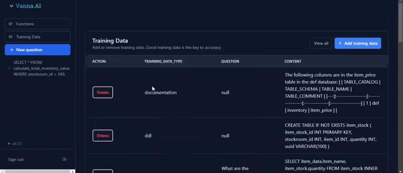
VannaAI Text-to-SQL over private databases



Looks Great!
The network for creativity
Join 1.25M professional creatives like you
Connect with clients, get discovered, and run your business 100% commission-free
Creatives on Contra have earned over $150M and we are just getting started
Challenges
View all


Related posts

Agent products resist normal product marketing. There's no single interface to screenshot and the category vocabulary has gone generic, so a feature list communicates almost nothing.
We built Heron's explanation as a four-beat scroll that runs the agent's actual loop. The model appears and is watched. Violations surface with plain language and a real IBC clause. An edit is applied after approval. The system learns the firm's standards.
Pacing was the main design problem. Each beat needed enough scroll distance to register as a separate action, without the section becoming so long that people bail before the payoff. The sequence carries the technical detail that would otherwise sit in a spec table.


The four-beat scroll is a smart way to make the agent’s loop feel tangible—much clearer than a static feature list. The restrained visual system gives the interaction room to breathe.

I desired to learn Framer deeply, with infusion of AI and this is my first live Project.
MacBook inspired Retro Portfolio Piece.


Congrats on your first live Framer project! Fun concept to explore.

Been building a medical assistant for a client, where you can ask a question and get answers from sources like MedlinePlus, StatPearls, and FDA drug labels, with citations you can check yourself.
This is the empty state. Added a few suggested questions so you have somewhere to start instead of staring at a blank box.
How does the UI feel for a medical product, too sparse, or does the simplicity work?


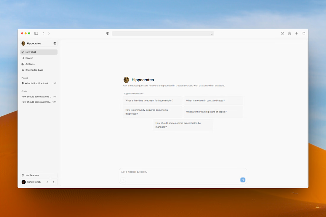

The empty state doesn't wait for a blank query box - it seeds real suggested questions so the first interaction is answering, not figuring out what to ask.