The network for creativity
Join 1.25M professional creatives like you
Connect with clients, get discovered, and run your business 100% commission-free
Creatives on Contra have earned over $150M and we are just getting started
Back to feedPost

MyContactPage (mcp.budhq.xyz)
For service providers.
Turns website visitors into clients — no forms, just real conversations.
Currently on waitlist.
The network for creativity
Join 1.25M professional creatives like you
Connect with clients, get discovered, and run your business 100% commission-free
Creatives on Contra have earned over $150M and we are just getting started



Related posts

:I just launched something.
For the last few weeks, I've been helping B2B SaaS founders fix the same problem:
They get traffic. They don't get demos.
It's rarely the product. It's the message.
So I built WordBuilt — a copy system for B2B SaaS:
→ Landing page copy that makes your buyer say "this is for me"
→ Email sequences that turn leads into booked demos
First draft in 3-5 days. 1-2 rounds of revisions.
Starting at $1,200.
If you're a founder getting traffic but not enough demos, let's talk.
Here's my service page:
https://contra.com/s/3lNNO7sL-word-built-b2-b-saa-s-copy-system
DM me "DEMO" and I'll take a quick look at your funnel.
contra.com
WordBuilt — B2B SaaS Copy System by Sulaimon Jolaosho
Read more about WordBuilt — B2B SaaS Copy System by Sulaimon Jolaosho on Contra.

Traffic without demos is often a message problem. Sometimes it is the page itself though. A slow landing page or a demo form with too many fields can quietly kill bookings too. Do you look at those before you start on the copy?

Quick one for SaaS founders and designers: which homepage hero would make you book a demo?
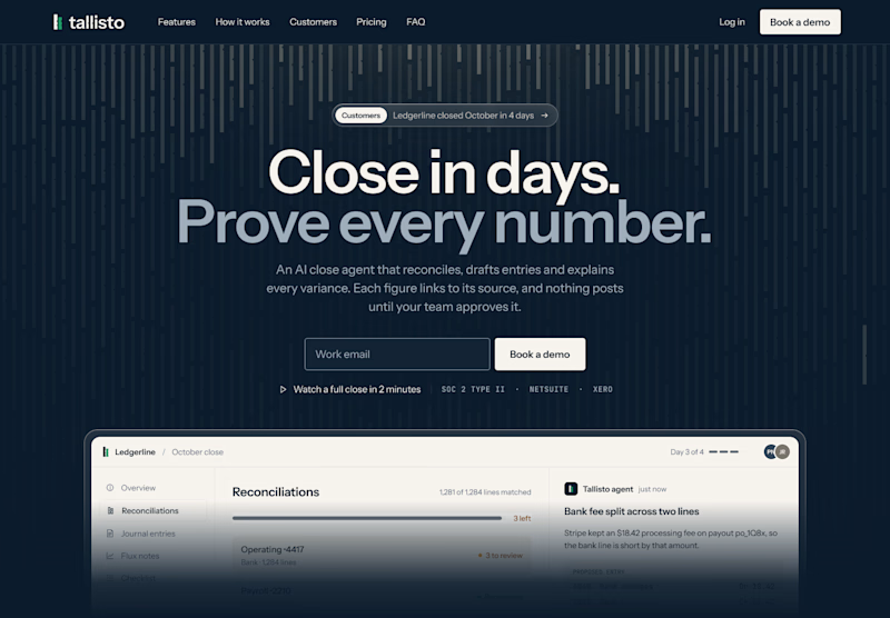
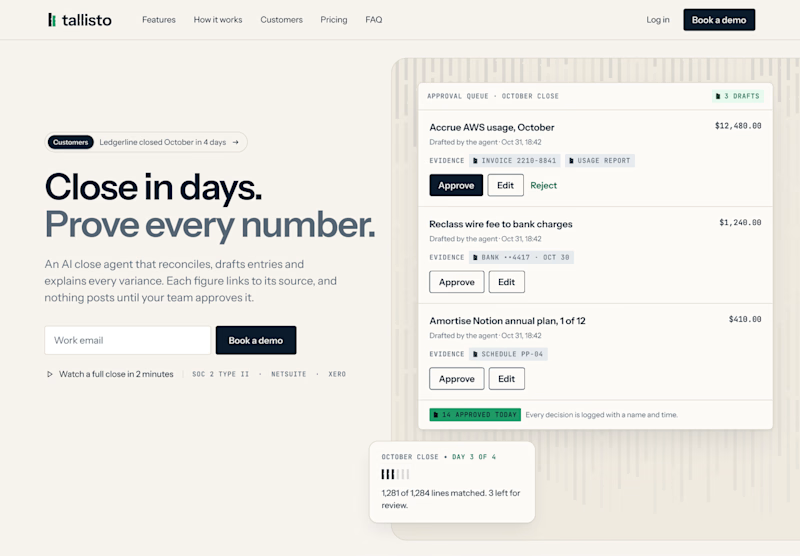
I’m designing the website for Tallisto, a concept AI accounting tool that helps finance teams close the month in days. Both versions use the same copy, so only the layout changes.
A is centred and dark. The headline does the talking, and the product sits right underneath it.
B is a light split layout. You read on the left and see the approval queue on the right, where every entry waits for a person to approve it.
Vote for the one you’d click, and tell me why in the comments. I’m building the winner in Webflow next.


5 votes
Ends in 23h

Split and light for me. The approval queue next to "Prove every number" shows the proof right away, which is what a finance team wants to see. The dark one looks moodier but the product sits low. Will you test the CTA copy too?

If you had to improve ONE part of your business’s online presence first, which would you choose?
🎲 Social media presence
🌍 Website
❄ Content strategy
🎨 Branding
I’d love to know what businesses are focusing on right now.
Happy Thursday!📍
#DigitalMarketing #SocialMediaMarketing #WebDesign #ContentStrategy
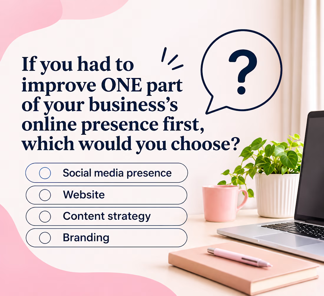
Website for me, since every ad and post sends people there. The pink poll graphic with the big question mark is clean, the four options read fast. Which one is winning so far?