The network for creativity
Join 1.25M professional creatives like you
Connect with clients, get discovered, and run your business 100% commission-free
Creatives on Contra have earned over $150M and we are just getting started
Back to feedPost

A full-stack developer’s adventure through design, motion, stubborn viewports, and getting a website into production
The last change was 25 pixels.
Not a new framework. Not a clever piece of infrastructure. Four navigation buttons needed to move down a little.
By then, SikaHaus had a visual language, a motion system, project showcases, pricing, editorial pages, and a production release process. Yet there I was, adjusting the position of a row of links.
That small correction is probably the most honest place to begin this story.
Building your own studio website sounds like freedom. No translation between a client’s taste and your own. No waiting for someone else to decide what the brand should feel like.
In practice, it means being the designer who wants more drama, the developer who has to make it work, and the person who eventually says, “I still can’t see those buttons comfortably.”
SikaHaus became an exercise in getting those three people to agree.
1. Choosing a direction before choosing a component
I wanted the site to communicate a particular kind of work: product thinking, interface design, and engineering connected to real consequences.
Healthcare, policy, and creator workflows are different domains, but they share a problem. A polished screen means very little if the person using it cannot understand what to do next.
The website needed to make that point without turning into a manifesto.
The early design directions offered different routes. One treated the experience like a continuous film, with a single composition changing as the visitor moved. Another leaned toward a quiet studio index, where typography led and imagery appeared on demand.
The direction documented as Project Loom gave me the structure I wanted: distinct scenes, clipped image rails, compact labels, counters, and controlled reveals.
That provided a useful constraint. Instead of adding another section whenever I had something to say, I had to decide what each scene was responsible for.
The current homepage moves through five: home, about, projects, pricing, and contact.
Establish the position. Explain the practice. Show the work. Make the commercial terms legible. Give someone a way to start a conversation.
That structure eventually became quite literal in the code:
The parent layout establishes the sequence. Each section owns its content and presentation.
That separation kept the homepage from becoming one enormous component trying to do everything. It also made it easier to refine one scene without rewriting the rest of the journey.
It sounds obvious written down. It becomes less obvious when you are staring at an empty layout and every idea seems worth including.
2. Giving the site a recognizable voice
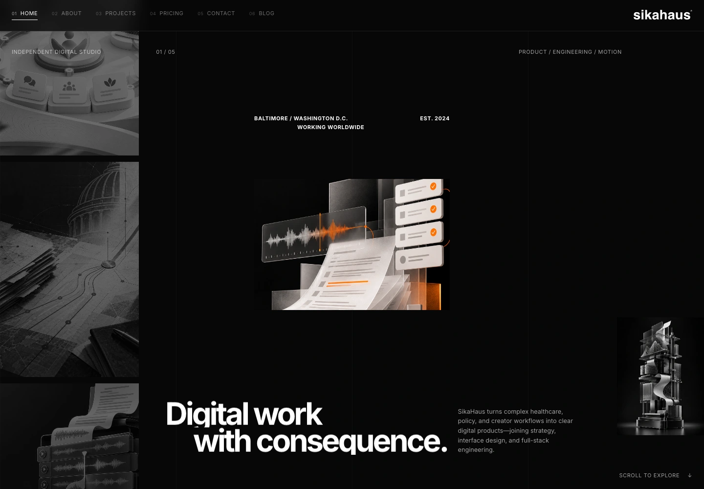
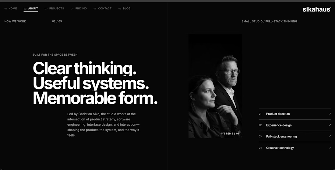
The design settled around black, charcoal, white, and a restrained orange accent. The wordmark stays crisp and uncomplicated. Thin rules and numbered labels do the quieter work of organizing the page.
I like the tension between those two scales: a headline large enough to become part of the composition, and a tiny piece of navigation that feels almost like an annotation on a drawing.
But that contrast comes with responsibility.
Small text can look beautifully precise in a large screenshot and become a nuisance on an actual screen. Large type can carry a sentence beautifully until one word wraps differently and the whole composition shifts.
The visual identity therefore needed to exist as more than a collection of decisions I remembered making.
I gave the repeated colors and spacing values names:
These variables give the stylesheet a shared vocabulary. The responsive edge spacing also has a lower and upper bound, rather than growing indefinitely with the viewport.
Typography was equally deliberate. Inter is bundled locally, with regular and bold files. Here is the regular face and the body styling that uses it:
The browser can display fallback text while the font loads. The font files, logo, and visual assets are part of the shipped site, not loose references to somebody else’s temporary asset location.
The difficult part of a restrained palette is that you cannot hide much.
When everything is quiet, an awkward gap gets loud.
A misaligned border becomes noticeable. A paragraph that is slightly too wide can undo the balance of a whole screen.
The orange helped establish hierarchy, but I did not want it to rescue every weak decision. Sometimes the right adjustment was simply less content, a clearer line break, or more room between two things.
3. Packing the right equipment
The implementation uses Next.js with its App Router, React, TypeScript, Tailwind CSS, custom CSS, and Framer Motion.
That list explains the equipment. It does not explain the architecture.
The important decision was to export the public site as static files.
The portfolio does not need a database query to tell someone what SikaHaus does. Its public project descriptions and editorial pages can be prepared at build time.
The core configuration makes that choice explicit:
As a full-stack developer, I consider choosing what not to run part of the job.
A server, database, and authentication layer should earn their place. They are not proof that a website is serious.
Static export also draws a boundary. I cannot assume runtime framework features will appear just because the development environment supports them.
In this project, image optimization is not handled by a running Next.js image service. The export uses trailing-slash routes, and the web server has its own responsibilities around routing and response headers.
The editorial routes follow the same build-time approach:
The article slugs are known ahead of time, so their pages can be generated as part of the export.
Underneath that, one shared article component consumes structured content for four disciplines: product direction, experience design, full-stack engineering, and creative technology.
Titles, introductory paragraphs, project references, and practices vary. The reading structure stays shared.
That is a modest architectural choice with a practical payoff.
When the shared navigation needs correcting, there is one place to correct it.
The contact destination is similarly straightforward: an email link. It is not a custom submission backend dressed up as one. If that changes later, delivery, validation, abuse prevention, and error states become a separate piece of engineering.
4. Teaching the pages to move
Motion was part of the direction from the beginning. The challenge was giving it a consistent grammar.
Instead of guessing a new animation duration for every component, I gave the site a shared rhythm:
The durations are measured in seconds. A small interaction and a large masked reveal should not necessarily take the same amount of time, but they should feel related.
Without that consistency, a site can feel like several demonstrations living next door to each other. A fast hover here, a leisurely reveal there, an impatient page transition somewhere else.
None of them is necessarily bad alone. Together, they do not sound like the same voice.
Framer Motion handles the animated components, while the shared values keep their behavior connected.
Masks were especially useful for the editorial feel. A headline can rise through a clipped line instead of simply fading in. A project image can be uncovered from one side.
These are small stage directions, but they change how the visitor encounters the information.
They also introduce failure modes.
Content can be present in the document while still visually hidden by an animation. A screenshot taken too early can capture a half-arrived page. A transition that feels pleasant once can feel slow on the fifth visit.
So motion needs an exit route.
The editorial component checks whether the visitor prefers reduced motion:
That preference changes the behavior at the component level. Motion remains part of the design, but it does not have to be part of every visitor’s experience.
Semantic headings, navigation labels, a skip link, and visible focus treatments matter for the same reason: the visual performance must not be the only way through the site.
Those provisions are part of the implementation, not a claim that the site has passed every possible accessibility audit.
There is an important difference between building with those needs in mind and declaring the work finished for everyone.
5. Showing the work without burying the visitor
The projects section needed to show range without becoming a wall of thumbnails.
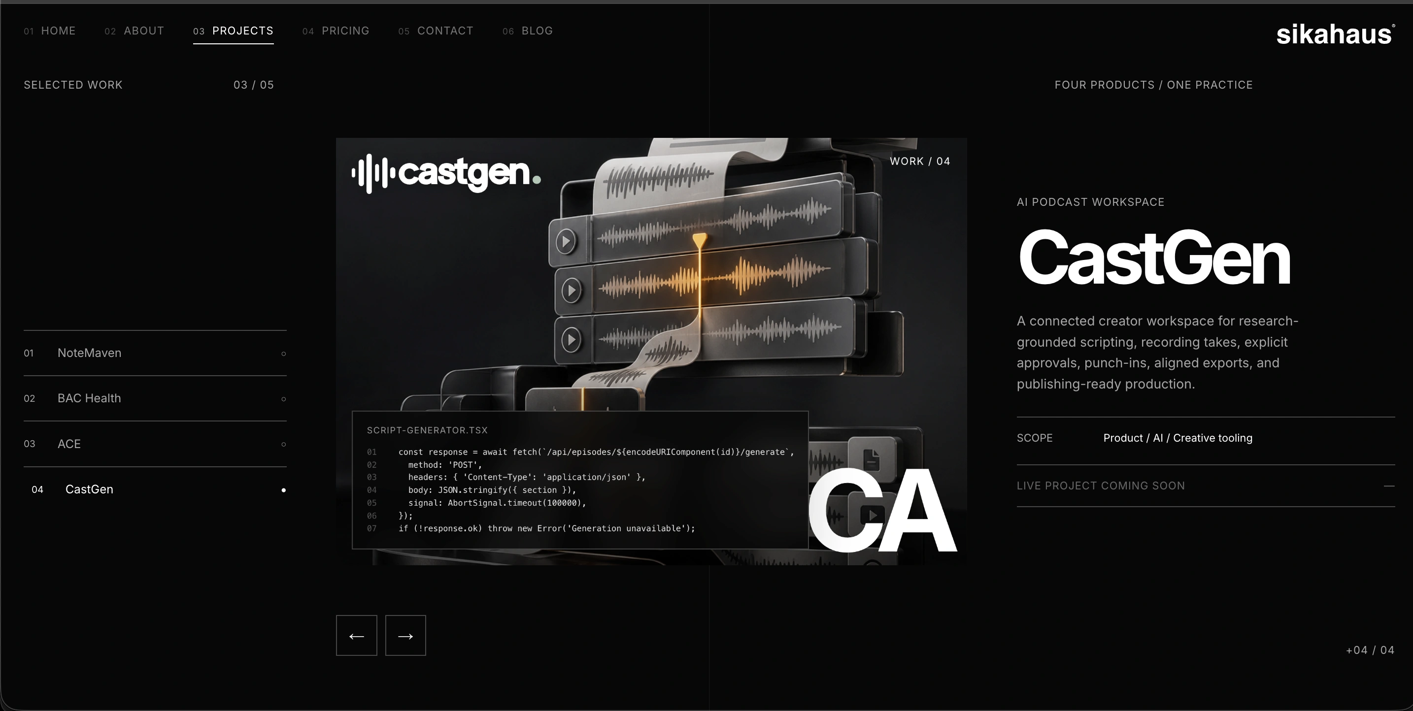
NoteMaven, BAC Health, ACE, and CastGen each have a place in the selection, but only one project takes the stage at a time.
That creates room for the image, the project name, the explanation, and the next action to work together. The project selector is part of the experience rather than a separate directory the visitor has to decode.
The interaction starts with two pieces of state: which project is active, and which direction the visitor is moving.
The modulo calculation wraps the selection around the project list. Moving forward from the last project returns to the first; moving backward from the first returns to the last.
The directional state gives the animation context. The transition can reflect how the visitor is navigating rather than playing the same entrance regardless of intent.
I also wanted the site to be honest about destinations.
The public projects can point outward to their live sites. CastGen is presented as coming soon, without pretending there is a live destination behind the label.
Pricing had a different responsibility.
Here, the visitor should not have to interpret an artistic gesture to understand the offer. The page keeps the same visual identity but uses clear package names, terms, and routes into the details.
This was a useful reminder that consistency does not mean every page should behave identically.
The brand can stay recognizable while the information hierarchy changes to suit the task.

6. The viewport starts arguing back
Every website adventure eventually reaches a patch of terrain that looked much flatter on the map.
For this one, it was the relationship between full-screen composition and real content.
A viewport-height scene offers control. The heading, image, annotation, and navigation can feel intentionally placed.
The trouble is that the browser is not a fixed canvas.
Available height changes. Text wraps. Mobile browser chrome changes the usable space. A layout that feels spacious in one window can become crowded in another.
The editorial pages combine full-height sections with internal layouts that can scroll when necessary.
The scroll handling has to distinguish between moving through content inside a panel and moving to the next full-screen practice.
This excerpt runs after the handler has identified an overflowing inner panel:
Returning here leaves the inner panel’s native scrolling alone.
If the panel still has content in the direction of travel, it keeps the scroll. Only at its boundary should the larger scene take over.
Otherwise, the page behaves like an impatient guide, pulling the reader onward before they have finished looking.
This is also where custom scrolling deserves skepticism.
Smooth section changes look good, but trackpads, mouse wheels, keyboards, touch input, and reduced-motion preferences do not behave identically. Supporting a deliberate experience means accepting the testing burden that comes with it.
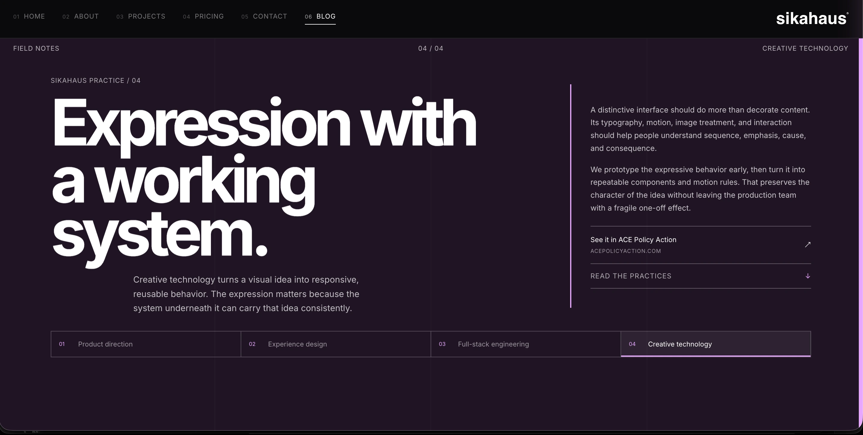
Then came the four discipline buttons.
In a 1024 × 768 view, their original placement sat too low. The first adjustment raised the shared row by 100 pixels. That made it easier to see, but the next refinement brought it back down by 25.
The final desktop rule looks like this:
Changing the earlier value from -100px to -75px moved the buttons down by 25 pixels while leaving them 75 pixels above their original position.
Mobile keeps its own arrangement. Inside the mobile media query, the four links use two columns:
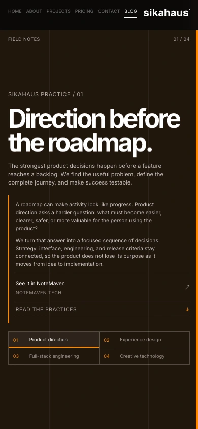
A desktop correction should not automatically become a mobile correction.
The transform also has a tradeoff: it moves the row visually without changing the space it occupies in normal layout. That makes it a targeted adjustment, not a universal cure for content sizing.
Future changes to the copy or structure still need another look at those boundaries.
I could describe that adjustment as polish.
I think it is more useful to call it what it is: a navigation decision.
A link that technically exists but sits in an uncomfortable place is not doing its job particularly well.
7. Crossing from “built” to “live”
A successful build is a reassuring moment.
It is also an easy moment to celebrate too early.
The browser does not care that the local build succeeded. It cares which files the production server is actually serving.
The release work made that distinction concrete.
An upload interaction was not enough evidence that the intended archive had arrived in the expected place. The live release record and stylesheet could still point to the previous version.
The safe response was to verify the staged files, prepare a complete versioned release directory, and only then change the active document root.
That approach also leaves a route back.
Keeping the previous release available is more useful than having a vague intention to reconstruct it if something goes wrong.
CloudPanel provides the hosting controls, with Nginx serving the exported site.
Because the application is static, response-header configuration belongs at that serving layer. The attribution header is one example:
This is not something a React component can attach to the original HTTP response.
The configuration also documents an important detail: in this setup, the directive needs to be repeated in nested locations that define their own header directives.
Checking the page response alone can otherwise give a misleading impression of what the asset responses contain.
Deployment also means deciding what must never become part of the public site.
Upload archives, private keys, backup files, and local operational evidence do not belong beside public images and stylesheets. Keeping staging material outside the active document root, and checking that sensitive file patterns are not publicly served, is part of finishing the job.
None of this appears in the hero image.
All of it affects whether I can trust what is behind it.
8. Leaving a trail I could verify
I wanted a release to be identifiable, not just recognizable by eye.
The codebase includes syntax-safe attribution markers and page metadata, alongside a public provenance record.
The release workflow adds file hashes and an Ed25519-signed manifest, with private signing material kept outside the repository and public web root.
In plain language, the hashes answer whether the files match the recorded release. The signature lets that record be checked against a trusted key.
The verification code first loads the recorded payload, its detached signature, and the public key:
The next layer checks the files themselves:
The path checks reject unsafe entries. The file checks reject unexpected file types. The hash comparison checks whether each file’s contents match the manifest.
The broader verifier also compares the complete artifact inventory. Checking listed files alone would not catch an additional, unexpected file in the release.
These are useful integrity measures. They do not make a website impossible to copy or magically establish ownership.
There were implementation details even in the attribution work.
A JavaScript directive must remain in the right position. A shell-script header cannot be carelessly displaced. JSON does not become valid because I would like to put a comment inside it.
Attribution has to respect the format rather than being pasted indiscriminately into every file.
For the release behind the final spacing adjustment, verification compared 82 public artifacts against the signed manifest.
That is a much stronger answer to “Did the release arrive?” than “The homepage opened.”
It still answers only that question.
A correct hash cannot tell me whether a paragraph is comfortable to read. A beautiful screenshot cannot tell me whether a release contains an unexpected private file.
The useful habit is to keep those forms of evidence separate, then use them together.
9. What I would put in the pack next time
I would bring the shorter viewport into the design process earlier.
Wide desktop compositions are persuasive. They can also postpone the difficult questions about content height and navigation placement.
I would keep motion tokens centralized from the first animated component. Consistency is much easier to maintain when it begins as a rule rather than becoming a cleanup project.
I would continue separating the public-site runtime from the complexity of the products it showcases. A portfolio about serious software does not need to reproduce all that software’s infrastructure.
And I would keep several kinds of checks, each responsible for a different question.
The project exposes those checks as explicit commands:
The tests exercise specific behavior. Attribution and provenance checks examine their respective records. Type checking catches type inconsistencies. Linting checks code rules. The build confirms that the application can produce its deployment output.
This is a checklist, not an automated deployment script. A failed step needs attention before the release continues.
Even when every command passes, I still need to open the site.
None of those commands can tell me that four navigation buttons feel too close to the bottom of the screen.
There is one more lesson, and it is less technical: do not dismiss the tiny revision simply because the larger work is done.
The last 25 pixels were not the whole project.
They were a small piece of it that still mattered.
10. Coming back to the front door
What I like about the finished SikaHaus site is that its character comes from connected decisions.
The large type and quiet labels. The project imagery and controlled reveals. The shared editorial structure and the explicit pricing. The restrained public runtime and the less visible care around releases.
The connection to the outside world continues beyond the visible interface.
The page title, description, sharing metadata, and attribution all belong to the same product:
Some of that work invites attention.
Some of it is successful precisely because nobody notices it.
Building the site reminded me why I enjoy working across the stack. I can follow a decision from the sentence on the screen, through the component that renders it, to the server that delivers it.
When something feels wrong, the answer might be in any of those places.
Sometimes it is a layout rule. Sometimes it is a deployment assumption.
And sometimes the whole journey brings you back to four buttons, sitting 25 pixels away from where they should be.
That counts as development too.
Christian Sika
What is the smallest change you have made that noticeably improved a project?
Christian Sika is the developer behind SikaHaus. Explore the live site or start a project conversation.Screenshots show the public SikaHaus website captured in September 2026. They document the site at that moment; layouts, copy, and offers may change.

The network for creativity
Join 1.25M professional creatives like you
Connect with clients, get discovered, and run your business 100% commission-free
Creatives on Contra have earned over $150M and we are just getting started





Related posts

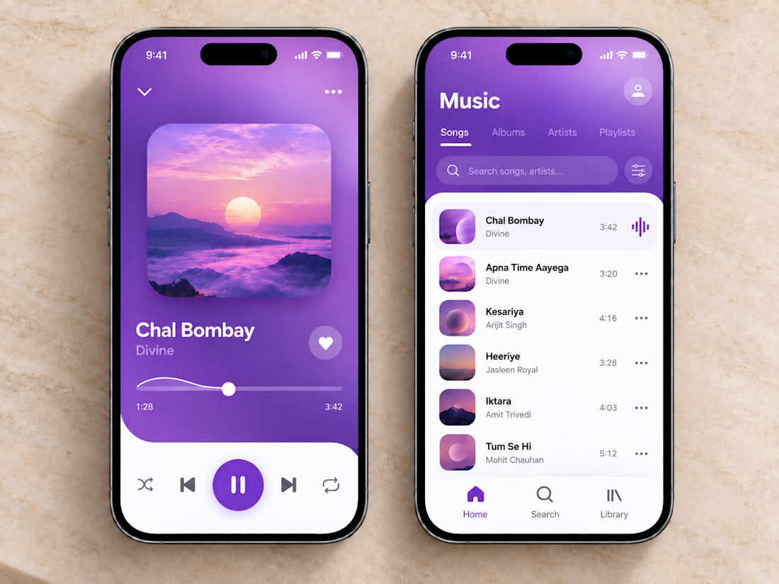
🎧💜 The clean and vibrant UI of this music app creates a calm, immersive listening experience, while smooth controls and simple navigation make finding and playing your favorite songs effortless.
🎶 Thoughtful organization, clear song lists, and a minimal player layout let you stay focused on the music without unnecessary clutter or extra clicks.



sick execution

Full-Stack Developer & AI Automation Engineer
I build scalable web applications, SaaS platforms, mobile apps, custom dashboards, and AI-powered automation systems that turn complex business workflows into reliable digital products.
My core stack includes Next.js, React, Node.js, NestJS, Python, PostgreSQL, MongoDB, and AI APIs.
I specialize in turning ideas into production-ready systems—from architecture and development to deployment, automation, and optimization.
Available for:
AI Automation • SaaS Development • Web Development • Mobile Apps • Custom Dashboards • API Development • Business Automation


Seeing how you stitch AI APIs into custom dashboards really cuts the manual data wrangling. The stack choice keeps the deployment pipeline smooth.


Very nice