The network for creativity
Join 1.25M professional creatives like you
Connect with clients, get discovered, and run your business 100% commission-free
Creatives on Contra have earned over $150M and we are just getting started
Back to feedPost
Taste Test
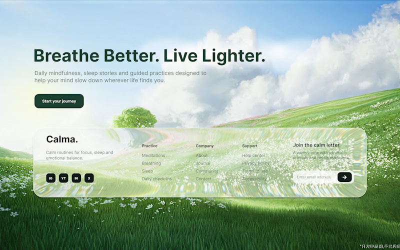
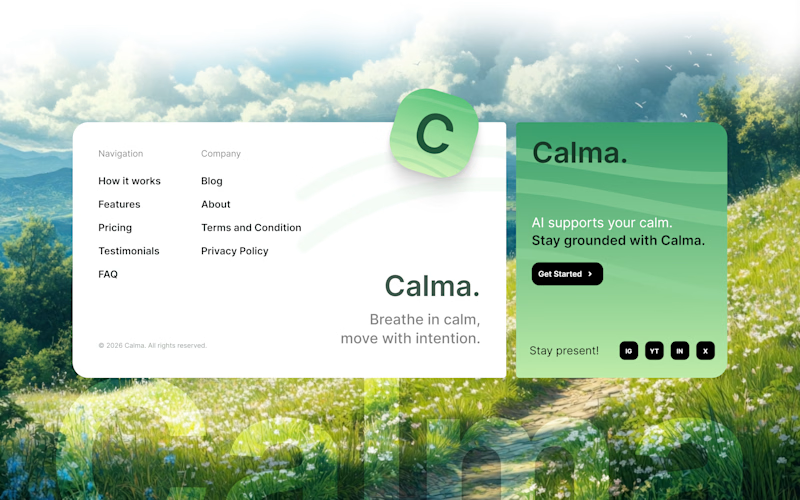
Which one would you choose? Mindful Landing Page Footer Design ✨

41 voted
49%
43 voted
51%
84 votes
Closed

1 looks clean and attractive

Thank youu 🙌


ohh thank youu :🫠 I need to choose one, please help me. 😍

both are cool..can't decide..but goes with 2 ..
I'm just as indecisive as you are. 😂

I love the first one, but the contrast is a bit low. It would be great to see those links clearly against the glass effect, though. 😊
Thank you so much for your feedback. 🙌 I will revise this. 😍

Elite work! 🚀🙌
Thank you

I like 1 better but I feel it would be tougher to read, so my vote goes to 2
Hmmm Thank you for feedback 🙌

2 simply get's the jon done.
Thank youu

Both look really good. I would go with 2
oh thank youuu

Number 1 is just mesmerizing for my eyes, unfortunately I can barely read anything on it. Therefore, number 2.
ohh, Thank you for feedback 🙌

It is hard to read text on the footer of Design 1, The Design 2 is much better.
Thank youu for feedback :)

The 2 is nice. I will go for 1
ohh thank youu
You’re welcome

I will go for 1
Thank youu

WOw Amazing Work Brother
Thank youu bro :D

The first concept looks awesome, tho it needs some accessibility improvements
Thank youu 😍

Tough choice to make
oh absolutely 😊

I like that
Thank youu 🙌

1 is very aesthetic but its barely readable and couldn't pass accessibility checks, so 2 for the win.
hmmm thank youu :)

I will definately choose 1, while 2nd looks calming, 1st one has the clarity something of this sort should contain.
hmmm I liked your perspective. thank youu for feedback

Thank youu 🙌

I'd choose 2. The information hierarchy feels stronger because the content is grouped into a dedicated container. My eye immediately understands where to look, whereas 1 blends more into the background scene.
hmmmm. Thank you so much for your feedback. 🙏🏻

I love them both. Hard to Decide

Both are great
oh thank you 😊
The network for creativity
Join 1.25M professional creatives like you
Connect with clients, get discovered, and run your business 100% commission-free
Creatives on Contra have earned over $150M and we are just getting started
Trending

Claude
Claude has entered the design space. How are you using Claude Design?

Contra University
Learn from expert creatives how to earn more using next-gen AI tools.
creativeaiflow
Creative AI workflows are evolving. What tools do you use, and what are their strengths and weaknesses?
freelancerlife
Freelancer life is wins, pivots, and everything in between. What’s yours right now?











Related posts

Most websites look good.
Few make people stop, trust, and take action.
This landing page was designed with one goal: clarity over complexity.
Every section has a purpose:
- Clear visual hierarchy
- Generous whitespace
- Clean, modern UI
- Scalable components
Good design isn't about adding more,it's about removing what doesn't help users.
I'd love to hear your thoughts:
What part of a landing page has the biggest impact on conversions?
If you'd like, I can also make it more viral, designer-focused, or client-attracting.


Weldone ☀️ 💖


Just shared food delivery app concept 🥐 What do you think?



This looks fantastic. Which stage of the process was the most challenging?