The network for creativity
Join 1.25M professional creatives like you
Connect with clients, get discovered, and run your business 100% commission-free
Creatives on Contra have earned over $150M and we are just getting started
Back to feedPost

Consistency Is More Than a Nice Grid
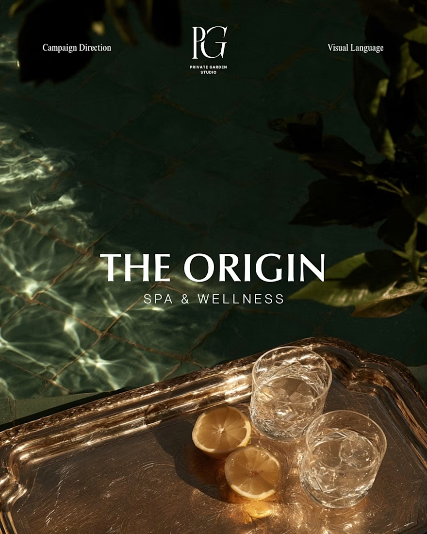
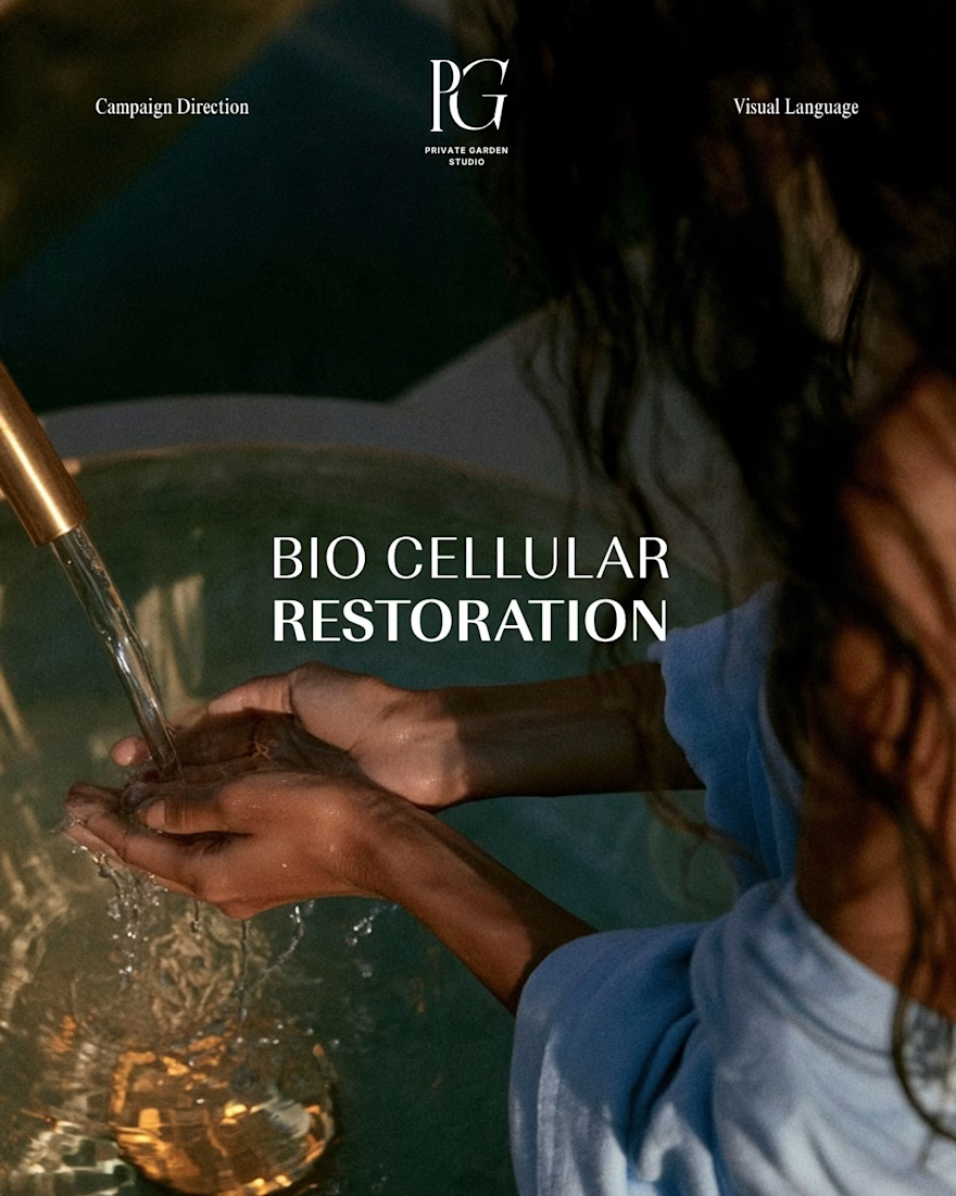
A consistent visual language is not about making an Instagram grid look good. That can be a nice byproduct, but it isn’t the goal.
Imagery should create a recognisable world around a brand through colour, mood, lighting, composition, messaging and atmosphere. These choices help attract the audience the brand is speaking to and shape what people expect to feel when they interact with it.
The clearer that visual language becomes, the less the brand has to rely on its logo to be recognised. A new product, a different location, a campaign image or even a corporate portrait can still immediately feel like it belongs to the same brand.
That recognition is particularly important as a brand grows. The goal is not for people to remember one product or one campaign, but to recognise and engage with the brand behind them.
A strong visual language gives different communications a shared identity without requiring them to look exactly the same.


The network for creativity
Join 1.25M professional creatives like you
Connect with clients, get discovered, and run your business 100% commission-free
Creatives on Contra have earned over $150M and we are just getting started





Related posts

Brand Identity & Packaging Design
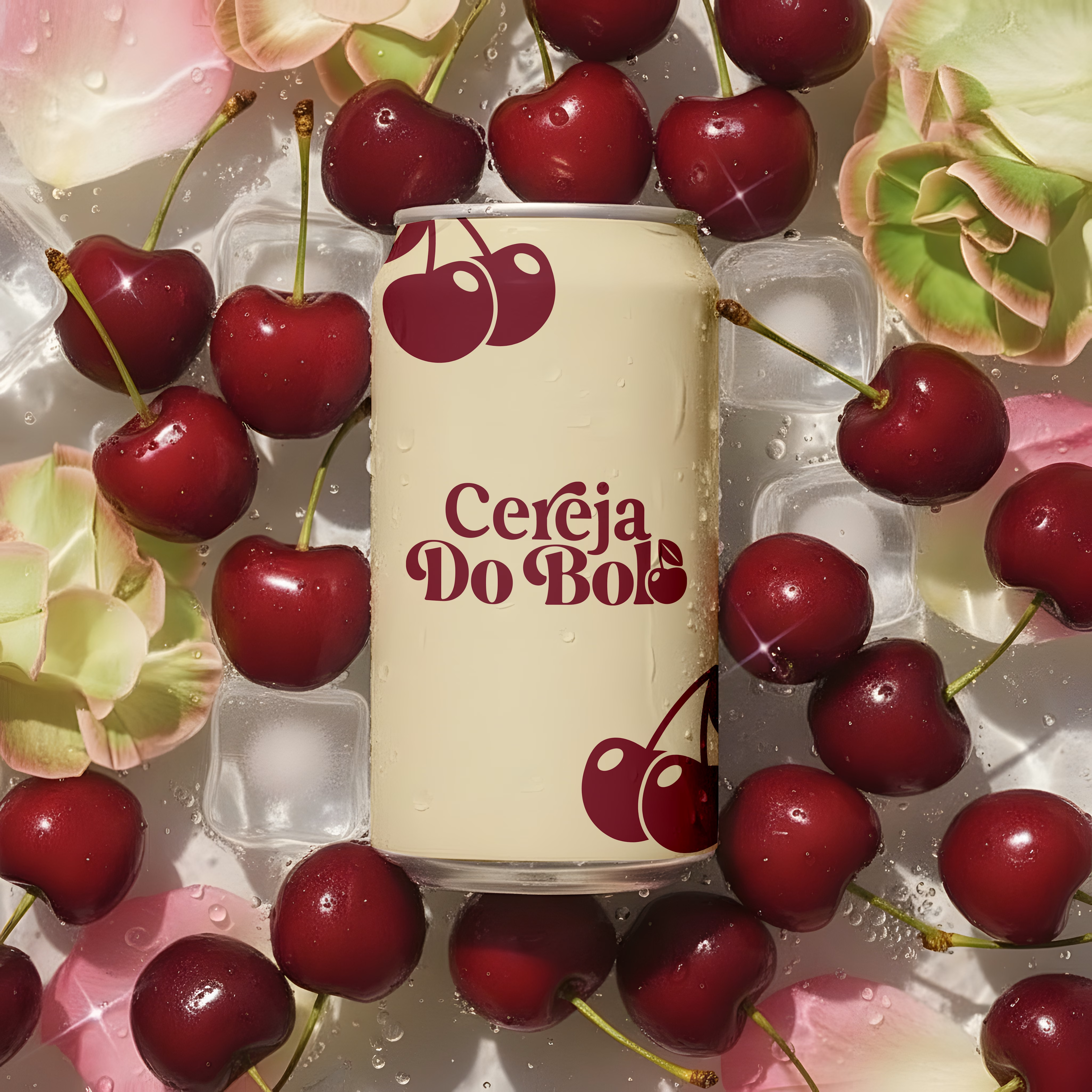
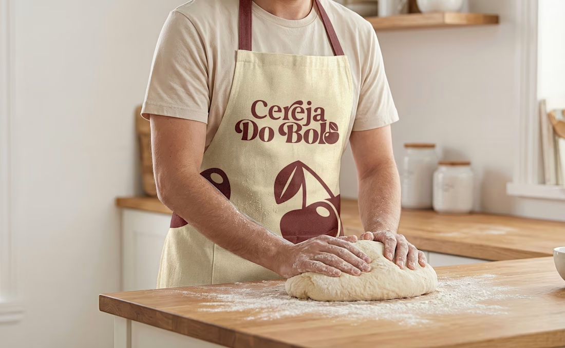
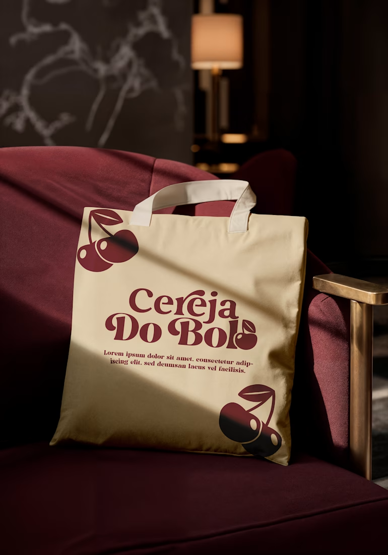
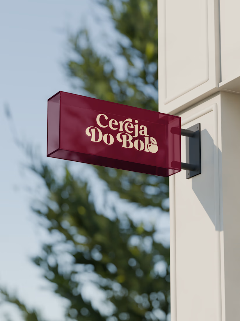
A complete visual identity and packaging concept for Cerveja do Bolo, including branded packaging, merchandise, and outdoor signage. I developed the visual direction and applied the brand consistently across multiple touchpoints to create a cohesive and recognizable identity.


Wow, love it


What would your workspace look like if you turned it into an ambient little world?
I recreated my actual workstation in Midjourney, with a little extra colour, mood lighting, and cinematic polish.
The warm desk lamp, cooler screen glow, my keyboard, books, and all the little things that make this corner mine. I wanted to capture that late-evening feeling when the rest of the world gets quiet and I can finally settle into my work:)
What's one thing in your workspace that you couldn't do without?

Mine's honestly just good desk lighting, everything else is negotiable. The reflections on your monitor and that neon glow read so convincingly though, how many passes did it take in Midjourney to get the lighting to behave like that?

XNOMAD — Brand Identity Design!
XNOMAD is a premium modular camper brand based in Scandinavia, offering both rental experiences and ownership of off-road pickup campers.
The goal was to create an identity that could sit naturally between two worlds:
Scandinavian minimalism + rugged outdoor capability.
Rather than following the typical loud adventure aesthetic, we kept the system clean, modern, and confident, reflecting XNOMAD's idea of quiet luxury and freedom.
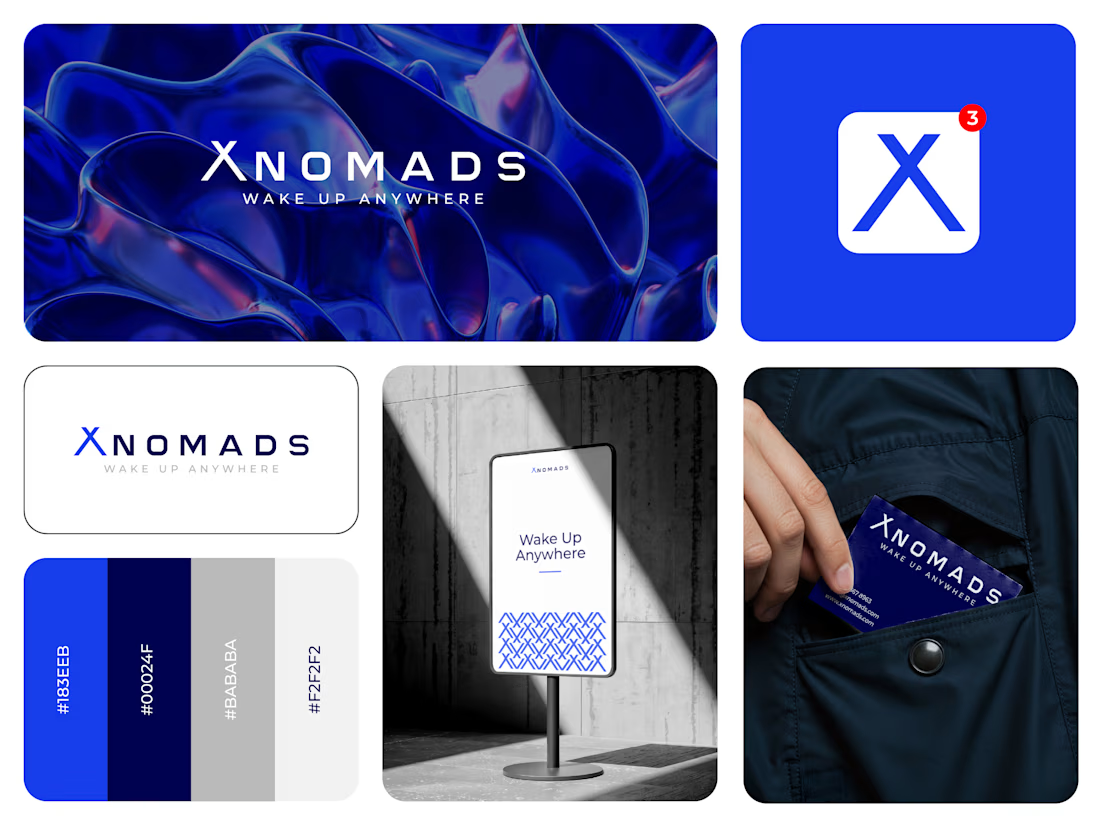
The identity was built around a distinctive X, supported by a minimal wordmark, bold blue palette, typography, graphic patterns, and applications across digital and physical touchpoints.
Wake Up Anywhere.
One of those projects where simplicity did most of the talking.



The blue visual system and mockup presentation work so well together.